Preparation is the key to success in any interview. In this post, we’ll explore crucial Excel and PowerPoint interview questions and equip you with strategies to craft impactful answers. Whether you’re a beginner or a pro, these tips will elevate your preparation.
Questions Asked in Excel and PowerPoint Interview
Q 1. Explain your experience with Excel’s pivot tables.
PivotTables are my go-to tool in Excel for summarizing and analyzing large datasets. Think of them as a dynamic, interactive summary report. Instead of manually calculating sums, averages, or counts across numerous rows and columns, a PivotTable allows you to drag and drop fields to instantly generate these calculations and group data in different ways. For example, if I have sales data for different regions and products, I can easily see total sales per region, average sales per product, or even sales trends over time, all by simply adjusting the PivotTable fields.
I’ve used PivotTables extensively in projects involving sales analysis, customer segmentation, and financial reporting. For example, in one project analyzing customer purchasing behavior, I used a PivotTable to identify high-value customers based on total spending and purchase frequency. This allowed for targeted marketing campaigns and improved customer retention strategies. I’m also comfortable with advanced PivotTable features like calculated fields, filters, and slicers, allowing for highly customized analyses.
Q 2. How proficient are you with VLOOKUP and HLOOKUP functions?
VLOOKUP and HLOOKUP are fundamental lookup functions in Excel that I use daily. VLOOKUP searches for a value in the first column of a table and returns a value from a specified column in the same row. HLOOKUP does the same, but searches the first *row* instead of the first column. Imagine a spreadsheet with a list of product IDs and their corresponding prices. Using VLOOKUP, I can quickly find the price of a specific product by simply inputting its ID. I’m very comfortable using these functions, including understanding and handling approximate matches and error handling (e.g., using IFERROR to gracefully manage situations where a lookup value isn’t found).
Beyond basic usage, I’m proficient in using these functions within more complex formulas, and I understand their limitations, particularly the restriction of VLOOKUP to searching only the first column. In such cases, I readily use INDEX and MATCH functions which offer greater flexibility and power. For example, I’ve used this combination for more efficient and robust data retrieval in scenarios where the lookup column wasn’t the first one.
Q 3. Describe your experience using macros in Excel.
My experience with Excel macros is substantial. I’m proficient in VBA (Visual Basic for Applications), the programming language used to create macros. Macros automate repetitive tasks, significantly increasing efficiency and reducing errors. For example, I’ve written macros to automate data import from external sources, format reports consistently, and generate complex charts with a single click. I understand how to use the VBA editor, debug code, and handle errors effectively.
One project involved automating a monthly financial report that previously took hours to complete manually. I developed a macro that pulled data from various sources, performed calculations, formatted the report, and emailed it to stakeholders, all automatically. This saved significant time and minimized the risk of human error. I also have experience creating user-defined functions (UDFs) to extend Excel’s functionality, making complex tasks easier and more accessible to non-programmers.
Q 4. How do you handle large datasets in Excel?
Handling large datasets in Excel efficiently requires a strategic approach. Simply opening a massive dataset can slow down Excel significantly. My preferred methods involve a combination of techniques. First, I often use Power Query (Get & Transform Data) to clean, transform, and filter data *before* it’s even loaded into Excel. This dramatically reduces the size of the data processed. Power Query allows for advanced data manipulation, including merging multiple data sources, removing duplicates, and applying complex filters. Once the data is cleaned, I’ll often work with a subset of the data relevant to my current analysis.
Secondly, I avoid unnecessary calculations and formulas within the dataset itself. Instead, I rely heavily on PivotTables and summary tables for analysis. Finally, for extremely large datasets that exceed Excel’s practical limits, I’d consider using a database management system (DBMS) like SQL Server or Access to manage and analyze the data, and then import only the necessary summarized results into Excel for visualization and reporting.
Q 5. What are your preferred methods for data visualization in Excel?
My approach to data visualization in Excel focuses on clarity and effectiveness. I select chart types appropriate for the data and the message I want to convey. For instance, bar charts are ideal for comparing categories, line charts for showing trends over time, and scatter plots for identifying correlations. I pay close attention to details such as axis labels, titles, legends, and data labels to ensure the chart is easily understandable and visually appealing.
Beyond the basic chart types, I’m comfortable using more advanced features like chart formatting, creating custom chart styles, and combining multiple charts for a comprehensive overview. For example, I recently created a dashboard combining bar charts, line charts, and gauges to effectively communicate key performance indicators (KPIs) to management. I aim to avoid chart clutter; simplicity is key for a compelling and easily-understood visualization.
Q 6. Describe your experience with conditional formatting in Excel.
Conditional formatting is a powerful tool for highlighting important data within a spreadsheet. I use it regularly to draw attention to outliers, critical values, or data that meets specific criteria. For example, I might highlight cells exceeding a certain threshold in red, or color-code cells based on their values using a color scale. This makes it easy to quickly identify key insights or potential problems without having to manually scan through large amounts of data.
I’m familiar with various conditional formatting options, including highlight cells rules, data bars, color scales, and icon sets. I can also create custom rules using formulas to apply conditional formatting based on complex logic. For instance, I’ve used conditional formatting to highlight cells that are both above a certain threshold *and* have a specific text value, effectively combining multiple criteria for more focused highlighting.
Q 7. How do you ensure data accuracy and integrity in Excel?
Ensuring data accuracy and integrity in Excel is paramount. My approach involves several steps. First, I meticulously check the source data for errors or inconsistencies before importing it into Excel. This includes verifying data types, looking for missing values, and identifying outliers. Next, I use data validation to restrict the type of data entered into specific cells, preventing incorrect input. This could involve restricting entries to numbers within a specific range or limiting input to a predefined list of values.
Further, I often use formulas and functions to cross-check data for inconsistencies. For instance, I might use SUM to verify that the sum of individual values matches a total, or use formulas to ensure values fall within expected ranges. Finally, regular backups and version control are crucial; this allows me to revert to previous versions if errors are discovered. Clear documentation of data sources, formulas, and cleaning steps is also essential for maintaining data integrity and enabling others to understand and verify the analysis.
Q 8. Explain your experience with Excel’s data validation tools.
Excel’s data validation tools are crucial for ensuring data accuracy and consistency. They allow you to define rules that govern what kind of data users can enter into specific cells. This prevents errors, improves data quality, and saves time during data entry and analysis.
For instance, you can restrict entries to specific numbers, dates, text lengths, or even lists of predefined values. Let’s say you’re creating a spreadsheet for tracking sales. Using data validation, you could ensure that the ‘Quantity Sold’ column only accepts numerical values greater than zero, preventing accidental negative entries or text inputs.
- Whole Number Validation: This ensures only integers are entered. Imagine tracking inventory; you can’t have half a widget.
- List Validation: This restricts input to a predefined list, like a dropdown menu of product names or customer IDs. This avoids typos and guarantees consistent data entry.
- Date Validation: This confines input to valid dates. In a project management spreadsheet, this ensures proper scheduling.
- Custom Validation: This allows complex rules using formulas, such as ‘the value must be less than 100’ or ‘the value must be within the range A1:A10’. This is incredibly versatile.
I’ve used data validation extensively in various projects, from building inventory management systems to creating sales reports, dramatically reducing errors and simplifying data analysis.
Q 9. What are your preferred methods for creating charts in PowerPoint?
My preferred method for creating charts in PowerPoint hinges on the type of data I’m presenting and the message I want to convey. I always start with the data itself in Excel, ensuring it’s clean and organized. Then, I leverage PowerPoint’s charting tools, often starting with a simple chart type and iteratively refining it.
I generally favor clean, minimalist chart designs. I often begin with bar charts, line charts, or pie charts—the classics—because they are easy to understand and interpret. However, I also utilize other chart types like scatter plots (for correlation analysis) or combo charts (combining data types for a richer perspective) when appropriate. PowerPoint’s built-in chart customization options, including colors, labels, titles, and data labels, are essential for making the chart visually appealing and easily understandable.
For example, when presenting sales data over time, a line chart clearly illustrates trends. But, if comparing sales figures across different product categories, a bar chart is more effective. I always remember the audience and tailor the chart type to best serve the information being conveyed.
Q 10. How do you create engaging and informative presentations in PowerPoint?
Creating engaging and informative PowerPoint presentations involves a multi-faceted approach that focuses on both content and design. The key is to tell a story, not just present data.
- Clear narrative structure: I always begin by outlining the key message and structuring the presentation to logically guide the audience through it.
- Visual hierarchy: Using headings, subheadings, bullet points, and white space creates a clear visual hierarchy, making it easy for the audience to follow along.
- Visual aids: Images, charts, and other visuals break up large blocks of text and make the presentation more engaging. I ensure they are high-quality and relevant to the content.
- Consistent design: Using a consistent theme, font, and color palette throughout the presentation creates a professional and polished look.
- Concise language: I avoid jargon and use clear, concise language, focusing on key takeaways.
- Audience engagement: I incorporate interactive elements such as questions, polls, or short quizzes to keep the audience involved.
I recently gave a presentation on market trends. By using compelling visuals, a clear narrative, and interactive elements like a short poll, I kept the audience engaged and they retained the key information much more effectively.
Q 11. Describe your experience with PowerPoint’s animation features.
PowerPoint’s animation features can significantly enhance a presentation’s impact, but should be used judiciously. Overuse can be distracting. My approach is to use animation strategically to highlight key points, emphasize transitions, and create visual interest without overwhelming the audience.
I often use subtle animations, such as appearing or fading effects for bullet points or charts, to guide the audience’s attention. I avoid complex, distracting animations that detract from the message. I find that animations are most useful in drawing attention to key data points or sequentially revealing information, building suspense or highlighting cause and effect relationships.
For instance, when presenting financial data, I might animate the appearance of each data point on a chart to build up the information gradually, creating a sense of progression. The key is to ensure the animation enhances, not detracts from the understanding of the content.
Q 12. How do you ensure consistency in formatting across your PowerPoint slides?
Maintaining consistent formatting across PowerPoint slides is crucial for a professional and polished presentation. I achieve this through several key strategies:
- Using PowerPoint’s Master Slides: This is my primary method. By defining fonts, colors, background styles, and layouts on the master slides, any changes made at the master level automatically apply to all slides that use that master.
- Themes: PowerPoint’s pre-designed themes offer consistent formatting options, providing a starting point that I can customize.
- Customizing Styles: I create custom styles for headings, subheadings, body text, and other elements to ensure consistency in fonts, font sizes, and formatting attributes.
- Using the Format Painter: This is a great tool for rapidly applying formatting from one element to another, maintaining consistency without manual repetition.
By leveraging these techniques, I ensure a clean, professional look that complements the message of the presentation, avoiding distractions caused by inconsistent formatting.
Q 13. How do you handle feedback on your PowerPoint presentations?
Handling feedback on PowerPoint presentations is a crucial part of the process. I approach it constructively, viewing it as an opportunity to improve the presentation. I always listen attentively and ask clarifying questions to fully understand the feedback.
I categorize feedback into different types: suggestions for content improvement, design adjustments, or technical corrections. I prioritize feedback based on its impact on the overall message and clarity. I always thank the person for their input, even if I don’t implement all suggestions. Sometimes, explaining my design choices helps to clarify my intent. Documentation of the feedback and the actions taken (or why certain changes were not made) is crucial for future reference and continuous improvement.
A collaborative approach to revising the presentation based on the feedback often results in a stronger and more impactful final product.
Q 14. What strategies do you use to create effective visuals in PowerPoint?
Creating effective visuals in PowerPoint requires careful consideration of audience, message, and design principles. My strategies include:
- Choosing the right chart type: As discussed earlier, selecting the appropriate chart type (bar, line, pie, etc.) is crucial for conveying information effectively.
- Using high-quality images and graphics: I ensure all visuals are crisp, clear, and relevant to the content. I use professional-quality images, avoiding low-resolution or blurry pictures.
- Maintaining visual consistency: Consistent use of colors, fonts, and styles creates a cohesive and professional look.
- Utilizing white space effectively: Appropriate white space improves readability and prevents the slides from feeling cluttered.
- Following design principles: I adhere to principles like proximity, alignment, contrast, and repetition to create visually appealing and easily digestible slides.
- Keeping it simple: I avoid overwhelming the audience with too much information on a single slide. Less is often more.
For example, in a presentation on sustainability, I would use high-quality images of nature to visually support the message, alongside charts illustrating key data points, all while maintaining a consistent color palette of greens and blues.
Q 15. Explain your experience using PowerPoint’s SmartArt graphics.
PowerPoint’s SmartArt graphics are a fantastic tool for visually representing information in a clear and concise manner. Instead of using simple bullet points, SmartArt allows you to transform lists, processes, hierarchies, and other data into professional-looking diagrams. I’ve extensively used various SmartArt layouts, including lists, processes, hierarchies, cycles, relationships, and matrices, to create compelling visuals for presentations.
For example, when presenting a project timeline, a hierarchical SmartArt graphic clearly shows the project phases, milestones, and tasks. Or, to illustrate a company’s organizational structure, a hierarchy chart is far more effective than a simple text description. My experience includes selecting the most appropriate SmartArt graphic based on the data and the message I want to convey, customizing the colors and styles to match the overall presentation theme, and ensuring the graphic is easily understandable for the audience.
I often use SmartArt to replace complex tables or lengthy text explanations with a visually engaging alternative. This enhances audience comprehension and keeps their attention focused.
Career Expert Tips:
- Ace those interviews! Prepare effectively by reviewing the Top 50 Most Common Interview Questions on ResumeGemini.
- Navigate your job search with confidence! Explore a wide range of Career Tips on ResumeGemini. Learn about common challenges and recommendations to overcome them.
- Craft the perfect resume! Master the Art of Resume Writing with ResumeGemini’s guide. Showcase your unique qualifications and achievements effectively.
- Don’t miss out on holiday savings! Build your dream resume with ResumeGemini’s ATS optimized templates.
Q 16. How do you incorporate data from Excel into your PowerPoint presentations?
Integrating data from Excel into PowerPoint presentations is crucial for creating data-driven narratives. There are several methods I employ, depending on the complexity of the data and the desired visual representation.
- Copy and Paste: For simple data sets, a straightforward copy-paste from Excel to PowerPoint works well. However, this method can be inflexible if you need to update the data later.
- Excel Charts: For more complex data, I create charts in Excel (bar charts, pie charts, line graphs, etc.) and then insert them directly into PowerPoint. This maintains a dynamic link; if the Excel data changes, the chart in the presentation automatically updates. This is my preferred method for most scenarios.
- Linking Excel Data: For advanced scenarios, I’ll link the PowerPoint presentation directly to the Excel spreadsheet. This ensures that all data is always synchronized. Any changes in the Excel sheet are immediately reflected in the presentation. This technique is ideal for large datasets or frequently updated information.
- Power Query (Get & Transform Data): For more complex data manipulation and cleaning before import, I leverage Power Query to transform data in excel, ensuring only relevant and accurate data gets presented in PowerPoint
Regardless of the method, I always ensure the data is clearly labeled, formatted consistently, and presented in a way that is easily understood by the audience. I focus on making the data visually appealing and avoiding clutter.
Q 17. How do you manage multiple versions of a PowerPoint presentation?
Managing multiple versions of a PowerPoint presentation is crucial for collaboration and version control. My approach typically involves a combination of techniques:
- Version Control Software: For significant projects or collaborative efforts, I utilize version control systems like Git (often integrated through platforms like GitHub or GitLab). This allows multiple users to work on the same presentation simultaneously, track changes, and revert to previous versions if needed.
- File Naming Conventions: I establish clear and consistent file-naming conventions (e.g., ‘Presentation_v1.pptx’, ‘Presentation_Final.pptx’) to keep track of different versions. I also add dates and descriptions to the filenames as necessary.
- Cloud Storage: I store all presentation files in a cloud-based storage service like Google Drive or OneDrive. This provides easy access, collaboration features, and automatic version history.
- Regular Backups: I regularly back up the presentation to an external hard drive or another cloud storage location as an additional safety precaution.
Combining these methods prevents confusion and ensures that I always have access to the most up-to-date version of the presentation while maintaining the ability to revert to prior versions if needed. This rigorous approach is particularly important for collaborative projects.
Q 18. Describe your experience with PowerPoint’s presentation mode.
PowerPoint’s presentation mode is a critical component of effective delivery. It provides features designed to enhance the viewing experience and streamline the presentation process. I leverage several of its key features, including:
- Presenter View: This feature is essential. It allows me to see the current slide, upcoming slides, speaker notes, and the time remaining all on my own screen, while the audience sees only the main presentation. This enables a smoother, more confident delivery.
- Laser Pointer: The laser pointer helps to highlight specific points or areas on the slide, drawing the audience’s attention and improving comprehension.
- Pen Tool: I use the pen tool to annotate slides during the presentation, adding emphasis or clarifying points in real-time. This fosters engagement and allows for spontaneity.
- Full-Screen Mode: Presenting in full-screen mode removes distractions and ensures a clear, professional visual experience for the audience.
I thoroughly practice my presentations in presentation mode to ensure a seamless and engaging experience for the audience. This practice helps me anticipate potential issues and deliver a polished presentation.
Q 19. How familiar are you with using transitions and animations in PowerPoint?
Transitions and animations in PowerPoint are powerful tools for creating engaging and memorable presentations. However, it’s crucial to use them judiciously. Overuse can be distracting. I employ transitions and animations strategically to enhance the flow and impact of the presentation:
- Transitions: I use subtle transitions between slides, such as fades or wipes, to maintain a smooth visual flow. Avoid jarring or overly flashy transitions. Consistency is key.
- Animations: I animate elements on individual slides to emphasize key points or reveal information gradually, making the presentation more dynamic and informative. I prioritize animations that enhance clarity and understanding, rather than simply adding visual flair. I often use entrance animations (e.g., appear, fly-in) and emphasis animations (e.g., highlight, bounce) to create a more engaging experience.
I test all transitions and animations thoroughly before the presentation to ensure they function correctly and don’t interfere with the flow or readability of the content. The goal is to enhance the message, not distract from it.
Q 20. What methods do you use to ensure your PowerPoint presentations are visually appealing?
Creating visually appealing PowerPoint presentations involves a multifaceted approach. I focus on several key principles:
- Consistent Design: I maintain consistency throughout the presentation using a unified color scheme, font styles, and layout. This creates a professional and cohesive look.
- High-Quality Images and Graphics: I use high-resolution images and graphics that are relevant to the topic. Poor-quality images detract from the overall presentation. I avoid using too many images which can lead to visual overload.
- White Space: I use ample white space to prevent clutter and allow the audience’s eye to easily focus on key information. A balanced use of space improves the visual impact significantly.
- Clear Typography: I choose easy-to-read fonts and appropriate font sizes. This ensures the text is legible and doesn’t overwhelm the slides. I use a limited number of fonts to maintain a consistent and clean look.
- Color Palette: I use a balanced color palette that is visually appealing and complements the overall theme. I ensure sufficient contrast for readability.
I often utilize online tools and resources to find inspiration and ensure the presentation aligns with current design trends, without sacrificing clarity and readability.
Q 21. How do you create and manage different PowerPoint templates?
Creating and managing PowerPoint templates is essential for maintaining consistency across multiple presentations. I employ the following strategies:
- Master Slides: I leverage PowerPoint’s master slide feature to define the overall layout, colors, fonts, and styles for the entire presentation. This ensures a consistent look and feel.
- Custom Templates: I develop custom templates tailored to specific needs or branding guidelines. This saves time and ensures consistency across different projects.
- Template Organization: I organize my templates in a structured manner, typically using a cloud storage service with clearly labeled folders. This ensures easy retrieval and organization.
- Version Control: Similar to managing presentation versions, I implement version control for templates, particularly for shared templates within a team. This is done by naming conventions and storing them in a controlled environment. This avoids confusion and ensures the latest version of a template is being used.
By implementing these methods, I ensure efficient reuse of design elements and maintain a consistent brand identity across all presentations.
Q 22. How familiar are you with PowerPoint’s collaboration features?
My familiarity with PowerPoint’s collaboration features is extensive. I’ve used features like co-authoring extensively, allowing multiple individuals to work on a single presentation simultaneously. This is incredibly beneficial for team projects, ensuring everyone’s input is integrated seamlessly. I’m also proficient in using PowerPoint’s version history to track changes and revert to previous versions if needed. This minimizes conflicts and ensures that everyone is on the same page. Furthermore, I’m experienced with sharing presentations online using OneDrive or SharePoint, enabling easy access and review by colleagues, clients, or stakeholders. This collaborative approach makes the process streamlined and efficient, accelerating the overall project timeline.
For example, in a recent marketing campaign, our team used co-authoring to develop a presentation outlining the strategy. Each team member worked on different sections simultaneously, and version history allowed us to easily track changes and ensure a consistent final product.
Q 23. What are your strategies for designing clear and concise slides?
Designing clear and concise slides involves prioritizing key messages and utilizing visual aids effectively. I follow the ‘less is more’ principle, focusing on one main idea per slide. I use bullet points to highlight key takeaways rather than dense paragraphs. Think of it like storytelling – each slide is a scene, building upon the previous one to tell a compelling narrative. Visuals, such as charts, graphs, and images, are crucial for illustrating data and maintaining audience engagement, but they must be relevant and easy to understand. I ensure a consistent design throughout, using a cohesive color palette and font style for a professional look.
For instance, instead of a slide crammed with text explaining sales figures, I’d use a simple, visually appealing chart showcasing the key trend. This helps the audience grasp the information instantly without getting bogged down in details.
Q 24. Explain your approach to preparing for a presentation.
My approach to presentation preparation is methodical and thorough. It begins with a deep understanding of the audience and the objective of the presentation. I then structure the content logically, creating an outline that flows naturally. I gather all necessary data and visuals, ensuring their accuracy and relevance. I rehearse the presentation multiple times, both privately and in front of a test audience if possible, to refine my delivery and anticipate potential questions. This process enables me to confidently deliver engaging and impactful presentations.
For example, before a presentation to investors, I’d spend time researching their investment priorities and tailor the presentation to address their specific concerns. I’d also practice the presentation until I feel comfortable and confident in my delivery.
Q 25. How do you handle unexpected questions during a presentation?
Handling unexpected questions requires a combination of preparedness and adaptability. I always anticipate potential questions based on the presentation’s content and the audience’s likely concerns. If I don’t know the answer immediately, I don’t hesitate to acknowledge it honestly, stating that I’ll follow up with the information later. I also ensure my responses are concise and clear, addressing the core of the question without unnecessary details. Above all, maintaining a calm and professional demeanor is essential to reassure the audience and project confidence.
For example, if asked about a complex technical detail I’m not fully versed in, I’d respond by saying something like, ‘That’s a great question; let me get back to you with precise details on that after I consult with the relevant team member.’
Q 26. Describe your experience with creating interactive elements in PowerPoint.
I have significant experience creating interactive elements in PowerPoint, leveraging features such as hyperlinks, animations, and embedded videos to enhance engagement. Hyperlinks can navigate the audience to related documents or websites, expanding on information within the presentation. Animations can highlight key points or draw attention to specific data points within a chart. Embedded videos can add another layer of interest and help deliver a message visually. I strategically incorporate these elements to ensure they enhance understanding and not distract from the core message.
For instance, in a training presentation, I might use animations to sequentially reveal steps in a process, while hyperlinks could lead to supplementary resources for further learning.
Q 27. How do you use Excel to support your PowerPoint presentations?
Excel is an indispensable tool in supporting my PowerPoint presentations. I use Excel to organize and analyze data that informs the presentation’s content. I then create charts and graphs within Excel that visually represent this data in an easily digestible format for the PowerPoint slides. Complex calculations or data manipulation are also done in Excel before being presented concisely within PowerPoint. This approach ensures accuracy and allows for a streamlined workflow between data analysis and presentation.
For example, if presenting sales data, I would use Excel to process the raw data, calculate key metrics, and then create visually appealing charts in Excel to be inserted directly into my PowerPoint presentation.
Q 28. What are your preferred methods for proofreading and editing your PowerPoint presentations?
My proofreading and editing process for PowerPoint presentations is meticulous. I always review the presentation thoroughly for grammatical errors, typos, and inconsistencies in formatting. I also check the accuracy of all data and ensure the visual elements are clear and consistent. I often use the ‘read aloud’ feature to catch errors that might be missed during visual review. Finally, I have a peer review process, where another colleague looks over the presentation to offer feedback before final delivery. This multi-faceted approach ensures a polished and error-free final product.
For example, before presenting to senior management, I’d have a colleague review my presentation for clarity, accuracy, and overall impact, providing a fresh perspective that often reveals unnoticed mistakes or areas for improvement.
Key Topics to Learn for Excel and PowerPoint Interview
- Excel: Data Manipulation & Analysis: Mastering data cleaning, filtering, sorting, and using formulas (VLOOKUP, INDEX-MATCH, SUMIF/S, etc.) to extract insights from datasets. Practice creating dynamic dashboards and reports.
- Excel: Pivot Tables & Charts: Learn to create and interpret PivotTables for effective data summarization and analysis. Practice visualizing data using various chart types to effectively communicate findings.
- Excel: Advanced Functions & Formulas: Explore more complex functions like array formulas, conditional formatting, and data validation to showcase your advanced Excel skills. Consider learning macros for automation.
- PowerPoint: Effective Visual Communication: Focus on creating visually appealing and concise presentations. Practice using charts, graphs, and images to support your message effectively.
- PowerPoint: Storytelling & Presentation Skills: Develop your ability to narrate data and insights compellingly. Practice structuring your presentations logically and delivering them confidently. Consider incorporating animation and transitions effectively.
- PowerPoint: Design Principles & Best Practices: Understand the principles of visual hierarchy, color theory, and typography to create professional and impactful presentations. Practice using templates and mastering design elements for consistency.
- Problem-Solving with Excel & PowerPoint: Prepare to articulate your approach to solving real-world problems using these tools. Think about how you would approach data analysis challenges or create a presentation to solve a specific business problem.
Next Steps
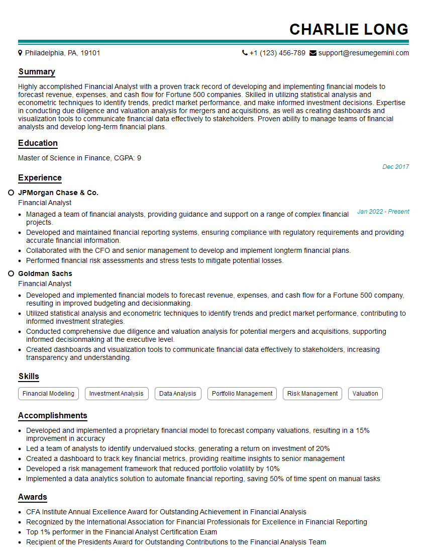
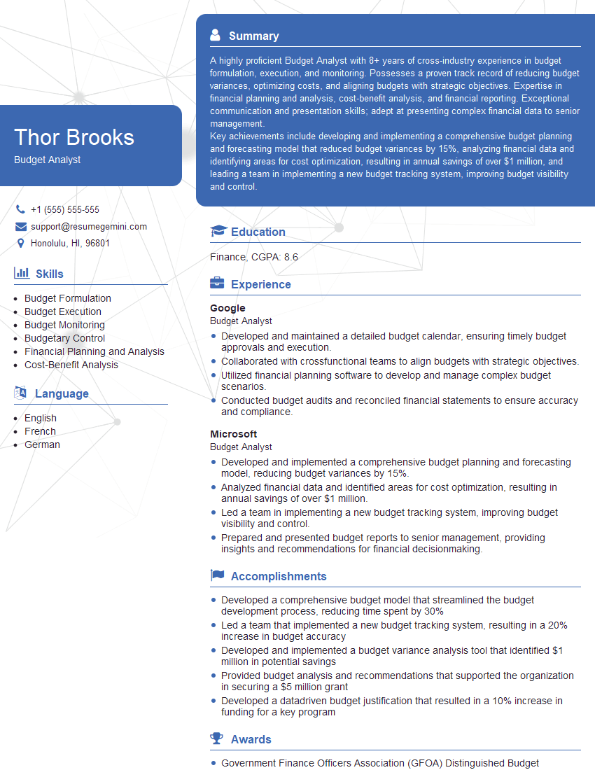
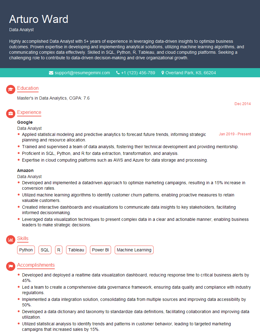
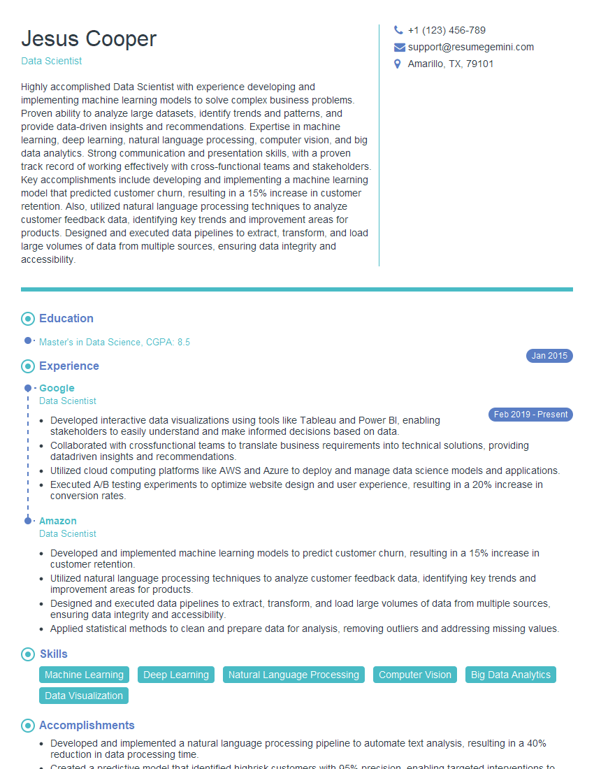
In today’s competitive job market, proficiency in Excel and PowerPoint is invaluable. Mastering these tools demonstrates strong analytical and communication skills – highly sought-after attributes across various industries. To maximize your job prospects, create an ATS-friendly resume that highlights your skills effectively. ResumeGemini is a trusted resource to help you build a professional and impactful resume that gets noticed. We provide examples of resumes tailored to showcasing Excel and PowerPoint expertise to help you get started. Invest the time to build a strong resume – it’s your first impression and a key step towards your career goals.
Explore more articles
Users Rating of Our Blogs
Share Your Experience
We value your feedback! Please rate our content and share your thoughts (optional).
What Readers Say About Our Blog
This was kind of a unique content I found around the specialized skills. Very helpful questions and good detailed answers.
Very Helpful blog, thank you Interviewgemini team.
