Cracking a skill-specific interview, like one for Color Enhancement Tools, requires understanding the nuances of the role. In this blog, we present the questions you’re most likely to encounter, along with insights into how to answer them effectively. Let’s ensure you’re ready to make a strong impression.
Questions Asked in Color Enhancement Tools Interview
Q 1. Explain the difference between hue, saturation, and brightness.
Hue, saturation, and brightness (HSB) are three independent components that define a color. Think of them like this: imagine you’re painting with watercolors.
Hue is the pure color itself – like red, blue, green, or a shade in between. It’s the color’s position on the color wheel.
Saturation refers to the color’s intensity or purity. A highly saturated color is vibrant and intense (like a bright red), while a low-saturated color appears duller or more grayish (a muted red).
Brightness (or value/lightness) indicates how light or dark the color is. A bright red is close to white, while a dark red is closer to black.
Changing these attributes independently allows for precise color manipulation. For example, you could increase the saturation of a photo to make it more vibrant without affecting its hue or brightness.
Q 2. Describe the various color spaces (e.g., RGB, CMYK, LAB).
Color spaces are systems for representing colors numerically. Each has its strengths and weaknesses.
RGB (Red, Green, Blue): This is the most common additive color model, used for displays like computer screens and TVs. It mixes red, green, and blue light to create all other colors. Each color component has a value from 0 (no light) to 255 (maximum light).
(255, 0, 0)represents pure red.CMYK (Cyan, Magenta, Yellow, Key/Black): This is a subtractive color model used in printing. It works by subtracting colors from white light. Cyan, magenta, and yellow inks are combined to create different colors, with black ink added for depth and sharpness. It’s less precise than RGB and often leads to different color representations between print and screen.
LAB (L*a*b*): This is a device-independent color space designed to be perceptually uniform. This means that a small numerical change in LAB values corresponds to a small perceptible color change for the human eye, regardless of the device. ‘L’ represents lightness, ‘a’ represents the green-red axis, and ‘b’ represents the blue-yellow axis. It’s frequently used for color correction and management across different devices and outputs.
Understanding these different color spaces is crucial for color management, particularly when moving images between different media (e.g., from screen to print).
Q 3. What are the common color enhancement techniques used in image editing?
Numerous techniques enhance colors in images. Here are some common ones:
Levels/Curves Adjustment: These tools allow precise control over the tonal range of an image by adjusting the brightness and contrast. This affects the distribution of color values, enhancing overall color depth.
Hue/Saturation/Brightness Adjustment: Modifying HSB values offers targeted color adjustments. For instance, selectively increasing the saturation of specific colors to make them pop.
Color Balance: This tool allows for adjusting the relative proportions of red, green, and blue, correcting color casts or enhancing specific color tones.
Selective Color Adjustment: This targets specific colors within the image, allowing for changes to their hue, saturation, and lightness. Useful for adjusting the color of a specific object or area in the image.
Vibrance/Saturation Adjustment: Vibrance selectively boosts the saturation of less-saturated colors, preventing oversaturation of already vibrant colors.
Color Grading: A more artistic approach, involving adjustments to overall color palette, mood, and look of the image (often involving LUTs – Look Up Tables).
The choice of technique depends on the desired outcome and the image’s specific needs.
Q 4. How do you handle color casts in photographs?
Color casts, where an unwanted color tint pervades the image (e.g., a bluish cast from shadow), are common issues. Here’s how to tackle them:
White Balance Adjustment: Many cameras and editing software offer white balance tools. This automatically attempts to neutralize color casts by identifying a neutral gray or white area in the image as a reference point.
Color Balance Adjustment: Manually adjust the red, green, and blue channels to counteract the dominant unwanted color. For a bluish cast, you might increase the yellow and red levels to counteract the blue.
Using Color Grading Tools: Tools like color wheels and curves can subtly shift the overall color balance to minimize casts.
Using Presets or LUTs: These provide pre-defined color adjustments that can often remove or minimize unwanted color casts.
The best approach is often a combination of techniques, carefully adjusting until the colors appear natural and balanced.
Q 5. Explain the concept of color profiling and its importance.
Color profiling creates a characterization of a specific device’s color output. It’s crucial because different devices (monitors, printers, scanners) reproduce colors differently due to their unique physical properties.
A color profile is a file that describes this device’s color response. When a color-managed system uses a profile, it translates the color data to match the specific device’s capabilities, ensuring consistent color reproduction across different devices. Without color profiles, colors may appear significantly different on various screens or printouts.
Imagine you’re printing a vibrant photograph. Without a color profile, the print might look significantly duller or have a different color cast than what appears on your screen. Color profiling bridges this gap, ensuring a more accurate and consistent representation of color.
Q 6. What software and tools are you proficient in for color enhancement?
My color enhancement expertise spans several software and tools, including:
Adobe Photoshop: Proficient in all aspects of color correction, adjustment layers, and advanced techniques.
Adobe Lightroom: Extensive experience with non-destructive editing, RAW file processing, and color grading workflows.
Adobe After Effects: Skilled in color correction and grading for video, utilizing advanced tools like curves, color wheels, and LUTs.
DaVinci Resolve: Proficient in professional-grade color grading for video, leveraging its extensive color tools and node-based workflow.
I also have experience with other color management software and plugins that further enhance the precision and efficiency of my workflow.
Q 7. Describe your experience with color grading for video.
I have extensive experience in color grading for video, working on various projects ranging from short films to corporate videos. My workflow typically involves:
Initial Color Correction: Addressing color imbalances and casts to establish a neutral baseline.
Creative Color Grading: Applying stylistic adjustments to establish the desired mood and look—this might include creating a specific color palette, enhancing contrast, or adjusting the overall tone.
LUT Application: Utilizing Look Up Tables (LUTs) for consistent color application across shots or to achieve specific cinematic looks.
Secondary Color Correction: Fine-tuning specific areas or elements within the video to enhance detail and visual interest.
Collaboration with Directors and Cinematographers: Working closely with creative teams to ensure the final color grade aligns with their artistic vision.
I’m adept at using color grading software, such as DaVinci Resolve and After Effects, to create a cohesive and visually compelling final product. I consider color grading a crucial aspect of storytelling in video.
Q 8. How do you ensure color consistency across different devices and platforms?
Ensuring color consistency across different devices and platforms is crucial for maintaining the integrity of your visual content. The key lies in employing a robust color management system. This involves using a standardized color profile (like sRGB for web or Adobe RGB for print) throughout the entire workflow, from image capture or creation to final output. Imagine trying to paint a picture with paints that change color depending on the light – frustrating, right? Color profiles act like a universal translator for colors, ensuring they are interpreted consistently.
This involves several steps:
- Profile your monitor: Calibrate your screen to match a known standard profile using a colorimeter.
- Work in a managed color space: Select a profile in your design software (Photoshop, Illustrator, etc.) and stick to it.
- Use color-managed software: Ensure all your software supports color management.
- Convert to the correct profile for output: Before sending your files to a printer or uploading to a website, convert the color profile to the correct one for that specific medium (e.g., converting from Adobe RGB to sRGB for web).
By diligently following these steps, you can minimize the variations in color appearance across different devices, ensuring your work looks as intended.
Q 9. Explain your understanding of color management workflows.
Color management workflows are the processes used to control color from capture to output, maintaining consistent appearance across different devices and media. Think of it as a carefully orchestrated dance of color profiles and software settings. A typical workflow involves:
- Capture/Creation: Establishing the initial color space in your camera, scanner, or design software.
- Editing: Working within a managed color space (e.g., Adobe RGB) to ensure accurate color representation during editing. This prevents undesirable color shifts.
- Proofing: Simulating how the final product will look on different output devices (soft proofing) to anticipate any discrepancies.
- Output: Converting the color space to a suitable profile for the final output device (e.g., sRGB for web, CMYK for print).
For example, a photographer shooting in RAW will have more control over color during post-processing because RAW files contain more color information than compressed JPEGs. The entire process hinges on consistently applying and converting color profiles.
Q 10. Describe a situation where you had to solve a complex color correction problem.
I once worked on a project involving restoring old, faded photographs. The images were severely degraded with uneven color casts, significant loss of detail, and significant color inconsistencies. The challenge was to restore the images to a visually appealing state while maintaining historical accuracy. A purely automated approach wasn’t feasible due to the complexity and variations in the degradation.
My solution involved a multi-step process:
- Initial Cleaning: Removing dust and scratches using specialized software tools.
- Selective Color Correction: Using masking techniques, I targeted specific areas affected by uneven fading, adjusting color balance, saturation, and brightness individually.
- Detail Enhancement: Employing sharpening and noise reduction techniques to restore lost detail without introducing artifacts.
- Color Grading: Applying subtle color grading adjustments to harmonize the overall color palette.
The result was a set of restored images that faithfully represented the originals while enhancing their visual appeal, showcasing the blend of technical skill and artistic judgment required in such restorations.
Q 11. How do you approach color correction for different types of media (e.g., print, web, video)?
Color correction for different media requires adjusting the approach based on the limitations and characteristics of each medium.
- Print: Print media uses the CMYK (Cyan, Magenta, Yellow, Key/Black) color model. Color correction for print often involves converting from RGB to CMYK, which can lead to color shifts. This requires careful profile management and soft proofing to predict the final output.
- Web: Web utilizes the sRGB color space. Color correction focuses on ensuring accurate color representation across various monitors and browsers, often involving optimization for various screen resolutions and color capabilities. The goal is a consistent experience across a wide array of display devices.
- Video: Video involves a wider color gamut and dynamic range than print or web. Color correction in video often entails working with color spaces like Rec.709 (standard definition) or Rec.2020 (high dynamic range), utilizing tools to adjust white balance, color temperature, and contrast to achieve the desired look. Often involves advanced techniques like color grading to achieve a specific mood or aesthetic.
The fundamental principles of color management remain the same across all media, but the specific color spaces, workflows, and tools used vary depending on the medium and its unique constraints.
Q 12. What is your experience with different color enhancement plugins or extensions?
My experience with color enhancement plugins and extensions is extensive. I’ve worked with a range of tools within Adobe Photoshop, Lightroom, and After Effects, including:
- Camera Raw: For powerful RAW file processing and color adjustments.
- Color Efex Pro: Offers a vast array of filters for creative and corrective color work.
- Topaz Labs plugins: Provides advanced noise reduction, sharpening, and detail enhancement tools that indirectly impact color fidelity.
- Alien Skin Exposure X: A fantastic tool for advanced color grading and creative effects.
The choice of plugin depends heavily on the specific needs of the project. Some plugins excel in specific areas like noise reduction, while others are better for creative color adjustments. My proficiency lies in understanding the strengths and limitations of each plugin and selecting the most appropriate tool for the task at hand.
Q 13. Explain the difference between selective color correction and global color correction.
The difference between selective and global color correction lies in the scope of the adjustments.
- Global color correction affects the entire image uniformly. This might involve adjusting the overall brightness, contrast, saturation, or white balance. Think of it as applying a single filter to the whole photograph.
- Selective color correction focuses on specific areas of the image. This is achieved using masks, selections, or adjustment brushes. For example, you might selectively brighten a subject’s face while leaving the background relatively unchanged. It’s like using a brush to paint only particular sections of a canvas.
Often, a combination of both techniques is used. Global adjustments provide a foundational base, while selective adjustments fine-tune specific areas for a more refined and impactful result.
Q 14. How do you handle color fringing or chromatic aberration?
Color fringing (or chromatic aberration) is a common issue where different wavelengths of light are not focused precisely at the same point, resulting in colored fringes around high-contrast edges. Think of it as a rainbow-like effect around sharp lines. Handling this depends on the source:
- During Capture: Using a lens with good optical correction and stopping down the aperture (using a smaller f-stop) can minimize fringing during the initial capture process.
- During Post-Processing: Software like Photoshop and Lightroom offer tools specifically designed to correct chromatic aberration. These tools often automatically detect and correct fringing, or manual adjustments can be made using tools like the Lens Correction filter. The specific functionality varies by software.
Identifying the root cause – whether it’s a lens defect or a processing artifact – informs the most effective approach to correction. In some extreme cases, manual editing may be needed, requiring patience and a keen eye for detail.
Q 15. How do you address color banding issues?
Color banding, those unsightly, stepped transitions between colors, usually arises from insufficient color depth. Think of it like a digital painting with only a few shades of each color – it looks blocky and unnatural. We address this primarily by increasing the bit depth of the image. This means expanding the range of possible colors, allowing for smoother gradients. For example, an 8-bit image has 256 shades of each color (red, green, blue). Converting this to a 16-bit image boosts that to 65,536 shades, significantly reducing banding. Beyond bit depth, techniques like dithering (introducing subtle noise to mask banding) and applying noise reduction filters can help, but these methods are secondary to ensuring sufficient color information from the source.
In practice, I’d first assess if the banding is an artifact of compression (like a heavily JPEG compressed image) or a limitation in the original image data. If the former, a lossless format conversion is often the best solution. If it’s inherent in the data, then we carefully explore the different color enhancement software options to increase the apparent color depth.
Career Expert Tips:
- Ace those interviews! Prepare effectively by reviewing the Top 50 Most Common Interview Questions on ResumeGemini.
- Navigate your job search with confidence! Explore a wide range of Career Tips on ResumeGemini. Learn about common challenges and recommendations to overcome them.
- Craft the perfect resume! Master the Art of Resume Writing with ResumeGemini’s guide. Showcase your unique qualifications and achievements effectively.
- Don’t miss out on holiday savings! Build your dream resume with ResumeGemini’s ATS optimized templates.
Q 16. Describe your experience with colorimetric measurements and instruments.
Colorimetric measurements are crucial for accurate color reproduction. My experience involves using spectrophotometers and colorimeters, instruments that measure the spectral reflectance or transmittance of a surface or object. This data allows us to quantify the color precisely, using standard color spaces like CIE XYZ, L*a*b*, and sRGB. I’ve worked with various instruments, including X-Rite i1Display Pro and Datacolor SpyderX Pro. These devices provide precise measurements critical for calibration and profiling, ensuring color consistency across devices and workflows.
For example, when working with print projects, I use these instruments to profile my printer, creating an ICC profile that allows my software to accurately translate digital color information into the print output. Without such meticulous measurements, colors could appear significantly different on screen versus on print.
Q 17. Explain your familiarity with ICC profiles.
ICC (International Color Consortium) profiles are essential for consistent color reproduction across different devices. Think of them as translators. They contain information about a device’s color characteristics – how it represents color – allowing software to adjust colors appropriately. For example, a monitor’s ICC profile tells the operating system how to display colors accurately on that specific screen. Similarly, a printer profile describes how that printer renders colors, helping ensure that the print matches the on-screen preview.
My familiarity extends to using and creating these profiles. I use software like ColorSync Utility (macOS) and dedicated color management tools to create profiles for monitors and printers. This ensures accurate color representation throughout my workflow, preventing discrepancies between the digital image and its output on different screens or printers. Mismatched profiles can lead to noticeable color shifts and inaccurate reproduction.
Q 18. How do you manage large batches of images for color correction?
Managing large image batches for color correction requires automation and batch processing capabilities. I leverage scripting and dedicated software to streamline this process. For instance, I might use Adobe Photoshop’s actions or batch processing features or explore options in other professional-grade image processing software, applying a series of pre-defined adjustments or scripts to each image. This involves creating a standardized workflow to ensure consistency and efficiency.
This often includes creating custom presets or actions within the software, focusing on consistent adjustments, such as adjusting white balance, brightness, contrast, and selectively correcting skin tones. This is much more efficient than manually correcting each image one-by-one.
Q 19. What are some common challenges you have faced in color enhancement, and how did you overcome them?
One common challenge is dealing with inconsistent lighting in a series of images. This is particularly tricky in photography where different lighting conditions significantly affect color balance. To address this, I often utilize advanced techniques such as masking and selective color correction, finely tuning the adjustments for specific image regions rather than globally applying them. If the images are drastically different in terms of lighting, I will often resort to a more methodical approach, involving the careful use of histogram equalization and color balancing tools to harmonize the imagery.
Another challenge is achieving a natural-looking result, especially during skin tone correction. Over-correction can lead to unrealistic and artificial results. I’ve overcome this by using subtle adjustments, paying close attention to the detail and focusing on maintaining a natural skin texture. This is often iterative, involving several small adjustments to gradually approach the desired result.
Q 20. What are your preferred methods for skin tone correction?
My preferred method for skin tone correction involves a combination of techniques, depending on the image and desired outcome. I frequently start by adjusting the overall white balance, ensuring the image is correctly exposed before focusing on the skin itself. Then, using selective color correction tools, I might subtly adjust the saturation and hue of specific skin tones, carefully avoiding harsh edits. Masking is crucial for isolating skin areas from other elements of the image, preventing unintended changes to the background or clothing.
For example, I might use a combination of curves and selective color adjustments to achieve a more natural and even skin tone. In some cases, using frequency separation techniques allows finer control, separating textures from color to adjust each independently. It’s important to remember that skin tones vary significantly; hence the correction should be sensitive and tailored to each image.
Q 21. How do you ensure that your color enhancements are aesthetically pleasing and natural-looking?
The key to aesthetically pleasing and natural-looking color enhancements lies in subtlety and understanding the image’s context. Over-saturation or overly bright colors often result in unnatural or cartoonish results. I always strive for a balance between improving the image’s quality and maintaining its natural appearance. This involves subtle adjustments, careful use of masking to isolate areas for correction, and a keen eye for detail. Reference images, and a detailed understanding of color theory, help immensely in achieving a natural outcome.
I frequently use before-and-after comparisons to monitor my progress and ensure I’m not overdoing any corrections. It’s about refinement, not drastic transformations. Think of it like makeup—a subtle enhancement rather than a complete overhaul.
Q 22. Describe your process for evaluating the quality of your color enhancement work.
Evaluating the quality of color enhancement is a multi-faceted process. It goes beyond simply making an image ‘look better’; it’s about achieving a specific goal and maintaining visual integrity. My process involves several key steps:
- Reference Check: I always start with a clear reference point – whether it’s a previously approved image, a client’s vision, or a set of style guidelines. This provides a benchmark for judging the success of my enhancements.
- Technical Assessment: I analyze aspects like color accuracy, dynamic range, and sharpness. I use tools to measure things like color temperature and saturation to ensure consistency and avoid over-processing.
- Aesthetic Evaluation: This is subjective, but crucial. I assess whether the enhancements enhance the mood, story, or message of the image, and whether the colors are pleasing and natural-looking, or appropriately stylized.
- Client Feedback: Crucially, I involve the client in the process. I present multiple versions with varying enhancement levels, seeking feedback to fine-tune the results to their specific needs and preferences.
- Cross-Platform Consistency: I ensure the enhanced image looks good across various devices and platforms, accounting for differences in screen calibration and color profiles.
For example, when enhancing a product photograph for an e-commerce site, I’d focus on accurate color reproduction to ensure the product appears as it does in real life. For a landscape photograph, I might prioritize enhancing the dynamic range to capture the vibrancy of the scene.
Q 23. How do you stay current with the latest trends and technologies in color enhancement?
Staying current in the fast-paced world of color enhancement requires a proactive approach. I employ several strategies:
- Industry Publications and Blogs: I regularly read publications like Color Research & Application and follow leading blogs on digital imaging and color science. This keeps me abreast of new research and emerging technologies.
- Online Courses and Workshops: Platforms like LinkedIn Learning and Skillshare offer excellent courses on color grading, HDR imaging, and related techniques. I actively participate in webinars and online workshops to learn from experts.
- Software Updates and Tutorials: I dedicate time to explore new features and functionalities of color grading software like DaVinci Resolve and Adobe Photoshop. I follow tutorials to master these new tools and techniques.
- Networking and Conferences: Participating in conferences like NAB or SIGGRAPH provides opportunities to network with professionals, learn about the latest trends firsthand, and gain insights from experienced colorists.
- Experimentation: I always allocate time for personal experimentation. I regularly work on personal projects, using them as a sandbox to try out new techniques and approaches.
For instance, the recent advancements in AI-powered color enhancement tools are incredibly exciting. I’ve spent time learning how these tools work and how to integrate them effectively into my workflow.
Q 24. Explain your understanding of different color gamuts.
Color gamuts represent the range of colors a particular device or system can reproduce. Understanding them is vital for accurate color representation. Different gamuts have varying sizes and shapes.
- sRGB: This is a standard gamut used widely on the web and for most consumer-level displays. It has a relatively small color space.
- Adobe RGB: A larger gamut than sRGB, often used in professional printing and photography. It includes a wider range of colors, especially greens and blues.
- ProPhoto RGB: The largest widely used gamut, encompassing a vast range of colors. However, it’s less compatible with various devices and often requires conversion for display or print.
- Display P3: Used in many Apple products and high-end displays. It offers a wider gamut than sRGB but smaller than Adobe RGB.
Working with different gamuts involves understanding color management. If you edit an image in a wide gamut like ProPhoto RGB and then try to display it on an sRGB monitor, some colors will be clipped (lost) or will appear different. Therefore, it’s essential to choose the appropriate gamut based on the intended output and target display and to convert correctly between gamuts to avoid color shifting.
Q 25. What is your experience with HDR imaging and color grading?
I have significant experience in HDR imaging and color grading. HDR (High Dynamic Range) expands the range of brightness levels far beyond what standard dynamic range (SDR) can display. This allows for more realistic and visually stunning images.
My workflow involves:
- Shooting in HDR: If possible, I prefer capturing images using HDR capable cameras to capture the maximum amount of light information.
- HDR Color Grading: I utilize specialized HDR grading software, such as DaVinci Resolve, which offers tools for handling the broader luminance and color range, including tools for managing highlights, mid-tones, and shadows independently in a more nuanced manner than SDR.
- Tone Mapping: This crucial step converts the HDR image into a format viewable on SDR displays. I carefully select a tone mapping algorithm to preserve the visual richness of the HDR image while ensuring it looks excellent on standard displays.
- Metadata Management: Properly handling HDR metadata is essential for compatibility with various platforms and devices. I make sure the metadata accurately reflects the image’s dynamic range.
One memorable project involved grading an HDR nature documentary. The vibrant colors and extreme brightness ranges of the sunsets and landscapes presented a challenge, but the final product was breathtaking.
Q 26. How do you balance artistic interpretation with technical accuracy in color enhancement?
Balancing artistic interpretation with technical accuracy is a delicate act, but crucial for successful color enhancement. It’s not about choosing one over the other; it’s about finding a synergy between them.
My approach:
- Understanding the Client’s Vision: I start by understanding the client’s goals and expectations. This could range from preserving realism to achieving a specific artistic style.
- Technical Foundation: I always start with a technically sound image. This means correcting any exposure problems, color casts, or other technical imperfections before applying any artistic enhancements.
- Gradual Adjustments: I favor making subtle and gradual adjustments to color and tone. This approach allows for greater control and prevents over-processing.
- Color Theory Knowledge: A solid understanding of color theory guides my choices. I use color harmonies and contrasts to achieve visually appealing and emotionally resonant results.
- Iteration and Refinement: I present several versions of the enhanced image, allowing the client to provide feedback and ensuring the final product meets both artistic and technical standards.
Think of it like cooking a fine meal; you need to use high-quality ingredients (technically sound image) and then apply your culinary skills (artistic interpretation) to create something delicious (visually stunning image).
Q 27. What are your strategies for optimizing images for different screen sizes and resolutions?
Optimizing images for different screen sizes and resolutions requires careful consideration of image scaling and compression techniques.
My strategy involves:
- Using appropriate file formats: JPEGs are suitable for web use, but less suitable for archival quality images. For web use, I compress JPEGs to a suitable size to maintain a balance between quality and file size.
- Scaling techniques: I use high-quality resampling algorithms like bicubic or lanczos to resize images for different resolutions. These methods minimize the artifacts often created by simpler scaling.
- Responsive design principles: For web-based images, I use responsive image techniques to provide appropriate versions of the image optimized for different screen sizes. This is a crucial aspect of delivering high-quality images across multiple devices.
- Compression levels: When using lossy compression techniques like JPEG, I carefully select the compression level to find the optimal balance between file size and image quality. Higher compression levels result in smaller files, but also more noticeable artifacting.
For example, a high-resolution image intended for print wouldn’t be directly uploaded to a website. It needs to be resized and compressed for web use to ensure fast loading times without compromising visual quality. It’s all about targeting the right image for the right platform.
Q 28. Explain your experience with color matching and consistency across different projects.
Maintaining color matching and consistency across multiple projects is crucial for professional credibility. This involves a rigorous approach to color management.
My techniques include:
- Color Profiles: I carefully manage color profiles throughout the workflow. I ensure all software and hardware are properly calibrated and use consistent color spaces.
- Reference Images: Using a color chart or a consistent reference image in each project allows me to check for discrepancies in color representation. This provides a reliable benchmark for maintaining consistency.
- Calibration Tools: I utilize colorimeters and spectrophotometers to calibrate my monitors and ensure accurate color representation on my screens.
- Standardized Workflows: I establish a standardized workflow with well-defined steps for color correction and enhancement. This minimizes variability across projects.
- Documentation: I keep detailed records of the color settings and adjustments made during each project, ensuring easy reference for future work and helping to maintain consistent styles.
Imagine a branding project spanning multiple advertisements, brochures, and website elements. Color consistency is essential to building brand recognition and maintaining a cohesive visual identity. This is where my rigorous color management approach becomes indispensable.
Key Topics to Learn for Color Enhancement Tools Interview
- Color Models and Spaces: Understanding RGB, CMYK, HSV, LAB color spaces and their applications in image editing and enhancement. This includes conversions between spaces and their impact on color perception.
- Color Correction Techniques: Mastering techniques like white balance adjustment, color grading, shadow/highlight manipulation, and color matching. Be prepared to discuss practical applications in photography, videography, or graphic design.
- Color Enhancement Algorithms: Familiarize yourself with common algorithms used for contrast adjustment, sharpening, noise reduction, and color saturation. Understanding the underlying principles and their limitations is key.
- Histogram Analysis and Manipulation: Learn how to interpret histograms and use them to make informed decisions about color correction and enhancement. Discuss practical applications in adjusting tonal range and overall image balance.
- Color Quantization and Dithering: Understand the concepts behind reducing the number of colors in an image and techniques used to minimize banding or artifacts. This is particularly relevant for applications with limited color palettes.
- Software and Tools: Demonstrate familiarity with industry-standard software like Adobe Photoshop, Lightroom, or other relevant color enhancement tools. Be ready to discuss your experience with specific features and functionalities.
- Color Perception and Psychology: Understanding how humans perceive color and the psychological impact of different color schemes can be a significant advantage. Discuss applications in design and marketing contexts.
- Workflow and Best Practices: Outline your approach to a typical color enhancement task, highlighting your workflow and problem-solving strategies. This demonstrates your practical experience and organizational skills.
Next Steps
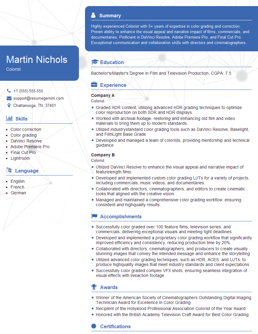
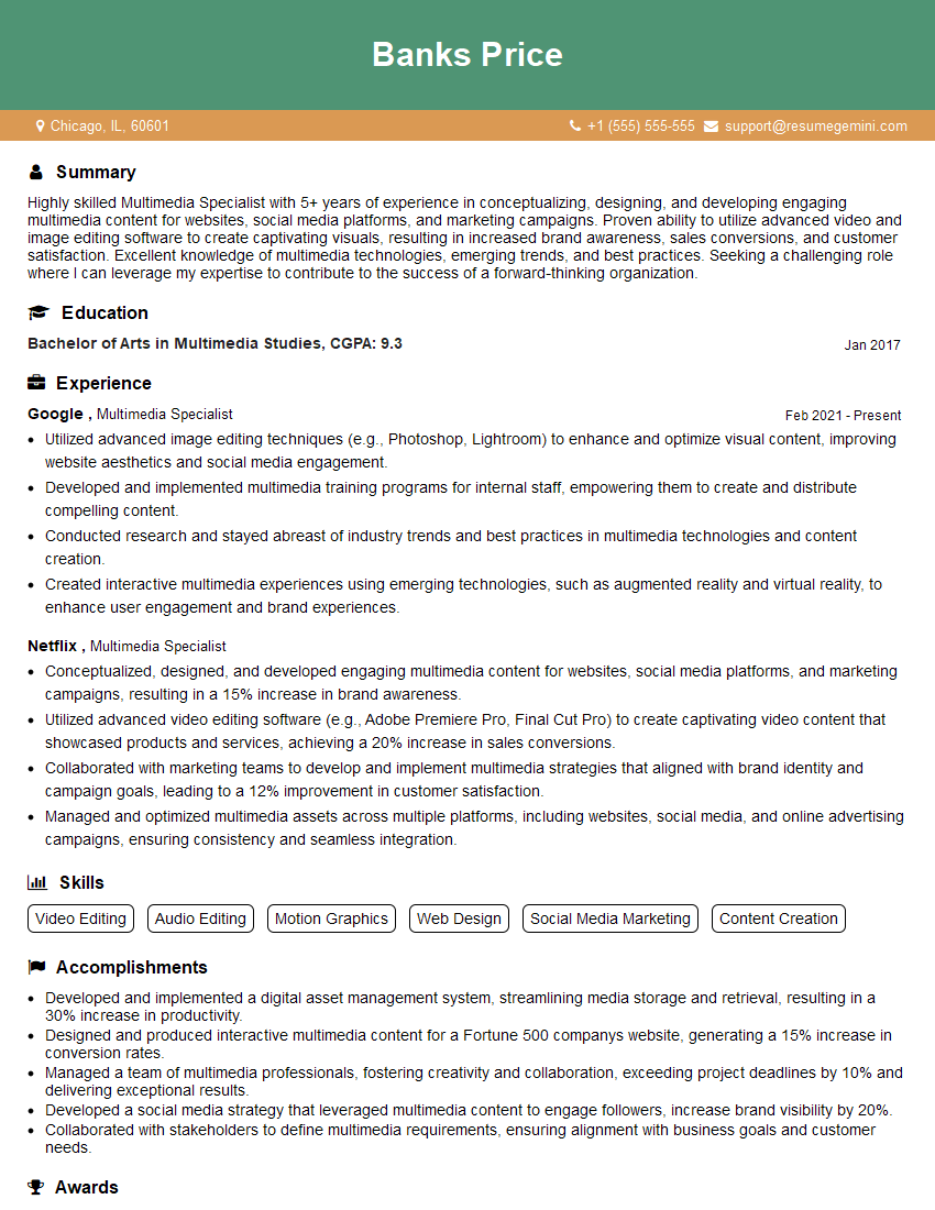
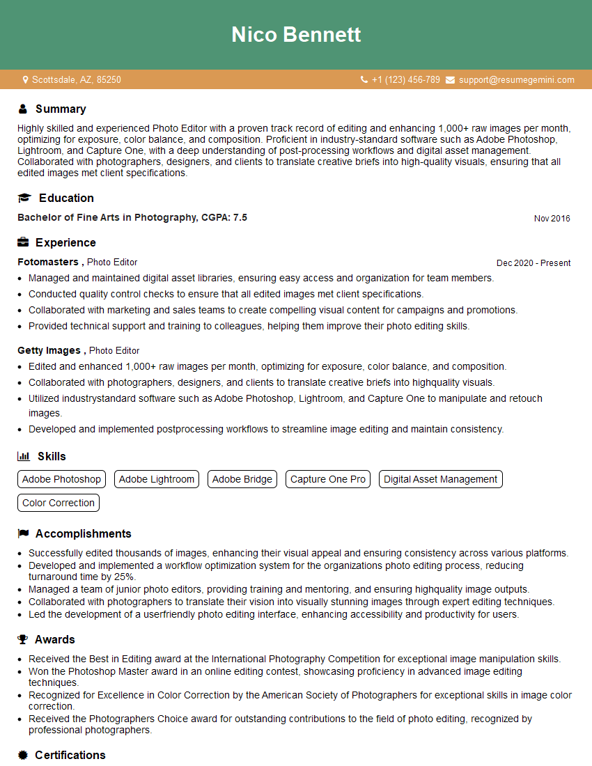
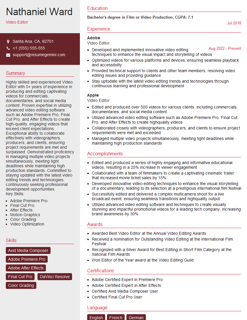
Mastering Color Enhancement Tools is crucial for career advancement in fields like graphic design, photography, video editing, and digital imaging. A strong understanding of these techniques significantly enhances your marketability and opens doors to exciting opportunities. To stand out, create an ATS-friendly resume that highlights your skills and experience effectively. ResumeGemini is a trusted resource to help you build a professional and impactful resume. Examples of resumes tailored to Color Enhancement Tools professionals are available to guide you.
Explore more articles
Users Rating of Our Blogs
Share Your Experience
We value your feedback! Please rate our content and share your thoughts (optional).
What Readers Say About Our Blog
This was kind of a unique content I found around the specialized skills. Very helpful questions and good detailed answers.
Very Helpful blog, thank you Interviewgemini team.

