Feeling uncertain about what to expect in your upcoming interview? We’ve got you covered! This blog highlights the most important Generate reports and prepare presentations interview questions and provides actionable advice to help you stand out as the ideal candidate. Let’s pave the way for your success.
Questions Asked in Generate reports and prepare presentations Interview
Q 1. Explain your experience with different reporting tools (e.g., Tableau, Power BI, Excel).
My experience with reporting tools spans several platforms, each offering unique strengths. I’m highly proficient in Tableau and Power BI, utilizing their robust data visualization capabilities for interactive dashboards and complex reports. I leverage Tableau’s drag-and-drop interface for quick prototyping and its advanced analytical features for deeper insights. Power BI’s integration with Microsoft’s ecosystem makes it ideal for collaborative projects and data integration with various sources. I also possess extensive experience with Microsoft Excel, using its pivot tables, charts, and formulas for data manipulation, analysis, and presentation, particularly for smaller datasets or quick turnaround reports. For instance, in a previous role, I used Tableau to create interactive sales dashboards that tracked key metrics across different regions, while Power BI was instrumental in generating automated weekly performance reports integrated directly with our CRM system. Excel remained a crucial tool for ad-hoc analysis and rapid report generation when needed.
Q 2. Describe your process for creating a compelling data visualization.
Creating compelling data visualizations is a process that prioritizes clarity and impact. It begins with understanding the data and the story it needs to tell. I start by defining the key message, identifying the target audience, and then selecting the appropriate chart type. For instance, a bar chart is best for comparing different categories, while a line chart is ideal for showing trends over time. Color palettes, font choices, and overall layout are carefully considered to ensure readability and visual appeal. I always prioritize data accuracy and avoid misleading representations. Think of it like storytelling – you want to guide the viewer’s eye to the most important information, using visuals to highlight key takeaways. For example, to showcase the growth of a company’s market share, I might use an area chart with a clear, concise title and labelled axes, emphasizing the upward trend with a contrasting color highlighting the growth period.
Q 3. How do you ensure data accuracy and integrity in your reports?
Data accuracy and integrity are paramount. My process involves several steps. First, I rigorously check the source data for inconsistencies and errors. This includes validating data types, looking for outliers, and identifying missing values. Second, I document my data cleaning and transformation processes, ensuring complete transparency and traceability. Third, I use appropriate validation checks within the reporting tools themselves to ensure data accuracy during calculations and visualization. Fourth, I perform regular audits of the reports to maintain ongoing quality control. Finally, clear data definitions and metadata are crucial. For example, if dealing with financial data, I’d meticulously check for currency inconsistencies and reconcile figures against different accounting systems. Any discrepancies are investigated and resolved before the report is finalized. This methodical approach minimizes errors and ensures the report’s credibility.
Q 4. What methods do you use to identify key performance indicators (KPIs)?
Identifying Key Performance Indicators (KPIs) requires a deep understanding of the business objectives and the data available. I begin by collaborating with stakeholders to define their strategic goals. Then, I analyze the relevant data to identify metrics that directly reflect progress towards these goals. This often involves brainstorming sessions to explore potential KPIs and evaluating their relevance, accessibility, and measurability. The chosen KPIs should be SMART – Specific, Measurable, Achievable, Relevant, and Time-bound. For example, if the goal is to increase customer satisfaction, relevant KPIs might include customer satisfaction scores (CSAT), Net Promoter Score (NPS), and the number of customer complaints. Regularly reviewing and adjusting KPIs is essential to ensure they remain aligned with evolving business priorities.
Q 5. How do you tailor a presentation to different audiences?
Tailoring presentations to different audiences is crucial for effective communication. The key is to understand the audience’s level of knowledge, their interests, and their decision-making authority. A technical audience requires detailed data and complex analyses, while a senior management team needs a high-level overview with key takeaways. For technical audiences, I might include detailed charts, statistical analysis, and technical jargon. For executive summaries, I’d focus on key findings, visually appealing charts, and actionable recommendations. The language, visuals, and level of detail are all adjusted to match the audience’s needs. For example, a presentation on marketing campaign performance to the marketing team might include detailed breakdowns of channel performance, while a presentation to the CEO would focus on overall ROI and key strategic implications.
Q 6. Describe your experience with storytelling through data.
Storytelling with data is about transforming raw numbers into a compelling narrative that resonates with the audience. It involves crafting a clear narrative arc, starting with a compelling introduction that establishes context and ends with a strong conclusion highlighting key insights and recommendations. Data visualization plays a critical role here – charts and graphs should not merely present data, but tell a story. For instance, I might use a map to showcase regional sales trends, highlighting areas of success and identifying areas that need improvement. I might use before-and-after charts to illustrate the impact of a specific initiative. The goal is to engage the audience, create emotional connection, and make the data memorable and actionable.
Q 7. How do you handle conflicting data sources or inconsistencies?
Handling conflicting data sources or inconsistencies requires a systematic approach. First, I investigate the discrepancies by identifying the root cause – this might involve data entry errors, different data definitions, or inconsistencies in data collection methods. Then, I prioritize data sources based on their reliability and credibility. This might involve validating the data against other trusted sources. When dealing with irreconcilable differences, I clearly document the discrepancies and highlight the potential impact on the analysis. Transparency is key, and it’s important to clearly explain limitations in the data. For example, if one dataset shows lower sales figures than another, I would investigate the reason for the difference (e.g., different reporting periods, inconsistent product categorization). If the discrepancies cannot be resolved, I clearly flag this within my report and discuss the potential implications of the inconsistencies on the analysis.
Q 8. What are your preferred methods for data cleaning and preprocessing?
Data cleaning and preprocessing are crucial first steps in any data analysis project. My preferred methods involve a multi-stage approach focusing on accuracy and efficiency. I begin with handling missing values. This might involve imputation techniques like mean/median/mode substitution for numerical data, or using more sophisticated methods like k-Nearest Neighbors for more complex relationships. For categorical data, I might use the most frequent category or create a new ‘missing’ category. Next, I address outliers. I use box plots and scatter plots to visually identify outliers and then decide on the best approach – removal (if justified and not biasing the data), capping (replacing extreme values with less extreme ones), or transformation (using techniques like logarithmic transformations to reduce the impact of outliers).
Then, I focus on data transformation. This might include scaling (standardization or normalization to ensure features have similar ranges), encoding categorical variables (using one-hot encoding or label encoding), and creating new features from existing ones that might improve model performance. Finally, I always perform data validation to ensure data consistency and accuracy, often using checks for data type consistency, range limitations, and unique identifier constraints. For example, if I’m working with dates, I’ll verify that the dates are in the correct format and within a reasonable range. This iterative process ensures clean and reliable data for analysis and reporting.
Q 9. Explain your experience with different chart types and their appropriate uses.
Choosing the right chart type is crucial for effective data visualization. My experience spans a wide range of charts, each suited to different data types and analytical goals. For example, bar charts are excellent for comparing categorical data, like sales figures across different product categories. Line charts are perfect for showing trends over time, such as website traffic or stock prices. Pie charts effectively illustrate proportions of a whole, like market share distribution. Scatter plots are ideal for exploring relationships between two numerical variables, helping identify correlations or clusters. More advanced options like heatmaps can effectively visualize correlation matrices or large datasets with color-coded values. I also leverage box plots for displaying data distribution, including median, quartiles, and outliers. The choice always depends on the data and the message I’m trying to convey. The goal is clarity and insight; the wrong chart can obscure important information.
Q 10. How do you present complex data in a clear and concise manner?
Presenting complex data clearly and concisely requires a strategic approach. I start by identifying the key insights I want to communicate and then structure the presentation around these key findings. Instead of overwhelming the audience with details, I focus on highlighting the most important trends and patterns. This often involves using summary statistics (means, medians, standard deviations) to present a concise overview of the data. I leverage effective data visualization techniques as discussed earlier, ensuring charts are clean, well-labeled, and easy to understand. I avoid cluttering the visuals with unnecessary details, focusing on the core message. I also use effective storytelling to guide the audience through the data, making it relatable and engaging. Think of it as a narrative; there’s a beginning, a middle (the insights), and a clear conclusion. Breaking down complex information into digestible chunks improves comprehension and avoids information overload.
Q 11. Describe your experience with creating interactive dashboards.
I have extensive experience building interactive dashboards using tools like Tableau and Power BI. The key to a successful interactive dashboard is intuitive design and clear navigation. I focus on creating a user-friendly interface that allows users to explore the data at their own pace. This often involves incorporating features like filters, drill-downs, and interactive elements (e.g., sliders, toggles) to allow users to customize their view of the data. For example, a sales dashboard might allow users to filter data by region, product category, or time period. The interactive elements enhance user engagement and allow for a deeper understanding of the data. I always prioritize clear labeling, consistent formatting, and visually appealing design to ensure the dashboard is not only functional but also aesthetically pleasing.
Q 12. How do you prioritize information when creating a presentation?
Prioritizing information in a presentation is crucial for maintaining audience attention and conveying the key message effectively. I use the pyramid principle, organizing information from the most important point at the top to the supporting details below. I start by defining a clear objective for the presentation – what key message do I want the audience to take away? Then, I identify the main points that directly support this objective. Finally, I select the supporting data (charts, graphs, specific data points) that reinforce these main points. Using this hierarchical approach ensures that the most critical information receives the most emphasis, while less crucial details are presented concisely and appropriately. This prevents overwhelming the audience with irrelevant information and helps them focus on the core message.
Q 13. How do you incorporate feedback into your reports and presentations?
Incorporating feedback is essential for improving the quality of reports and presentations. I actively solicit feedback throughout the process, starting with initial drafts and continuing through to final revisions. I utilize a variety of methods for gathering feedback, such as formal reviews, informal discussions, and audience surveys. I carefully analyze the feedback received, distinguishing between constructive criticism and subjective opinions. For constructive feedback, I assess if the suggestions enhance clarity, accuracy, or overall effectiveness. I then revise the report or presentation accordingly, addressing the identified areas for improvement. I document all changes made and explain the reasoning behind each alteration, demonstrating a proactive approach to refinement based on insightful feedback.
Q 14. Describe a time you had to present data under pressure.
I once had to present quarterly financial results to the executive board just hours after receiving a last-minute data revision. Under pressure, I remained calm and focused on the key metrics. Instead of trying to present every detail, I highlighted the most significant changes and their implications. I used clear and concise language, relying heavily on visuals (charts and graphs) to communicate the information quickly and effectively. I prepped a concise backup presentation focusing solely on the key figures to avoid getting lost in the details. The revised data added an unexpected challenge, but by focusing on clarity and precision, I delivered a successful presentation and maintained the integrity of the message, even under severe time constraints.
Q 15. How do you ensure your reports and presentations are accessible to all audiences?
Ensuring accessibility in reports and presentations is paramount. It means crafting content understandable and usable by everyone, regardless of their background, abilities, or technological access. This involves several key strategies:
- Clear and concise language: Avoid jargon and technical terms. Use simple, everyday language that is easy to understand. For instance, instead of saying ‘utilize’, use ‘use’.
- Visual clarity: Use high-contrast colors, appropriate font sizes (at least 12pt), and sufficient spacing between elements. Ensure all visuals have clear, descriptive alt text for screen readers.
- Structural organization: Employ headings, subheadings, bullet points, and numbered lists to break down information logically. This improves readability and scannability, especially for those with cognitive differences.
- Multiple formats: Offer reports in multiple formats (PDF, Word, accessible online versions) to cater to different preferences and technological capabilities. For example, provide a plain text version for screen readers and visually impaired users.
- Consider color blindness: Use color palettes that are accessible to individuals with color vision deficiencies. Don’t rely solely on color to convey information; use patterns or shapes as well.
- Accessibility checkers: Utilize online tools and software (e.g., WAVE, Accessibility Insights) to scan reports and presentations for accessibility issues before distribution.
For example, when presenting financial data, instead of using complex financial jargon, I would explain key concepts using simple analogies, like comparing investment growth to the growth of a plant.
Career Expert Tips:
- Ace those interviews! Prepare effectively by reviewing the Top 50 Most Common Interview Questions on ResumeGemini.
- Navigate your job search with confidence! Explore a wide range of Career Tips on ResumeGemini. Learn about common challenges and recommendations to overcome them.
- Craft the perfect resume! Master the Art of Resume Writing with ResumeGemini’s guide. Showcase your unique qualifications and achievements effectively.
- Don’t miss out on holiday savings! Build your dream resume with ResumeGemini’s ATS optimized templates.
Q 16. What metrics do you use to measure the effectiveness of your reports?
Measuring the effectiveness of reports and presentations goes beyond simply checking if they were completed. I focus on quantifiable metrics demonstrating impact and engagement. Some key metrics include:
- Audience understanding: Post-presentation quizzes or surveys assess comprehension of key takeaways. A high percentage of correct answers indicates effective communication.
- Actionable insights: Track the number of decisions made or actions taken based on the report’s recommendations. For example, if a sales report suggests a new marketing strategy, monitoring the subsequent sales figures shows the report’s direct impact.
- Engagement levels: For presentations, measure audience participation through Q&A sessions, online polls, or feedback forms. Higher engagement suggests a more captivating and relatable presentation.
- Time spent engaging with the report: Analyzing how long people spent reviewing the report, particularly which sections they focused on, can reveal areas of interest and areas needing improvement.
- Goal attainment: If the report aims to increase efficiency or reduce costs, measure the degree to which these goals are met following its dissemination.
For instance, if a report on customer satisfaction leads to a 15% increase in positive customer feedback, that is a clear indicator of its effectiveness.
Q 17. How do you choose the appropriate visualisations for different datasets?
Choosing the right visualization is crucial for effectively communicating data. The dataset itself dictates the appropriate chart type. Here’s a simple framework:
- Categorical data (comparing categories): Bar charts, pie charts, and treemaps are effective for showing proportions or comparing different groups.
- Numerical data (showing trends over time): Line charts and area charts are ideal for illustrating trends and changes over a period.
- Relationships between variables: Scatter plots are excellent for showing correlations between two numerical variables. Heatmaps can display correlations within a larger dataset.
- Distribution of data: Histograms are used to display the frequency distribution of a single numerical variable. Box plots show the distribution’s central tendency and variability.
- Geographical data: Maps are perfect for visualizing data associated with geographical locations.
For example, to show the sales performance of different product categories over a year, I would use a clustered column chart, comparing each category’s sales across months. To display the distribution of customer ages, a histogram would be more suitable.
Q 18. Explain your process for identifying and addressing potential biases in data.
Addressing potential biases in data is a critical step in ensuring the integrity of reports and presentations. My process involves:
- Data source evaluation: Assessing the reliability and objectivity of the data sources. Are there inherent biases in how the data was collected or sampled?
- Data cleaning and validation: Identifying and correcting errors, outliers, and inconsistencies in the data. This step helps remove potential distortions.
- Bias detection techniques: Employing statistical methods to detect potential biases. For instance, checking for gender or racial imbalances in datasets and assessing whether specific subgroups are under- or over-represented.
- Transparency and disclosure: Clearly stating the limitations of the data and acknowledging any potential biases in the report or presentation. This includes describing the methodology used and explaining any assumptions made.
- Multiple perspectives: Seeking input from diverse team members to ensure various viewpoints are considered and potential biases are identified.
For example, if analyzing survey data, I would ensure the sample represents the population accurately and address potential response bias by examining the demographic profile of respondents.
Q 19. How do you handle unexpected questions during a presentation?
Handling unexpected questions during a presentation requires preparation and adaptability. My approach involves:
- Anticipating questions: Before the presentation, I brainstorm potential questions and prepare concise, clear answers. This helps me stay calm and collected.
- Acknowledging the question: Repeat or paraphrase the question to ensure understanding and buy time to formulate a thoughtful response.
- Honest and thoughtful responses: If I don’t know the answer immediately, I’ll say so honestly. I might offer to follow up with the information later or suggest researching the topic together.
- Redirecting if necessary: If a question is irrelevant to the presentation’s focus, I may politely redirect the questioner to an appropriate resource or suggest discussing it after the presentation.
- Turning challenges into opportunities: Unexpected questions can be an opportunity to show expertise and address audience concerns directly.
For instance, if asked about a topic outside my expertise, I would acknowledge the question’s validity, highlight that it’s outside my immediate domain but offer to find relevant research and share it with the audience later.
Q 20. Describe your experience with automated reporting processes.
I have extensive experience with automated reporting processes, leveraging tools and technologies to streamline report generation. This includes:
- Data extraction and transformation: Using scripting languages like Python or R, along with tools like SQL, to automate data extraction from various sources and transform it into a suitable format for reporting.
- Report generation tools: Proficiency in using business intelligence (BI) tools like Tableau, Power BI, or Qlik Sense to create interactive and automated reports. These tools can pull data automatically and generate reports based on pre-defined templates or schedules.
- Data visualization automation: Automating the creation of charts and graphs using scripting languages or BI tools, ensuring consistency and efficiency in visualization.
- Scheduling and distribution: Setting up automated report delivery schedules via email or cloud platforms, making sure reports reach stakeholders promptly.
For example, I automated a monthly sales report using Python and SQL, pulling data from a database, performing calculations, creating charts, and sending the report automatically to the sales team every month at 8 am.
Q 21. How do you ensure your reports are timely and relevant?
Ensuring timeliness and relevance requires a proactive approach. My strategy combines meticulous planning with agile adaptation:
- Clear deadlines and timelines: Establishing realistic deadlines and adhering to them throughout the reporting process. This requires careful project management and prioritization.
- Data acquisition strategy: Implementing efficient data collection processes to ensure timely access to relevant data. This involves collaborating with data sources and establishing clear communication channels.
- Iterative reporting: Developing reports in an iterative manner, allowing for revisions based on feedback and new information. This is particularly useful for ongoing or long-term reports.
- Dynamic content: Incorporating tools that automatically update data in real-time, allowing the report to remain up-to-date and relevant. This requires using dynamic data sources and linking reports to live data feeds.
- Prioritization: Focusing on reporting the most critical information first. This avoids unnecessary delays and ensures that the most vital insights are communicated promptly.
For example, for a daily market report, I would utilize real-time data feeds and automate the report generation process to ensure it is delivered before the market opens each day, providing stakeholders with up-to-the-minute insights.
Q 22. What techniques do you use to maintain consistency in your reports?
Maintaining consistency in reports is crucial for clarity and credibility. I employ several techniques to achieve this. First, I develop a style guide that dictates everything from font choices and color palettes to the formatting of tables and charts. This guide serves as a single source of truth for all my reporting projects. Second, I use templates. Creating reusable templates ensures uniformity across reports, saving time and reducing errors. For instance, I have a standardized template for financial reports, another for market analysis reports, and so on. Each template adheres strictly to the style guide. Third, I leverage the features of my reporting software (like Microsoft Power BI or Tableau) to enforce consistency. These tools often have features for creating custom themes and formatting rules which I utilize to streamline the process and prevent deviations. Finally, I always thoroughly review each report before finalizing it, paying close attention to details like consistent numbering, labeling, and data formatting. This final check helps identify and correct any inconsistencies that might have slipped through.
Q 23. Explain your experience with creating executive summaries.
Executive summaries require a concise yet comprehensive overview of a report’s key findings and recommendations. My approach begins with a deep understanding of the report’s purpose and the audience’s needs. I identify the three to five most crucial findings, emphasizing the impact and implications of these results. I then craft a narrative that presents these findings logically and compellingly. I use strong verbs and avoid jargon to maintain clarity and accessibility. Numbers and data are carefully presented, often using visuals like charts or graphs to reinforce key points. For example, if I’m summarizing a market analysis report, I would highlight the key market trends, growth forecasts, and potential risks, incorporating supporting data to substantiate these conclusions. I always ensure the summary is self-contained, meaning the reader can grasp the essence of the report even without reading the full document. I conclude with a clear statement of the recommended actions or next steps, tailored to the executive audience’s decision-making process.
Q 24. How do you incorporate data security best practices into your reporting processes?
Data security is paramount in my reporting processes. I adhere to several best practices, starting with secure data storage. Sensitive data is stored on encrypted servers and access is controlled through robust authentication and authorization mechanisms. I strictly follow the principle of least privilege, meaning users only have access to the data they absolutely need for their roles. Furthermore, I employ data masking and anonymization techniques wherever possible to protect sensitive information during the reporting process. For example, I might replace identifying details like names and addresses with unique identifiers or anonymized values. Throughout the reporting lifecycle, I carefully track data lineage and maintain audit trails. This ensures transparency and accountability in case of any security incidents. Finally, I regularly update my knowledge of data security best practices and relevant industry regulations like GDPR and CCPA to stay ahead of emerging threats and adapt my processes accordingly.
Q 25. What software and tools are you proficient in for report generation and presentation?
I’m proficient in a variety of software and tools for report generation and presentation. My core competencies lie in Microsoft Power BI and Tableau for data visualization and interactive dashboards. I also have extensive experience with Microsoft Excel and Google Sheets for data manipulation and analysis. For creating presentations, I excel in Microsoft PowerPoint and Google Slides, leveraging their features for creating dynamic and engaging visual aids. I also have working knowledge of data extraction and transformation tools like SQL and Python libraries such as Pandas and Matplotlib, allowing me to extract data from various sources and prepare it for visualization and analysis. This multifaceted skillset enables me to handle a wide range of reporting and presentation tasks effectively.
Q 26. How do you stay current with the latest trends in data visualization and reporting?
Staying updated on the latest trends in data visualization and reporting is an ongoing process. I actively follow industry blogs, publications, and online communities such as those on data visualization best practices. I attend webinars and conferences focused on data visualization and business intelligence. I also experiment with new tools and techniques, constantly seeking ways to improve the effectiveness and impact of my reports. For example, I recently explored the use of interactive dashboards that allow users to explore data dynamically, offering a more engaging and insightful experience. I also keep an eye on emerging trends like AI-powered data visualization and augmented analytics, understanding how these technologies can be incorporated into my work to enhance efficiency and the depth of analysis.
Q 27. Describe your experience with A/B testing different presentation styles.
A/B testing presentation styles is a valuable technique for optimizing communication effectiveness. I have used this approach on several occasions, particularly when presenting complex data to diverse audiences. For example, when presenting financial performance data, I might test two versions of the presentation: one using primarily charts and graphs and another with a more narrative-driven approach. By tracking audience engagement metrics such as time spent on slides, click-through rates, and post-presentation feedback, I could determine which presentation style resonated better with the audience. This data-driven approach helps refine my presentation strategy, improving clarity and effectiveness. I use analytics tools embedded within my presentation software or external tracking mechanisms to collect the necessary data for analysis.
Q 28. How do you balance visual appeal with data accuracy in your presentations?
Balancing visual appeal with data accuracy is crucial for creating impactful presentations. A visually stunning presentation is useless if it misrepresents the data. My approach begins with a clear understanding of the data’s message. I use visualizations to highlight key insights, not to obscure them. I select the appropriate chart type based on the data being presented. For example, I would use a bar chart for comparing categories and a line chart for displaying trends over time. I avoid using overly complex charts or distracting animations that might detract from the data’s message. I carefully label all charts and graphs, ensuring clarity and accuracy in the data representation. I also rigorously review the data’s integrity and accuracy before integrating it into the presentation, ensuring that the visual representation aligns precisely with the underlying data. A visually appealing presentation should enhance the understanding of the data, not replace it.
Key Topics to Learn for Generate reports and prepare presentations Interview
- Data Analysis & Interpretation: Understanding different data types, identifying key trends and insights, and drawing meaningful conclusions from data sets relevant to report generation.
- Report Writing Techniques: Mastering clear, concise, and persuasive writing styles; structuring reports logically; choosing appropriate visualizations and charts; tailoring reports to different audiences (technical vs. non-technical).
- Data Visualization & Presentation Design: Selecting effective charts and graphs; creating visually appealing and informative presentations; understanding principles of design and storytelling through data.
- Presentation Skills: Practicing confident and engaging delivery; structuring presentations effectively; handling questions and feedback professionally; using technology (e.g., PowerPoint, Google Slides) proficiently.
- Software Proficiency: Demonstrating expertise in relevant software for data analysis (e.g., Excel, SQL, Tableau, Power BI) and presentation creation. Highlighting specific skills used for report generation and presentation preparation.
- Problem-Solving & Critical Thinking: Applying analytical skills to identify and solve problems related to data inconsistencies, incomplete information, or unclear reporting requirements. Articulating your thought process clearly.
- Collaboration & Teamwork: Describing experiences working collaboratively on projects involving report generation and presentations. Highlighting your contributions to team success.
Next Steps
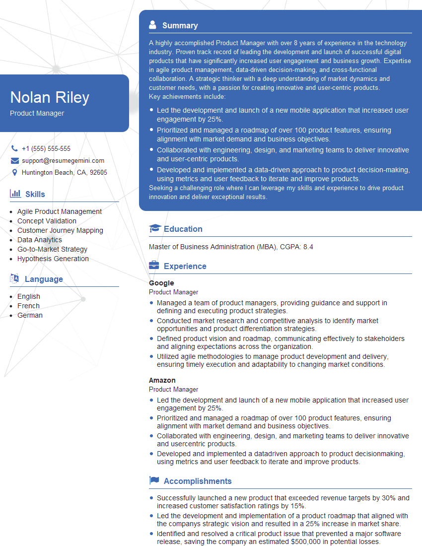
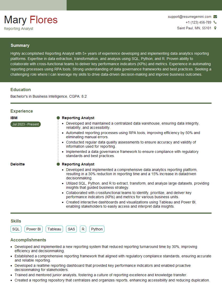
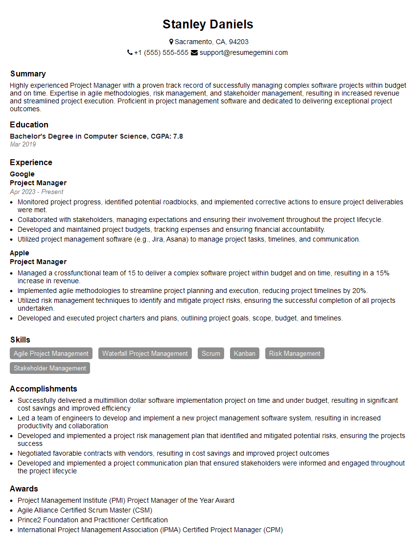
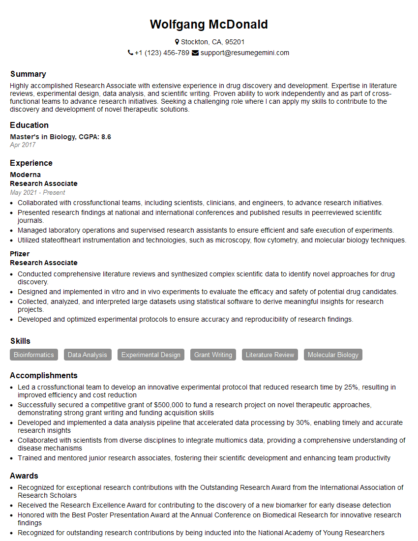
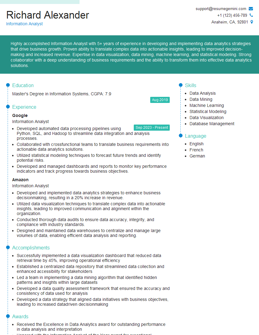
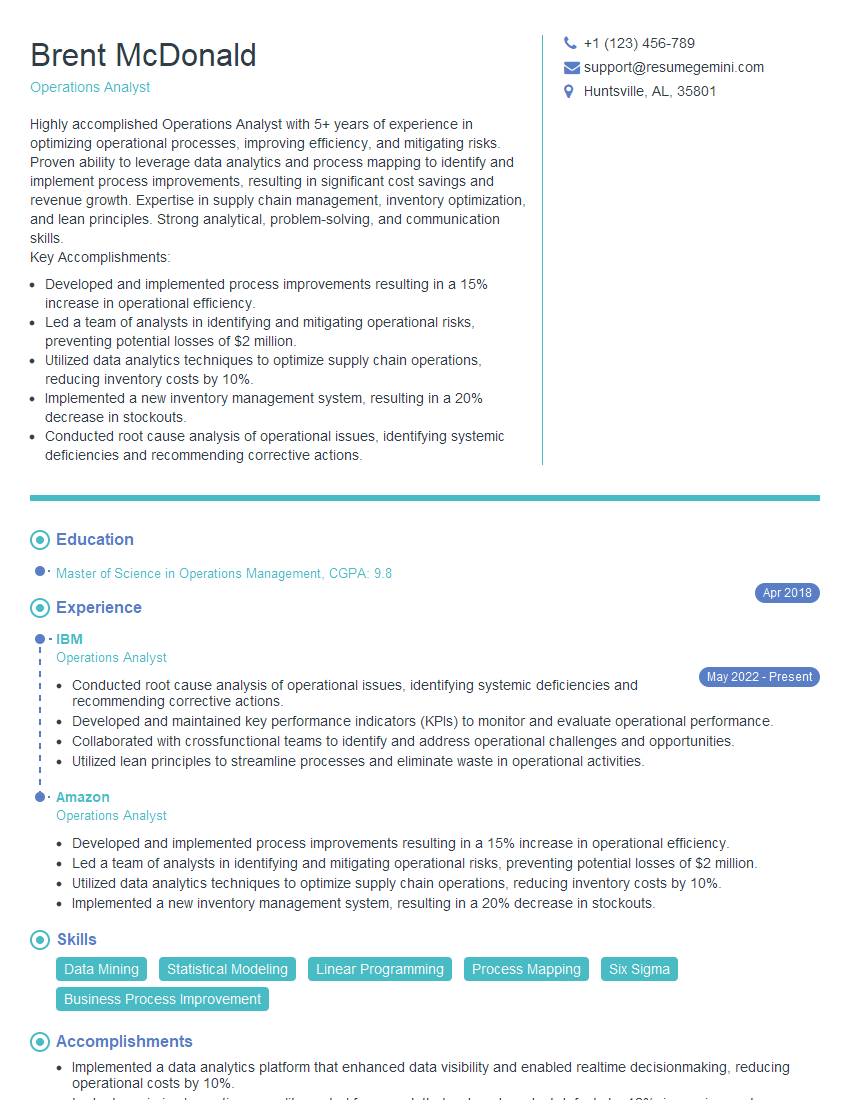
Mastering the skills of generating reports and preparing presentations is crucial for career advancement across numerous fields. These abilities demonstrate your analytical capabilities, communication skills, and problem-solving aptitude – highly valued attributes in today’s competitive job market. To maximize your job prospects, focus on building an ATS-friendly resume that clearly showcases your relevant experience and skills. ResumeGemini is a trusted resource to help you create a professional and impactful resume. We provide examples of resumes tailored to the “Generate reports and prepare presentations” skillset to guide you. Use these resources to craft a resume that effectively highlights your qualifications and helps you land your dream job.
Explore more articles
Users Rating of Our Blogs
Share Your Experience
We value your feedback! Please rate our content and share your thoughts (optional).
What Readers Say About Our Blog
To the interviewgemini.com Webmaster.
Very helpful and content specific questions to help prepare me for my interview!
Thank you
To the interviewgemini.com Webmaster.
This was kind of a unique content I found around the specialized skills. Very helpful questions and good detailed answers.
Very Helpful blog, thank you Interviewgemini team.
