Interviews are opportunities to demonstrate your expertise, and this guide is here to help you shine. Explore the essential Communicating Demographic Information interview questions that employers frequently ask, paired with strategies for crafting responses that set you apart from the competition.
Questions Asked in Communicating Demographic Information Interview
Q 1. Explain the importance of accurate data representation in communicating demographic information.
Accurate data representation in communicating demographic information is paramount because it forms the foundation of informed decision-making. Inaccurate or misleading data can lead to flawed policies, ineffective resource allocation, and societal inequities. Imagine, for example, a city planning its public transportation based on outdated census data – the result could be inadequate service in rapidly growing areas and wasted resources in less populated areas. Accurate representation ensures that decisions are based on reality, promoting fairness and efficiency.
Accuracy involves not just the data itself, but also how it’s presented. This includes clearly defining terms, acknowledging limitations in data collection (like sampling bias), and avoiding visual distortions that might misrepresent the information. For instance, using a misleading scale on a bar chart can exaggerate or minimize differences between demographic groups. Transparency about data sources and methodologies builds trust and allows for critical evaluation.
Q 2. Describe different methods for visualizing demographic data (e.g., charts, graphs, maps).
Visualizing demographic data effectively requires choosing the right method for the specific data and audience. Several powerful techniques are available:
- Charts: Bar charts are ideal for comparing categories (e.g., population by age group), while pie charts effectively show proportions (e.g., ethnic breakdown). Line charts are suitable for showing trends over time (e.g., population growth).
- Graphs: Scatter plots can reveal correlations between variables (e.g., income and education levels), and histograms show the distribution of a single variable (e.g., income distribution).
- Maps: Choropleth maps use color shading to represent data across geographic areas (e.g., poverty rates by county), while dot density maps use dots to show the concentration of a phenomenon (e.g., population distribution).
The choice of visualization depends heavily on the story you’re trying to tell. A choropleth map might be best for highlighting regional disparities, whereas a bar chart could be more suitable for comparing specific groups within a region. Using multiple visualizations in conjunction often provides a richer understanding.
Q 3. How do you tailor your communication style to different audiences when presenting demographic data?
Tailoring communication to different audiences is crucial for effective understanding and engagement. A technical audience, like fellow researchers, will appreciate detailed methodological explanations and complex statistical analyses. I would use precise terminology and present findings in a formal manner, perhaps including statistical significance levels.
Conversely, a non-technical audience, like community members, needs a simpler, more narrative-driven approach. I would avoid jargon, use clear and concise language, and rely on visually compelling charts and graphs to communicate key findings. Analogies and real-world examples can also enhance understanding. For example, instead of stating ‘the unemployment rate among young adults is statistically significant’, I might say ‘Many young people are struggling to find jobs, and this is a serious problem that needs attention’.
The key is to adapt the level of detail, vocabulary, and visual aids to the audience’s knowledge and interests, ensuring the message remains accurate and impactful.
Q 4. What are some common biases to watch out for when interpreting and presenting demographic data?
Several biases can creep into the interpretation and presentation of demographic data. It’s crucial to be vigilant and mitigate these risks:
- Confirmation bias: The tendency to interpret data in a way that confirms pre-existing beliefs. To counteract this, it’s essential to approach data analysis with an open mind and consider alternative explanations.
- Sampling bias: When the sample used doesn’t accurately represent the population. This necessitates careful consideration of sampling methods and acknowledging limitations of the data.
- Selection bias: When the selection of data points is not random, leading to a skewed representation. Rigorous data collection methods are essential to avoid this bias.
- Overgeneralization: Drawing broad conclusions based on limited data. It’s important to present findings with appropriate caveats and acknowledge areas where more research is needed.
Transparency is key. Clearly stating data limitations and potential biases builds credibility and allows the audience to critically evaluate the information.
Q 5. How do you identify the key takeaways from a complex dataset before presenting it?
Identifying key takeaways from a complex dataset involves a systematic approach:
- Exploratory Data Analysis (EDA): Begin by summarizing the data using descriptive statistics (mean, median, standard deviation, etc.) and visual exploration (histograms, scatter plots, etc.). This step helps identify patterns, outliers, and potential relationships.
- Hypothesis testing: If specific questions are being addressed, use statistical tests to determine if relationships are statistically significant.
- Focus on the ‘so what?’: Translate statistical findings into meaningful insights. What are the implications of these findings? How can they be used to inform decisions or address problems?
- Prioritize key findings: Based on the significance and impact of the findings, choose a few key takeaways to communicate. Avoid overwhelming the audience with too much detail.
For example, if analyzing income inequality, a key takeaway might be ‘The income gap between the wealthiest and poorest 20% has increased by X% over the past decade, indicating a need for policy interventions’. This statement summarizes a complex dataset into a concise, actionable insight.
Q 6. Describe a time you had to simplify complex demographic information for a non-technical audience.
During a community outreach program, I had to explain complex census data regarding population aging and its impact on healthcare services to a group of residents with diverse backgrounds and limited statistical knowledge. Instead of delving into demographic ratios and statistical significance, I focused on a relatable analogy: ‘Imagine our community as a family, and as we age, our family members need more care. The census data shows that the number of older adults in our community is growing, meaning we need more healthcare professionals and facilities to support them’.
I complemented this with simple visuals: a bar graph showing the projected growth of the older adult population and a map highlighting areas with the highest concentration of seniors. This approach made the data accessible and understandable, leading to a productive discussion about community needs and resource allocation.
Q 7. Explain your experience using data visualization software (e.g., Tableau, Power BI).
I have extensive experience using data visualization software such as Tableau and Power BI. These tools are invaluable for creating visually appealing and insightful representations of demographic data. In Tableau, I’m proficient in creating interactive dashboards, connecting to various data sources (e.g., SQL databases, CSV files), and using advanced features like calculated fields and custom maps. For example, I recently used Tableau to create a dashboard showing the distribution of different ethnic groups across a city’s neighborhoods, allowing users to interactively explore different demographic variables and identify potential disparities.
Similarly, I’ve utilized Power BI to develop reports and visualizations for presenting demographic trends to management and stakeholders. I’m comfortable creating various chart types, using DAX (Data Analysis Expressions) for data manipulation and calculations, and embedding the reports into business intelligence platforms. The ability to connect these tools to live data sources allows for dynamic updates and real-time monitoring of key demographic metrics.
Q 8. How do you ensure the ethical implications of communicating demographic data are considered?
Ethical considerations are paramount when communicating demographic data. We must avoid perpetuating stereotypes, biases, or discrimination. This involves careful selection of language, ensuring data is presented in context, and highlighting the diversity within demographic groups, not just averages. For example, instead of stating “Group X is less likely to graduate,” a more ethical approach might be “Factors such as socioeconomic status and access to resources are correlated with graduation rates in Group X. Further research is needed to understand the specific contributing factors.” We also need to prioritize data privacy and security, adhering to regulations like GDPR and CCPA, ensuring anonymity and avoiding the identification of individuals. Transparency is key – clearly stating data sources, methodologies, and limitations builds trust and accountability.
- Data Anonymization: Employing techniques to remove personally identifiable information from datasets.
- Contextualization: Presenting data within the appropriate social, economic, and historical context to prevent misinterpretations.
- Transparency: Openly disclosing data limitations and methodological choices.
Q 9. How do you handle conflicting or incomplete data when presenting demographic insights?
Conflicting or incomplete data is a common challenge. The first step is to identify the source of the conflict or incompleteness. Is it due to different data collection methods, sampling biases, or simply missing values? Once the source is identified, we can apply appropriate strategies. For missing data, we might use imputation techniques (replacing missing values with estimated ones) – but we must clearly state this in our communication. For conflicting data, we might conduct a sensitivity analysis to see how much the conflicting data influences the overall conclusions. Alternatively, we might present both sets of data alongside each other, highlighting the discrepancies and acknowledging the uncertainties. Crucially, we always acknowledge the limitations in the data and the potential impact on our analysis. Transparency is key to maintaining credibility.
- Data Imputation: Replacing missing values with reasonable estimates based on existing data.
- Sensitivity Analysis: Assessing the impact of variations in data on the overall analysis.
- Transparency in Limitations: Openly acknowledging limitations in data quality and its impact on interpretations.
Q 10. What metrics do you use to measure the effectiveness of your demographic communication?
Measuring the effectiveness of demographic communication is crucial. We use a combination of metrics, focusing on both the understanding and the impact of the communication. This might include:
- Audience Understanding: Pre- and post-communication surveys assessing knowledge and attitudes related to the demographic data presented. For example, measuring changes in understanding of disparities in access to healthcare.
- Information Recall: Testing audience recall of key statistics and insights shared.
- Behavioral Change: Observing whether the communication leads to changes in behavior or decision-making. For example, an increase in donations to a charity addressing inequalities highlighted in the data.
- Engagement Metrics: Tracking website traffic, social media interactions, and feedback on the communication (e.g., likes, comments, shares).
The specific metrics used depend on the communication’s goal and target audience. We always strive to assess whether the communication achieved its intended effect.
Q 11. Describe your approach to analyzing demographic trends and patterns.
Analyzing demographic trends involves a multi-step process. We begin by collecting relevant data from credible sources, such as census data, government reports, and academic research. Then, we employ various statistical methods like time series analysis (to identify trends over time), regression analysis (to understand relationships between variables), and spatial analysis (to visualize geographic patterns). Data visualization is a critical component; we use charts, graphs, and maps to present complex data in a clear and accessible manner. For instance, we might use a line graph to show population growth over time or a choropleth map to visualize income inequality across different regions. Finally, we interpret the findings in the context of existing literature and broader societal trends, generating insights that are both statistically sound and contextually relevant.
Q 12. Explain the difference between correlation and causation in demographic data analysis.
Correlation and causation are often confused but are distinct concepts. Correlation refers to a statistical relationship between two or more variables; if one variable changes, the other tends to change as well. However, correlation does not imply causation. Just because two variables are correlated doesn’t mean that one causes the other. There could be a third, unobserved variable influencing both. For example, ice cream sales and crime rates might be positively correlated (both increase in summer), but ice cream sales don’t cause crime. The underlying factor is the warmer weather. Establishing causation requires more rigorous methods, often involving controlled experiments or advanced statistical techniques to account for confounding variables. It’s essential to communicate this distinction clearly when presenting demographic insights, avoiding misleading interpretations.
Q 13. How do you identify and address potential inaccuracies in demographic data sources?
Identifying and addressing inaccuracies is critical. We begin by evaluating the credibility of our data sources. Are they reputable organizations with transparent methodologies? We check for inconsistencies within and across datasets, looking for outliers or anomalies that might indicate errors. We might cross-reference data with multiple sources to verify information. Metadata is also crucial – understanding how data was collected and processed helps identify potential biases or errors. If inaccuracies are identified, we need to investigate the source, and if possible, correct them. If correction is not possible, we must acknowledge the limitations and potential impact on the analysis.
- Source Validation: Assessing the reputation and methodological rigor of data sources.
- Data Consistency Checks: Identifying inconsistencies and outliers within datasets.
- Cross-referencing: Comparing data from multiple sources to validate information.
- Metadata Review: Examining the details of data collection and processing methods.
Q 14. How do you incorporate demographic data into strategic planning and decision-making?
Demographic data is integral to strategic planning and decision-making across various sectors. For instance, in urban planning, demographic data on population density, age distribution, and income levels helps inform decisions about infrastructure development, resource allocation, and service provision. In marketing, demographic data guides targeted advertising campaigns, product development, and market segmentation. In healthcare, understanding the demographic distribution of diseases helps allocate resources effectively and design targeted public health interventions. We help organizations understand their target populations, anticipate future needs, and make data-driven decisions that address social and economic disparities. We create reports, dashboards, and visualizations to communicate key demographic insights, facilitating informed decision-making across different departments and levels within an organization.
Q 15. What are some effective strategies for communicating demographic information to stakeholders?
Communicating demographic information effectively requires understanding your audience and tailoring your message accordingly. This involves choosing the right format, visual aids, and language to ensure clarity and impact. Key strategies include:
- Visualizations: Charts, graphs, and maps are crucial for presenting complex data in an easily digestible format. For example, a choropleth map could show variations in population density across a region.
- Storytelling: Weaving data into a compelling narrative helps stakeholders connect with the information on an emotional level. Instead of simply stating statistics, highlight the human stories behind the numbers.
- Targeted Communication: Tailor your communication to the specific needs and interests of your audience. A presentation to government officials will differ greatly from a report for community leaders.
- Interactive Dashboards: For dynamic data exploration, interactive dashboards allow stakeholders to delve deeper into specific aspects of the data set at their own pace.
- Plain Language: Avoid jargon and technical terms. Use clear, concise language that everyone can understand.
For instance, when presenting unemployment rates, you might compare them to historical trends and discuss the impact on specific communities, rather than just presenting raw percentages.
Career Expert Tips:
- Ace those interviews! Prepare effectively by reviewing the Top 50 Most Common Interview Questions on ResumeGemini.
- Navigate your job search with confidence! Explore a wide range of Career Tips on ResumeGemini. Learn about common challenges and recommendations to overcome them.
- Craft the perfect resume! Master the Art of Resume Writing with ResumeGemini’s guide. Showcase your unique qualifications and achievements effectively.
- Don’t miss out on holiday savings! Build your dream resume with ResumeGemini’s ATS optimized templates.
Q 16. Describe your process for translating raw data into compelling narratives.
My process for translating raw data into compelling narratives involves several key steps:
- Data Exploration and Cleaning: I begin by thoroughly examining the raw data to identify patterns, outliers, and inconsistencies. This often involves data cleaning and manipulation to ensure accuracy and consistency.
- Identifying Key Trends and Insights: I look for significant trends and patterns within the data that answer the questions driving the analysis. This may involve statistical analysis and data mining techniques.
- Developing a Narrative Framework: Once key insights are identified, I develop a narrative structure that organizes the information logically and engagingly. This involves outlining the main points and deciding on the order of presentation.
- Visualizing the Data: Appropriate charts, graphs, and maps are selected to visually represent the key trends and insights identified. This helps simplify complex information.
- Crafting the Narrative: I write the narrative, weaving together the data visualizations and findings into a cohesive and compelling story. The goal is to create a clear and memorable message that resonates with the audience.
- Iterative Refinement: I review and refine the narrative based on feedback and testing, ensuring clarity, accuracy, and impact.
For example, if analyzing census data showing a shift in age demographics, I would build a narrative around the implications of this shift for healthcare, education, and the economy, using charts and graphs to illustrate the changes.
Q 17. How familiar are you with different demographic data sources (e.g., census data, surveys)?
I’m highly familiar with a wide range of demographic data sources, including:
- Census Data: I have extensive experience working with data from national and international census bureaus, leveraging information on population size, age, gender, ethnicity, income, education, and housing.
- Surveys: I’m proficient in analyzing data from various survey methodologies, including household surveys, opinion polls, and market research studies. I understand the importance of sampling techniques and potential biases.
- Administrative Data: I’m also experienced in working with administrative records like hospital discharge data, school enrollment figures, and government benefit records to gain a more comprehensive understanding of population characteristics.
- Commercial Data Providers: I am familiar with various commercial data providers that offer detailed demographic data at various geographic levels, often integrating these with other data sources for richer analyses.
Understanding the strengths and limitations of each source is crucial for conducting robust and reliable analyses.
Q 18. How do you choose the appropriate data visualization method for a specific demographic dataset?
Choosing the right data visualization method depends heavily on the specific demographic dataset and the message you’re trying to convey. The goal is always clarity and impact. Here’s my approach:
- Data Type: The type of data (e.g., categorical, numerical, temporal) dictates the appropriate chart type. For example, a bar chart is ideal for comparing categories, while a line graph shows trends over time.
- Key Message: What is the main point you want to emphasize? Different chart types are better suited to highlight specific aspects of the data.
- Audience: Consider your audience’s level of statistical literacy. Simple and intuitive visualizations are generally preferred.
- Data Complexity: For very complex datasets, interactive dashboards might be the best option, allowing users to explore the data at their own pace.
For instance, to show the age distribution of a population, a histogram would be appropriate. To compare income levels across different ethnic groups, a grouped bar chart would be effective. If illustrating changes in population size over time, a line graph would be ideal.
Q 19. Describe your experience working with large and complex demographic datasets.
I have extensive experience working with large and complex demographic datasets, often involving millions of data points. My approach involves:
- Data Management Techniques: I utilize databases and data management software (e.g., SQL, R, Python) to efficiently store, process, and analyze large datasets.
- Statistical Software: I’m proficient in statistical software packages such as R and SPSS, enabling me to conduct advanced statistical analyses on large datasets.
- Data Sampling and Aggregation: When dealing with extremely large datasets, I employ techniques such as data sampling and aggregation to make analysis more manageable without sacrificing accuracy.
- High-Performance Computing (HPC): For particularly large and computationally intensive tasks, I leverage high-performance computing resources to speed up the processing time.
For example, I’ve worked on projects involving analyzing national census data to identify geographic areas with high social vulnerability, requiring efficient data manipulation and statistical modeling techniques.
Q 20. How do you maintain data confidentiality when communicating demographic information?
Maintaining data confidentiality is paramount when working with demographic information. My approach includes:
- Data Anonymization: I utilize techniques to remove or mask personally identifiable information (PII), such as names, addresses, and social security numbers, ensuring individuals cannot be identified.
- Data Aggregation: Aggregating data at higher levels (e.g., reporting at the county level instead of the individual level) reduces the risk of re-identification.
- Secure Data Storage and Access Control: I follow strict protocols for secure data storage, access control, and data encryption to prevent unauthorized access or disclosure.
- Compliance with Regulations: I adhere to all relevant data privacy regulations, such as HIPAA and GDPR, ensuring compliance with legal and ethical guidelines.
I always prioritize responsible data handling and prioritize protecting the privacy of individuals while ensuring the data’s valuable insights are accessible for legitimate purposes.
Q 21. How do you use demographic information to inform marketing or communications strategies?
Demographic information is invaluable for informing and refining marketing and communication strategies. It allows for targeted messaging and resource allocation. Here’s how I use it:
- Market Segmentation: I use demographic data to segment markets into distinct groups with shared characteristics (age, income, location, etc.), enabling customized messaging for each segment.
- Campaign Targeting: I identify the most promising audiences for marketing campaigns based on demographic profiles, maximizing the return on investment.
- Product Development: Demographic trends inform product development decisions, ensuring products and services meet the needs of target groups.
- Message Crafting: Demographic insights influence the language, tone, and channels used for communications, ensuring effective messaging.
- Media Planning: Demographic data helps determine the most effective media channels to reach target audiences, optimizing media buying decisions.
For instance, a campaign promoting senior healthcare services would focus on television advertisements during programming popular with older demographics, while a campaign for a new video game might target online advertising channels frequented by younger demographics.
Q 22. How do you explain statistical concepts related to demographics to a non-statistical audience?
Explaining statistical concepts to a non-statistical audience requires translating complex jargon into plain language. Instead of using terms like ‘standard deviation’ or ‘regression analysis,’ I focus on the underlying meaning and implications. For example, instead of saying ‘the population has a high standard deviation in age,’ I’d say ‘the age range of the population is quite broad, with a significant number of both young and older people.’ I use visuals like charts and graphs extensively, focusing on clear and concise labels. I often use analogies to relate abstract concepts to everyday experiences. For instance, to explain percentiles, I might compare them to ranking in a race: the 90th percentile is like being among the top 10% of finishers. I also keep the language simple, avoiding technical terminology unless absolutely necessary and explaining it thoroughly when used.
For instance, if discussing population growth rates, I might explain it as: ‘Imagine a town with 100 people. If the growth rate is 2%, next year the town will have approximately 102 people.’ This simple example illustrates the concept without resorting to complex formulas.
Q 23. What are some common pitfalls to avoid when communicating demographic data?
Common pitfalls in communicating demographic data include: Overgeneralization – assuming all members of a demographic group share the same characteristics; Misleading visuals – using charts or graphs that distort the data to support a specific narrative; Ignoring context – presenting data without considering relevant factors like time period, geographic location, or socioeconomic status; Causation vs. correlation – assuming that a correlation between two demographic variables implies a causal relationship; Lack of transparency – not clearly explaining data sources, methodology, or limitations; and finally Ignoring data nuances – focusing only on headline numbers and neglecting important subtleties and variations within the data itself.
For example, simply stating ‘Millennials prefer online shopping’ without specifying age ranges within the millennial cohort or considering income levels paints an incomplete and potentially misleading picture.
Q 24. How do you stay updated on current trends and best practices in communicating demographic information?
Staying updated requires a multi-pronged approach. I regularly read publications from reputable sources like the Pew Research Center, the U.S. Census Bureau, and academic journals focusing on demography and data visualization. I actively participate in professional networks and attend conferences related to data analysis and communication. This allows me to network with experts and learn about the latest methodologies and best practices. I also subscribe to relevant newsletters and podcasts covering demographic trends and data visualization techniques. Finally, I continuously engage with online resources and tutorials to keep my skills sharp in using the latest data analysis and visualization software.
Q 25. Describe a situation where you had to defend your interpretation of demographic data.
In a previous project, I analyzed data on housing affordability in a specific city. My interpretation showed a significant disparity between the housing costs and the average income of certain demographic groups. This contradicted the prevailing narrative that the city had a vibrant and inclusive housing market. I had to defend my findings by presenting a detailed breakdown of my methodology, including the data sources, statistical analyses, and visualizations used to support my conclusions. I demonstrated that my results were robust and statistically significant. I also carefully addressed potential confounding factors that could have influenced the data. Ultimately, my detailed explanation and evidence-based arguments convinced stakeholders to acknowledge the housing affordability challenges facing these specific demographic groups.
Q 26. How would you communicate the uncertainty or limitations of demographic data to an audience?
Communicating uncertainty is crucial for maintaining transparency and credibility. I always acknowledge the limitations of the data by stating the margin of error, sample size, and potential biases. For example, if a survey has a 5% margin of error, I’ll explain that the actual value could be 5% higher or lower than the reported number. I use clear and concise language to describe the uncertainty, avoiding technical jargon. I might also visually represent uncertainty using error bars on charts or confidence intervals in tables. It’s important to emphasize that data doesn’t provide definitive answers but rather insights that help us understand complex issues. I focus on explaining how the uncertainty affects the interpretation and conclusions, encouraging critical thinking rather than blind acceptance.
Q 27. How do you present demographic information in a way that is both accurate and engaging?
Accuracy and engagement go hand-in-hand. I begin by focusing on the most important aspects of the data, using clear and concise language to explain complex trends. I always prioritize using visuals to make the data easier to understand, choosing appropriate chart types (e.g., bar charts for comparisons, line charts for trends, maps for geographical data). I use storytelling techniques to present data in a narrative form, helping the audience connect with the information on an emotional level. This involves using compelling visuals, relatable examples, and concise summaries. Interactive elements, like dashboards or online tools, can make data exploration more engaging. Finally, tailoring the level of detail and complexity to the audience’s prior knowledge is crucial.
Q 28. How do you adapt your communication style depending on the context and purpose of the communication?
Adapting communication style depends heavily on the audience and the purpose. For a technical audience, I can delve deeper into statistical methods and present more detailed data. For a non-technical audience, I would focus on the bigger picture, using simpler language and compelling visuals. The purpose also dictates the style. A presentation for a board meeting requires a different approach than a blog post aimed at the general public. For example, a board meeting presentation needs to be concise, data-rich, and focused on actionable insights, while a blog post might use a more narrative and engaging style. In all cases, clarity and accuracy remain paramount.
Key Topics to Learn for Communicating Demographic Information Interview
- Data Privacy and Ethical Considerations: Understanding legal frameworks and ethical guidelines surrounding the collection, use, and disclosure of demographic data. This includes exploring potential biases and ensuring responsible data handling practices.
- Data Visualization and Presentation: Mastering techniques to effectively communicate demographic trends and insights using charts, graphs, and other visual aids. This involves choosing appropriate visualizations for different datasets and audiences.
- Interpreting and Analyzing Demographic Data: Developing skills to identify patterns, trends, and anomalies within demographic datasets. This includes understanding statistical concepts relevant to demographic analysis.
- Communicating Complex Information Clearly: Practicing the ability to translate complex demographic data into concise, understandable narratives for diverse audiences, including those without a statistical background.
- Addressing Bias and Ensuring Inclusivity: Recognizing and mitigating potential biases in data collection and interpretation. This includes understanding how to present demographic information in a way that is inclusive and avoids perpetuating stereotypes.
- Problem-Solving with Demographic Data: Applying demographic insights to solve real-world problems, such as identifying underserved populations or predicting future trends. This involves using data to support strategic decision-making.
- Data Storytelling: Crafting compelling narratives around demographic data to effectively convey meaning and insights. This focuses on creating a clear and engaging message that resonates with your audience.
Next Steps
Mastering the art of communicating demographic information is crucial for career advancement in many fields. Your ability to effectively analyze, interpret, and present this data will significantly impact your contributions and career trajectory. Creating an ATS-friendly resume is paramount to increasing your job prospects. ResumeGemini can be a valuable tool in this process, helping you craft a professional and impactful resume that highlights your relevant skills and experience. Examples of resumes tailored to Communicating Demographic Information are available to help you build yours. This is your chance to showcase your expertise and unlock exciting opportunities.

Communications Director Resume Sample

Communications Manager Resume Sample
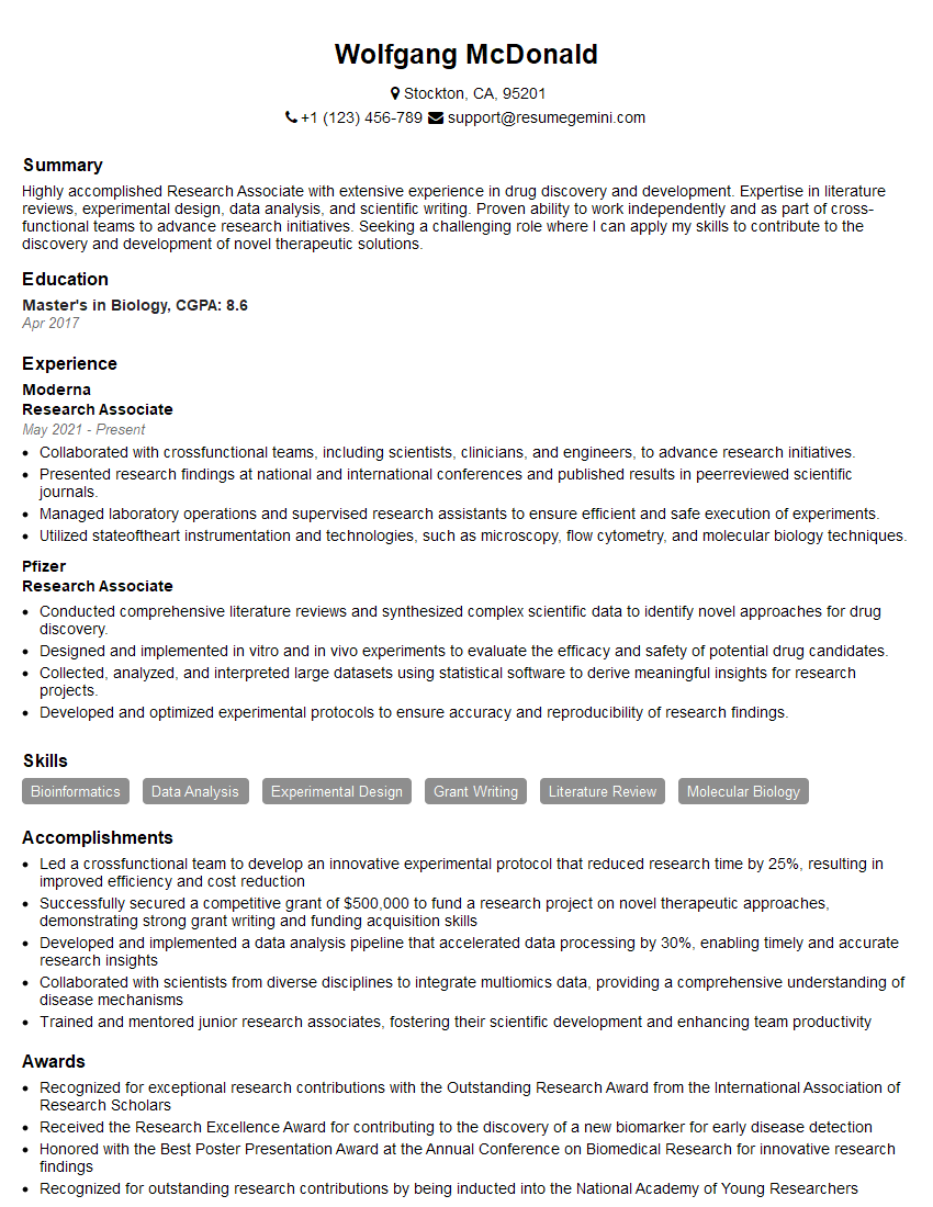
Research Associate Resume Sample
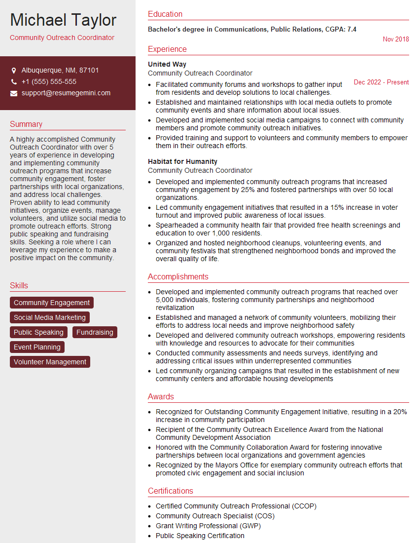
Community Outreach Coordinator Resume Sample
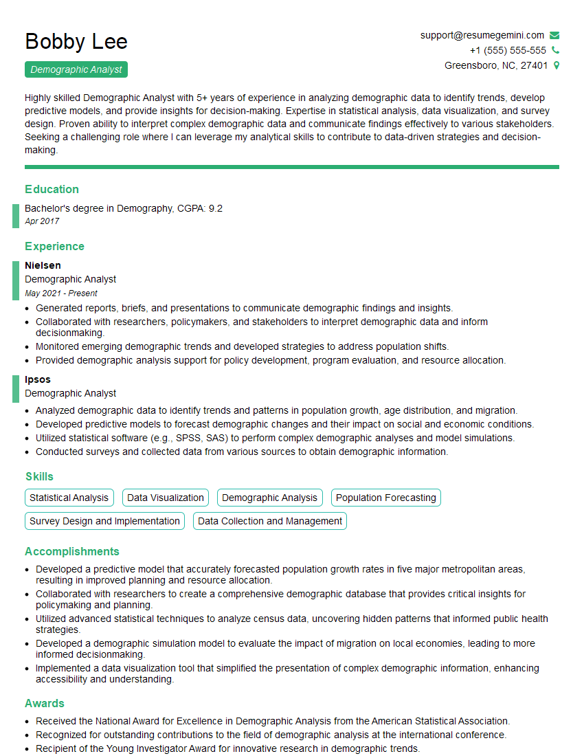
Demographic Analyst Resume Sample
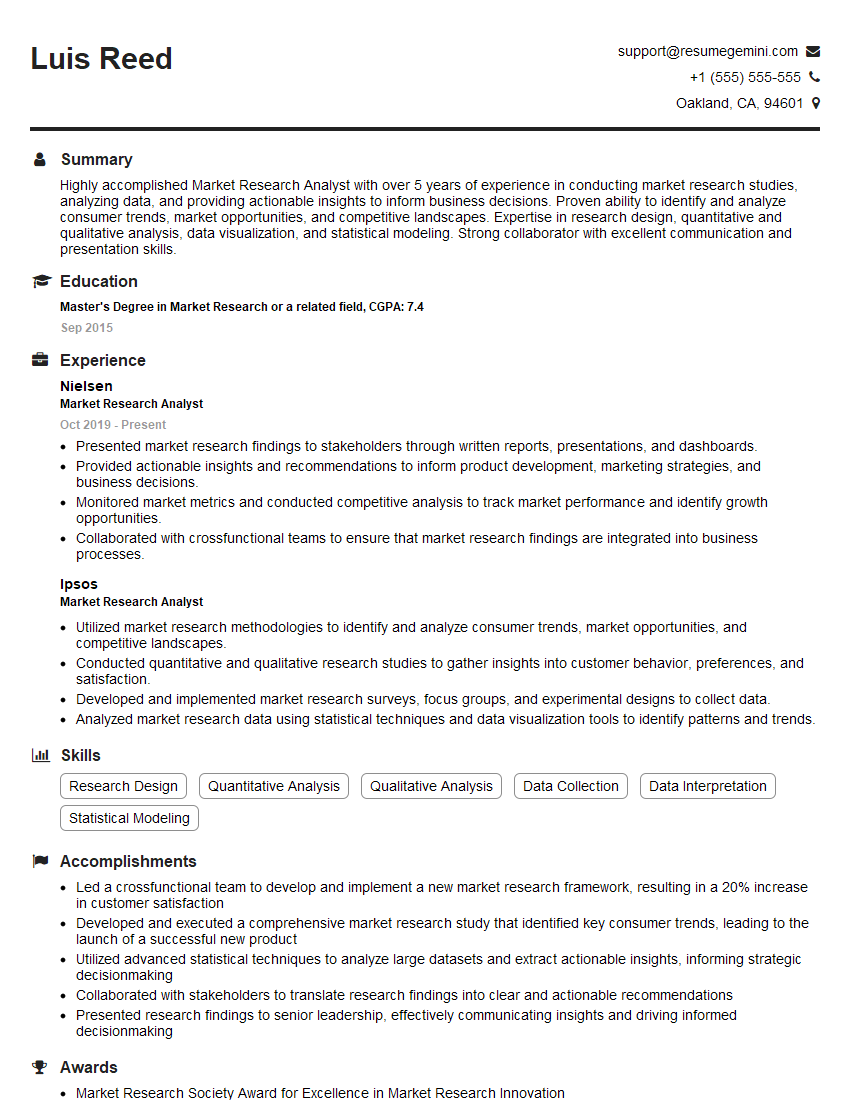
Market Research Analyst Resume Sample

Social Media Manager Resume Sample
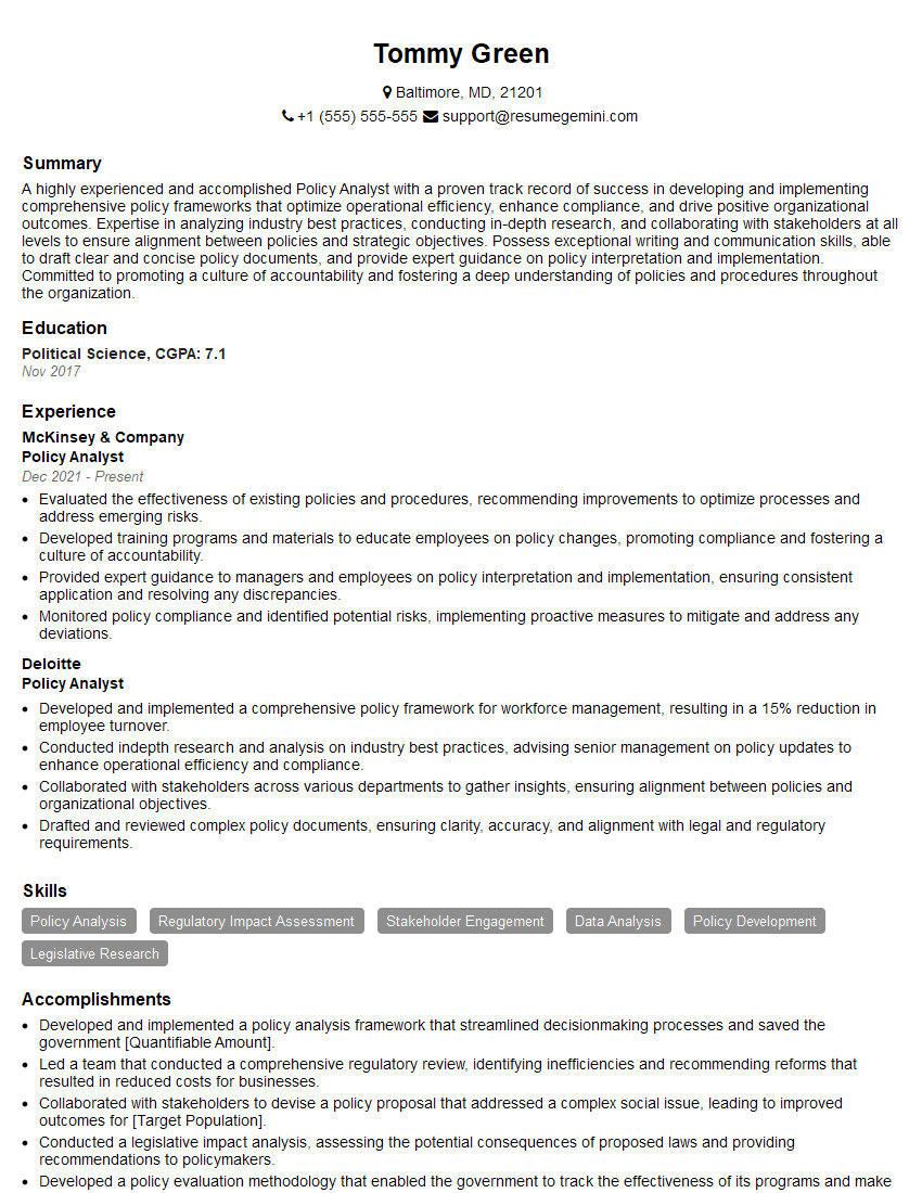
Policy Analyst Resume Sample
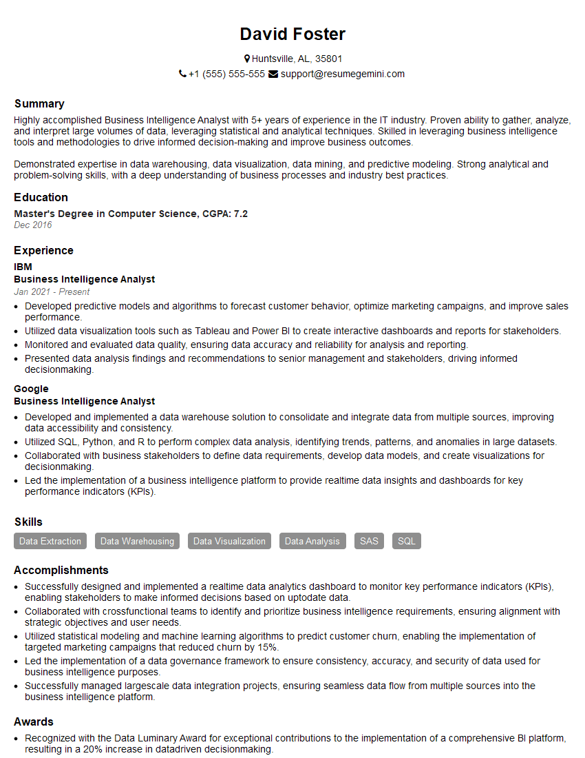
Business Intelligence Analyst Resume Sample

Content Strategist Resume Sample

Statistical Analyst Resume Sample
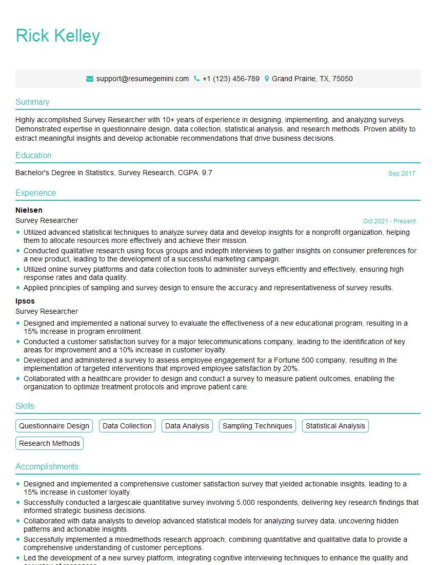
Survey Researcher Resume Sample
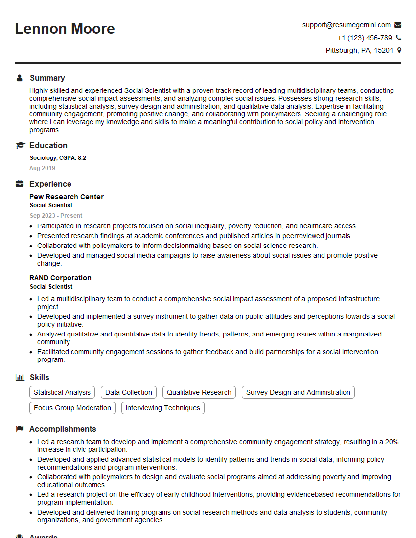
Social Scientist Resume Sample
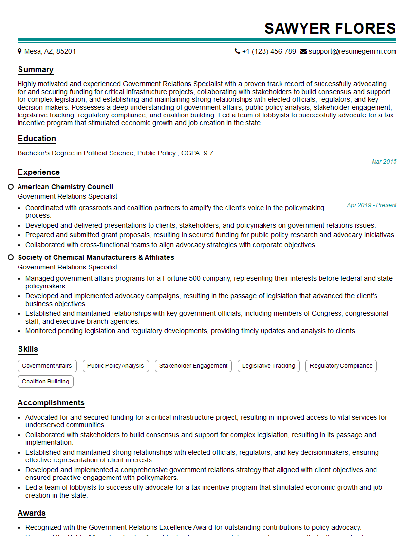
Government Relations Specialist Resume Sample
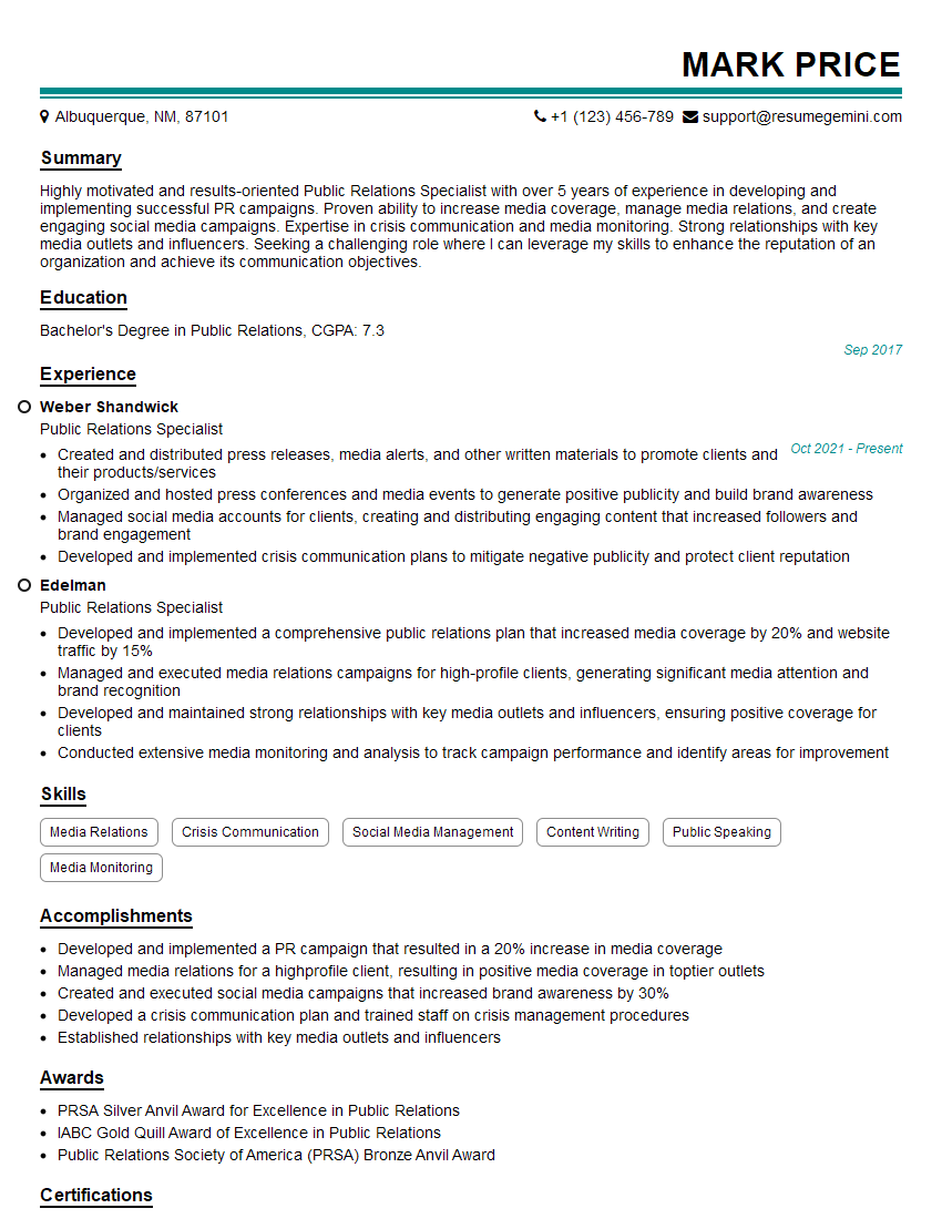
Public Relations Specialist Resume Sample
- Communications Director
- Communications Manager
- Research Associate
- Community Outreach Coordinator
- Demographic Analyst
- Market Research Analyst
- Social Media Manager
- Policy Analyst
- Business Intelligence Analyst
- Content Strategist
- Statistical Analyst
- Survey Researcher
- Social Scientist
- Government Relations Specialist
- Public Relations Specialist
Explore more articles
Users Rating of Our Blogs
Share Your Experience
We value your feedback! Please rate our content and share your thoughts (optional).
What Readers Say About Our Blog
To the interviewgemini.com Webmaster.
Very helpful and content specific questions to help prepare me for my interview!
Thank you
To the interviewgemini.com Webmaster.
This was kind of a unique content I found around the specialized skills. Very helpful questions and good detailed answers.
Very Helpful blog, thank you Interviewgemini team.