Preparation is the key to success in any interview. In this post, we’ll explore crucial Data Analysis and Visualization (Python, R) interview questions and equip you with strategies to craft impactful answers. Whether you’re a beginner or a pro, these tips will elevate your preparation.
Questions Asked in Data Analysis and Visualization (Python, R) Interview
Q 1. Explain the difference between exploratory data analysis (EDA) and confirmatory data analysis (CDA).
Exploratory Data Analysis (EDA) and Confirmatory Data Analysis (CDA) are two crucial stages in the data analysis process, but they serve very different purposes. Think of EDA as the detective work – you’re exploring the data, looking for patterns, and formulating hypotheses. CDA, on the other hand, is the courtroom – you’re rigorously testing the hypotheses generated during EDA using statistical methods.
EDA is primarily qualitative. It involves summarizing the main characteristics of the data, identifying potential relationships between variables, and detecting anomalies or outliers. It’s an iterative process, often involving visualization techniques to gain insights and guide further analysis. For example, you might create histograms to understand the distribution of a variable or scatter plots to see the correlation between two variables. The goal is not to draw definitive conclusions, but rather to understand the data’s structure and generate hypotheses.
CDA, in contrast, is quantitative and hypothesis-driven. You begin with a specific hypothesis and use statistical tests to determine if the data supports or refutes it. This involves using formal statistical methods to quantify the evidence, calculate probabilities, and control for various sources of error. For example, you might perform a t-test to compare the means of two groups or a regression analysis to model the relationship between variables. The outcome is a statistically-based conclusion about the hypothesis.
In short: EDA is about discovery, while CDA is about verification.
Q 2. What are some common data visualization libraries in Python and R?
Python and R both offer a rich ecosystem of libraries for data visualization. Here are some popular choices:
- Python:
matplotlib: A foundational library providing a wide range of plotting capabilities, from basic plots to more complex visualizations. It’s highly customizable but can be a bit verbose for simpler plots.seaborn: Built on top ofmatplotlib,seabornoffers a higher-level interface with statistically informative plots and aesthetically pleasing defaults. It simplifies the creation of common visualization types.plotly: Creates interactive plots that are easily embedded in web applications or dashboards. Ideal for exploring data dynamically and sharing insights online.bokeh: Similar toplotly,bokehis excellent for creating interactive visualizations, especially for large datasets.- R:
ggplot2: A powerful and elegant system for creating grammatically correct visualizations. It follows a layered approach, allowing you to build up complex plots from simpler components. It is very popular in the R community for its flexibility and aesthetics.lattice: Provides functions for creating trellis graphics, which are useful for visualizing data across different subsets or groups.plotly: Also available in R,plotlyoffers the same interactive capabilities as its Python counterpart.
The choice of library often depends on the specific needs of the project and the user’s familiarity with the tools. For example, I frequently use seaborn in Python for its ease of use and attractive output, while in R, I often rely on ggplot2 for its flexibility and publication-quality graphics.
Q 3. Describe your experience with data cleaning and preprocessing techniques.
Data cleaning and preprocessing are critical steps that significantly impact the quality and reliability of your analysis. My experience encompasses a broad range of techniques, including:
- Handling Missing Data: Employing imputation methods (e.g., mean/median imputation, k-Nearest Neighbors imputation), or removing rows/columns with excessive missing values, depending on the context and the nature of the missingness.
- Outlier Detection and Treatment: Identifying outliers using box plots, scatter plots, and statistical methods like the Z-score or Interquartile Range (IQR). Depending on the analysis, I might remove outliers, transform the data (e.g., using logarithmic transformations), or use robust statistical methods less sensitive to outliers.
- Data Transformation: Applying transformations like standardization (Z-score normalization) or min-max scaling to ensure features have comparable scales, which is particularly important for algorithms sensitive to feature scaling (e.g., k-means clustering, Support Vector Machines).
- Feature Engineering: Creating new features from existing ones to improve model performance. This might involve creating interaction terms, polynomial features, or deriving features from dates or categorical variables.
- Data Type Conversion: Converting data types to ensure consistency and compatibility with analysis methods. For example, converting string dates to datetime objects or categorical variables to numerical representations using one-hot encoding or label encoding.
- Data Consistency Checks: Verifying data consistency across different sources, ensuring that values are within acceptable ranges, and resolving discrepancies.
For instance, in a recent project analyzing customer churn, I had to deal with missing values in customer demographics. Instead of simply removing rows with missing values, I used k-Nearest Neighbors imputation to fill in the missing values based on similar customers. This preserved more data and improved the accuracy of my churn prediction model.
Q 4. How do you handle missing data in a dataset?
Missing data is a common challenge in data analysis. The best approach depends on the nature of the missing data (Missing Completely at Random (MCAR), Missing at Random (MAR), Missing Not at Random (MNAR)), the percentage of missing data, and the analysis goals.
Here are some common techniques:
- Deletion: Simple but can lead to information loss. Listwise deletion (removing entire rows with missing values) is straightforward but can bias results if missingness is not MCAR. Pairwise deletion (using available data for each analysis) can lead to inconsistencies.
- Imputation: Replacing missing values with estimated values. Methods include:
- Mean/Median/Mode Imputation: Simple but can distort the distribution, especially for skewed data.
- Regression Imputation: Predicting missing values based on other variables using regression models.
- K-Nearest Neighbors (KNN) Imputation: Replacing missing values based on the values of similar data points.
- Multiple Imputation: Creating multiple plausible imputed datasets and combining the results to account for uncertainty in the imputation.
- Model-Based Approaches: Some machine learning models (e.g., XGBoost, random forests) can handle missing data directly without requiring pre-processing.
The choice of method depends heavily on the context. For example, if the missing data is MCAR and a small percentage of the data is missing, simple imputation methods (like mean imputation) might suffice. However, if the data is MAR or MNAR and a significant portion is missing, more sophisticated techniques like multiple imputation or model-based approaches are preferred. Always document your approach to missing data handling.
Q 5. What are the different types of data visualizations and when would you use each?
Data visualization techniques are varied and the best choice depends on the type of data and the insights you are trying to convey.
- Histograms and Density Plots: Show the distribution of a single continuous variable. Histograms use bins to group data, while density plots provide a smoother representation.
- Scatter Plots: Show the relationship between two continuous variables. Useful for identifying correlations and patterns.
- Bar Charts: Compare the values of categorical variables. Useful for showing frequencies or proportions.
- Box Plots: Show the distribution of a continuous variable across different categories. Useful for comparing medians, quartiles, and identifying outliers.
- Line Charts: Show changes in a continuous variable over time or another continuous variable. Excellent for displaying trends.
- Heatmaps: Visualize correlations or other relationships between variables using color intensity. Great for exploring relationships in large datasets.
- Pie Charts: Show proportions of a whole. Best used for a limited number of categories.
- Treemaps: Hierarchical representation showing proportions using nested rectangles.
For example, to show the distribution of customer ages, I would use a histogram. To show the relationship between customer age and spending, I would use a scatter plot. To compare sales across different regions, I would use a bar chart. The key is to choose the visualization that best communicates your findings clearly and effectively.
Q 6. Explain the concept of outliers and how you would identify and handle them.
Outliers are data points that significantly deviate from the rest of the data. They can be caused by errors in data entry, measurement errors, or simply represent truly unusual observations. Identifying and handling them is crucial because outliers can unduly influence statistical analyses and machine learning models.
Identification:
- Visual Inspection: Box plots, scatter plots, and histograms can visually highlight outliers.
- Statistical Methods:
- Z-score: Measures how many standard deviations a data point is from the mean. Points with a Z-score above a certain threshold (e.g., 3) are often considered outliers.
- Interquartile Range (IQR): The difference between the 75th and 25th percentiles. Points outside 1.5 * IQR below the first quartile or above the third quartile are often flagged as outliers.
Handling:
- Removal: Remove outliers if they are clearly due to errors or if they significantly distort the analysis. However, this should be done cautiously and with justification.
- Transformation: Apply transformations like logarithmic or square root transformations to reduce the influence of outliers.
- Winsorization or Trimming: Cap extreme values at a certain percentile or remove a certain percentage of extreme values.
- Robust Statistical Methods: Use statistical methods less sensitive to outliers, such as median instead of mean, or robust regression techniques.
In a real-world example, I encountered outliers in a dataset of house prices. After investigating, I found some were due to data entry errors. I corrected the errors where possible and removed the remaining outliers that couldn’t be explained, documenting this process thoroughly in my analysis.
Q 7. What are some common statistical methods used in data analysis?
Many statistical methods are used in data analysis, depending on the research question and data type. Here are some common ones:
- Descriptive Statistics: Summarizing data using measures like mean, median, mode, standard deviation, variance, and percentiles. Essential for understanding the basic characteristics of the data.
- Inferential Statistics: Making inferences about a population based on a sample. Methods include:
- Hypothesis Testing: Formally testing hypotheses about population parameters (e.g., t-tests, ANOVA, chi-squared tests).
- Confidence Intervals: Estimating the range within which a population parameter is likely to fall.
- Regression Analysis: Modeling the relationship between a dependent variable and one or more independent variables (linear regression, logistic regression, polynomial regression).
- Correlation Analysis: Measuring the strength and direction of the linear relationship between two variables (Pearson correlation, Spearman correlation).
- Clustering Analysis: Grouping similar data points together (k-means clustering, hierarchical clustering).
- Principal Component Analysis (PCA): Reducing the dimensionality of data by identifying principal components that capture most of the variance.
For example, in a study of the relationship between advertising spending and sales, I used linear regression to model the relationship and hypothesis testing to determine the statistical significance of the relationship. In another project involving customer segmentation, I used k-means clustering to group customers based on their purchasing behavior.
Q 8. Describe your experience with regression analysis (linear, logistic, etc.).
Regression analysis is a powerful statistical method used to model the relationship between a dependent variable and one or more independent variables. I have extensive experience with various regression techniques, including linear, logistic, and polynomial regression.
Linear Regression is used when the dependent variable is continuous and the relationship with the independent variables is linear. For example, I used linear regression to predict house prices based on features like size, location, and number of bedrooms. The model produces a line of best fit, allowing us to estimate the price for a new house given its characteristics. In Python, I typically use the scikit-learn library’s LinearRegression model.
Logistic Regression is employed when the dependent variable is categorical (usually binary, like 0 or 1). It predicts the probability of an event occurring. I’ve applied this to classify customer churn, predicting whether a customer will cancel their subscription based on their usage patterns and demographics. The output is a probability score, which can be thresholded to classify the customer as churning or not churning. Again, scikit-learn provides a convenient implementation.
Beyond these, I’m also proficient in other regression techniques like polynomial regression (for non-linear relationships) and regularized regression (like Ridge and Lasso) to handle multicollinearity and prevent overfitting. My experience includes model selection, evaluation (using metrics like R-squared, RMSE, AUC), and interpreting the results in a meaningful way.
Q 9. Explain the difference between correlation and causation.
Correlation and causation are often confused, but they represent distinct concepts. Correlation simply indicates a statistical relationship between two variables – they tend to change together. A positive correlation means that as one variable increases, the other tends to increase as well. A negative correlation means that as one variable increases, the other tends to decrease. However, correlation does not imply causation.
Causation means that one variable directly influences or causes a change in another variable. Establishing causation requires more rigorous evidence, often through controlled experiments or carefully designed observational studies.
For example, ice cream sales and crime rates might be positively correlated: both tend to be higher during summer months. However, this doesn’t mean that eating ice cream causes crime. Both are likely influenced by a third factor, like warm weather. This third factor is called a confounding variable.
Q 10. How would you explain a complex data analysis result to a non-technical audience?
Explaining complex data analysis results to a non-technical audience requires a clear, concise, and engaging approach. I avoid jargon and technical terms whenever possible, instead focusing on the story the data tells. I would typically:
- Start with the big picture: What was the main objective of the analysis? What was the key question we were trying to answer?
- Use clear, simple language: Avoid statistical jargon. Use analogies or metaphors to explain complex concepts. For example, instead of saying “the p-value was less than 0.05”, I might say “the results were statistically significant, meaning the observed effect was unlikely due to chance.”
- Focus on the key findings: Highlight the most important results and their implications. Don’t overwhelm the audience with excessive detail.
- Use visuals: Charts, graphs, and other visuals can help to communicate complex information more effectively. Keep them simple and easy to understand.
- Tell a story: Frame the results in a narrative that is easy to follow. The goal is not just to present the numbers, but to communicate the insights they reveal.
- Address potential limitations: Acknowledge any limitations of the analysis, such as sample size or potential biases. Transparency builds trust.
For example, if analyzing customer satisfaction, instead of presenting a regression equation, I would say something like: “We found that customers who regularly use our mobile app tend to report higher satisfaction levels.”
Q 11. What are your preferred methods for data storytelling?
My preferred methods for data storytelling involve a combination of clear visualization, compelling narratives, and interactive elements. I believe in crafting a story that engages the audience from beginning to end, ensuring the key takeaways are memorable and actionable.
- Visualizations: I leverage a variety of charts and graphs (like interactive dashboards using tools such as Tableau or Plotly) to present the data in a digestible format, choosing the most appropriate visual for the specific data and message.
- Narrative: I structure my presentations with a clear beginning, middle, and end. The beginning sets the context, the middle presents the key findings, and the end summarizes the conclusions and implications. I ensure the narrative is cohesive and easy to follow.
- Interactive Elements: Where appropriate, I use interactive tools to allow the audience to explore the data themselves. This fosters deeper engagement and understanding.
- Data Tables: For detailed information, well-formatted tables are used to support the visual elements and the narrative, providing concrete evidence.
I believe in tailoring my storytelling to the specific audience, understanding their level of technical expertise and their needs. For example, a presentation for executives will focus on high-level insights and implications, while a presentation for a data science team might include more technical details.
Q 12. What is the difference between a bar chart and a histogram?
Both bar charts and histograms are used to display the frequency distribution of categorical or numerical data, but they differ in their application and how they represent the data.
A bar chart displays the frequency of distinct categories. The x-axis represents the categories, and the y-axis represents their frequencies. There are gaps between the bars, emphasizing the distinctness of each category. For example, a bar chart could show the number of customers in different age groups.
A histogram displays the frequency distribution of numerical data that is grouped into bins or intervals. The x-axis represents the range of values (bins), and the y-axis represents the frequency of data points falling within each bin. There are no gaps between the bars, suggesting a continuous distribution. For example, a histogram could show the distribution of exam scores.
In essence, bar charts are for categorical data, while histograms are for numerical data.
Q 13. Explain the concept of a box plot and its uses.
A box plot (also known as a box-and-whisker plot) is a visual representation of the distribution of a dataset. It displays the median, quartiles, and potential outliers.
The box represents the interquartile range (IQR), which contains the middle 50% of the data. The line inside the box marks the median. The whiskers extend from the box to the minimum and maximum values within 1.5 times the IQR from the box edges. Points beyond the whiskers are plotted individually and are considered potential outliers.
Uses of box plots:
- Comparing distributions: Box plots are excellent for comparing the distribution of a variable across different groups or categories.
- Identifying outliers: They highlight potential outliers that may require further investigation.
- Summarizing data: They provide a concise summary of the central tendency, spread, and skewness of the data.
For example, a box plot can effectively compare the salary distribution of employees in different departments within a company, quickly revealing potential salary discrepancies.
Q 14. How do you choose the appropriate visualization for a given dataset?
Choosing the appropriate visualization depends on the type of data, the message you want to communicate, and the audience. There’s no one-size-fits-all answer, but here’s a general approach:
- Data Type: Is your data categorical or numerical? Categorical data might be best represented by bar charts or pie charts, while numerical data can be visualized using histograms, scatter plots, line graphs, or box plots.
- Message: What story are you trying to tell? Are you showing trends over time? Comparing groups? Identifying correlations? The choice of visualization should highlight the key findings.
- Audience: Consider the technical expertise of your audience. Keep it simple and easy to understand. Avoid overly complex visualizations that might be confusing.
- Data Size: A small dataset may be effectively displayed in a simple bar chart, while a large, complex dataset might be better suited for an interactive dashboard.
Example: If you’re showing trends in sales over time, a line graph is a natural choice. If comparing the average salaries of different job titles, a bar chart would be appropriate. For showing the relationship between two numerical variables, a scatter plot would be most suitable.
Consider using tools like Tableau or Power BI to explore various chart options and interactively analyze the data to find the best fit.
Q 15. What is your experience with data manipulation using Pandas (Python) or dplyr (R)?
Pandas in Python and dplyr in R are my go-to tools for data manipulation. They provide powerful and efficient ways to clean, transform, and prepare data for analysis. Think of them as your data Swiss Army knives – they handle almost any task you throw at them.
In Pandas, I frequently use functions like .loc and .iloc for selecting specific rows and columns, .groupby() for aggregation, .merge() and .join() for combining datasets, and .apply() for applying custom functions to data. For example, cleaning up inconsistent date formats is a breeze using pd.to_datetime().
Similarly, in R, dplyr offers a suite of verbs like filter(), select(), mutate(), and summarize() that allow for intuitive data manipulation using a chainable syntax. This makes code more readable and easier to understand. For instance, I might use mutate(new_column = old_column * 2) to create a new column based on an existing one.
I’m comfortable working with large datasets efficiently using these tools, optimizing performance where necessary through techniques like vectorization.
Career Expert Tips:
- Ace those interviews! Prepare effectively by reviewing the Top 50 Most Common Interview Questions on ResumeGemini.
- Navigate your job search with confidence! Explore a wide range of Career Tips on ResumeGemini. Learn about common challenges and recommendations to overcome them.
- Craft the perfect resume! Master the Art of Resume Writing with ResumeGemini’s guide. Showcase your unique qualifications and achievements effectively.
- Don’t miss out on holiday savings! Build your dream resume with ResumeGemini’s ATS optimized templates.
Q 16. How do you perform data aggregation and summarization?
Data aggregation and summarization involve condensing large datasets into smaller, more manageable summaries. Imagine trying to understand the sales performance of a large retail chain by looking at individual transactions – impossible! Aggregation helps.
I commonly use groupby() in Pandas and group_by() in dplyr followed by aggregate functions like sum(), mean(), median(), count(), std(), min(), and max(). For example, to find the average sales per region, I’d groupby('region') and then calculate the mean('sales'). This reveals key trends at a higher level.
Beyond basic statistics, I use more advanced aggregations. For instance, I might calculate percentiles, custom weighted averages, or apply more complex functions depending on the analytical needs. I also visualize these summaries using libraries like Matplotlib and Seaborn (Python) or ggplot2 (R) to gain insights more easily.
Q 17. Describe your experience with different types of data (categorical, numerical, etc.).
My experience spans a wide range of data types. Numerical data (e.g., sales figures, temperatures) is straightforward to analyze using statistical methods. Categorical data (e.g., colors, product categories) requires different approaches. Often, I’ll need to convert categorical variables into numerical representations (one-hot encoding or label encoding) for certain machine learning algorithms.
I’ve worked extensively with time series data (e.g., stock prices, sensor readings), requiring specialized techniques for handling temporal dependencies and seasonality. Text data, a common challenge, is often pre-processed using techniques like stemming, lemmatization, and tokenization before applying natural language processing (NLP) methods. I’ve also dealt with geospatial data, using libraries like GeoPandas to perform spatial analyses. Each data type presents unique challenges and opportunities; I adapt my approach accordingly.
I’m particularly comfortable working with messy, real-world datasets – the kind that have missing values, inconsistent formatting, or outliers. Handling these challenges is crucial for producing accurate and reliable results.
Q 18. Explain your experience with data wrangling and transformation techniques.
Data wrangling is a crucial step in any data analysis project. It’s the process of cleaning, transforming, and preparing your data for analysis. Think of it as preparing ingredients before cooking a meal – vital for a delicious outcome!
My experience includes handling missing data (imputation using mean, median, or more sophisticated methods), dealing with outliers (removal or transformation), converting data types, standardizing data formats, and joining datasets from disparate sources. I frequently use regular expressions (regex) to clean text data, removing unwanted characters or extracting specific information. I’m also proficient in pivoting and melting datasets to restructure them for analysis.
For example, I might use Pandas’ fillna() to impute missing values or replace() to correct inconsistencies. In R, I’d leverage dplyr’s mutate() for creating new variables or transforming existing ones. The specific techniques employed depend heavily on the nature of the data and the analysis goals.
Q 19. What are some common challenges you’ve encountered during data analysis projects?
Common challenges include data quality issues (missing values, inconsistencies, errors), dealing with large datasets that require optimization for efficient processing, and ensuring data security and privacy. The biggest hurdle is often understanding the data itself – truly understanding the context, source, and limitations.
Another challenge involves selecting appropriate analytical techniques. The choice of method depends on the data type, size, and the research question. For example, a simple linear regression might be inappropriate for non-linear relationships. Communicating complex findings to a non-technical audience can also be demanding.
One project involved analyzing a large customer database with numerous missing values and inconsistencies. I had to develop a robust data cleaning pipeline and employ appropriate imputation strategies to ensure data quality before proceeding with any analysis. This highlighted the importance of thorough data validation.
Q 20. How do you ensure the accuracy and reliability of your data analysis results?
Ensuring accuracy and reliability is paramount. I employ several strategies. First, I meticulously check data quality, looking for missing values, outliers, and inconsistencies. I use descriptive statistics and visualizations to identify potential problems.
Second, I document my data cleaning and analysis steps meticulously. Reproducibility is key – someone else should be able to replicate my results. I use version control (like Git) to track changes to my code and data. Third, I perform sensitivity analyses to assess how results vary under different assumptions or data alterations. This builds confidence in the robustness of my conclusions.
Finally, I validate my findings using multiple methods where possible. If I’m using regression analysis, for instance, I’ll check the model assumptions and consider alternative models. A multi-faceted approach helps to identify and mitigate bias and errors, enhancing the reliability of the analysis.
Q 21. What are some ethical considerations related to data analysis?
Ethical considerations are critical. Data privacy is paramount. I always ensure compliance with relevant regulations (like GDPR or CCPA). This includes anonymizing or de-identifying data where necessary, obtaining informed consent when collecting data, and using data only for its intended purpose.
Bias in data and algorithms is another key concern. I’m mindful of potential biases in the data I use, which could lead to unfair or discriminatory outcomes. I carefully examine my data for biases and use techniques to mitigate them when possible. Transparency is also crucial. I make sure my methods are clearly documented and my findings are presented honestly and accurately, avoiding misleading interpretations.
Ultimately, responsible data analysis requires a strong ethical compass, ensuring that the work is conducted with integrity and fairness, and that the potential impact on individuals and society is carefully considered.
Q 22. Explain your experience with using version control systems (e.g., Git).
Version control, primarily using Git, is fundamental to my workflow. It’s like having a detailed journal for my code, allowing me to track changes, revert to previous versions if needed, and collaborate seamlessly with others. I’m proficient in branching strategies (like Gitflow), merging, resolving conflicts, and using platforms like GitHub and GitLab for remote repositories. For example, in a recent project analyzing customer churn, I used Git to manage different branches for feature development (e.g., implementing new algorithms, data cleaning routines), allowing simultaneous work by multiple team members without overwriting each other’s contributions. The ability to easily revert to stable versions when encountering bugs was invaluable. I also regularly use pull requests and code reviews to ensure high-quality, collaborative coding.
Q 23. Describe your experience with database management systems (e.g., SQL, NoSQL).
My experience spans both SQL and NoSQL databases. SQL databases, like PostgreSQL and MySQL, are my go-to for structured data with well-defined schemas. I’m comfortable writing complex queries involving joins, subqueries, and window functions for data extraction and manipulation. For instance, I’ve used SQL extensively to build data warehouses for business intelligence, extracting data from operational databases, cleaning it, and transforming it into a format suitable for reporting and analysis. NoSQL databases, such as MongoDB, are useful when dealing with unstructured or semi-structured data where schemas might evolve or be less rigidly defined. I’ve used MongoDB in projects where the data structure changed frequently, allowing for greater flexibility. I understand the trade-offs between different database systems and choose appropriately based on project requirements. For instance, when designing a system to handle social media comments where data structure is unpredictable, I’d choose NoSQL over SQL for scalability and flexibility.
Q 24. How do you handle large datasets that don’t fit into memory?
Handling large datasets that exceed available memory requires employing techniques like data chunking, sampling, and utilizing specialized libraries. Data chunking involves reading and processing the data in smaller, manageable pieces. Libraries like Dask in Python provide excellent support for this. Instead of loading the entire dataset into memory at once, Dask allows you to work with it as if it were in memory, performing operations on chunks and combining the results. Sampling involves selecting a representative subset of the data for analysis. This reduces processing time and memory consumption. However, the conclusions should be carefully generalized to the full dataset. For example, when working with a terabyte-sized customer transaction log, I used Dask to process it in parallel across multiple CPU cores, performing aggregations and calculations on chunks of the data before combining them to derive meaningful insights. Database techniques, such as using appropriate indexes or querying only the necessary data, are also key aspects of this optimization.
Q 25. What is your experience with A/B testing and its applications?
A/B testing is a crucial part of my data analysis toolkit. It’s a randomized experiment where users are randomly assigned to different versions (A and B) of a website, app feature, or marketing campaign. By comparing the results, we can determine which version performs better based on a key metric, such as click-through rate or conversion rate. For example, I helped a client optimize their website’s landing page by conducting an A/B test comparing two different layouts. We used statistical methods to determine whether the difference in conversion rates between the two versions was statistically significant. This involved careful consideration of sample size, statistical power, and multiple testing corrections. This resulted in a 15% increase in conversions, demonstrating the effectiveness of A/B testing in data-driven decision making.
Q 26. Describe your experience with machine learning algorithms used for data analysis.
My experience with machine learning algorithms for data analysis includes both supervised and unsupervised learning techniques. In supervised learning, I’ve used linear and logistic regression for prediction tasks, support vector machines (SVMs) for classification and regression, and decision trees and random forests for both classification and regression problems. For example, I built a model to predict customer churn using logistic regression, achieving over 85% accuracy in identifying customers at risk. In unsupervised learning, I’ve utilized clustering algorithms like K-means and hierarchical clustering for customer segmentation, helping businesses tailor their marketing strategies to specific customer groups. Dimensionality reduction techniques like Principal Component Analysis (PCA) have also been essential for feature engineering and visualizing high-dimensional data. The choice of the right algorithm depends heavily on the dataset characteristics (size, nature of the variables, and the target variable) and the business objective.
Q 27. How do you evaluate the performance of a machine learning model?
Evaluating a machine learning model’s performance is critical to ensuring its reliability. The choice of evaluation metrics depends heavily on the type of problem (classification, regression, clustering). For classification tasks, common metrics include accuracy, precision, recall, F1-score, and the area under the ROC curve (AUC). For regression tasks, metrics like mean squared error (MSE), root mean squared error (RMSE), and R-squared are often used. The choice depends on the specific problem and which aspects are most critical to the business objective (e.g., minimizing false positives vs false negatives). Furthermore, cross-validation techniques like k-fold cross-validation are used to obtain robust performance estimates and avoid overfitting. Visualizations, such as confusion matrices and learning curves, also provide valuable insights into the model’s performance and potential areas for improvement. Finally, I always emphasize the importance of testing the model on unseen data to assess its generalization ability. For example, I used a 10-fold cross validation along with AUC and a confusion matrix to evaluate a model for fraud detection to account for class imbalance (fraudulent transactions being a small subset of the data).
Key Topics to Learn for Data Analysis and Visualization (Python, R) Interview
- Data Wrangling and Cleaning: Mastering techniques like data imputation, handling missing values, and outlier detection in both Python (Pandas) and R (dplyr, tidyr) is crucial for preparing reliable datasets for analysis.
- Exploratory Data Analysis (EDA): Learn to perform effective EDA using descriptive statistics, data visualization techniques (histograms, box plots, scatter plots), and identifying patterns and trends within your data. Practical application includes identifying potential insights before complex modeling.
- Data Visualization Fundamentals: Gain proficiency in creating clear and effective visualizations using libraries like Matplotlib, Seaborn (Python) and ggplot2 (R). Understand the principles of choosing appropriate chart types for different data and insights.
- Statistical Modeling: Familiarize yourself with regression analysis (linear, logistic), hypothesis testing, and other statistical methods. Understand how to interpret results and draw meaningful conclusions.
- Data Storytelling and Communication: Practice effectively communicating your findings through compelling narratives supported by visualizations. This includes presenting results clearly and concisely, both verbally and visually.
- Version Control (Git): Demonstrate your understanding of Git and its importance in collaborative data science projects. This often includes knowledge of branching, merging and collaborative workflows.
- Python Libraries (NumPy, Pandas, Scikit-learn, Matplotlib, Seaborn): Develop a strong command of these essential libraries for data manipulation, analysis, modeling and visualization.
- R Libraries (dplyr, tidyr, ggplot2): Similarly, master these crucial R libraries for data manipulation, visualization and analysis.
- SQL for Data Extraction: Understanding SQL and its applications in querying and extracting data from databases is increasingly important for Data Analysts.
- Problem-Solving and Algorithm Design: Practice tackling analytical problems using a structured approach, demonstrating your ability to break down complex tasks into manageable steps.
Next Steps
Mastering Data Analysis and Visualization with Python and R significantly enhances your career prospects in a rapidly growing field. These skills are highly sought after across various industries, leading to exciting and rewarding opportunities. To maximize your chances of landing your dream role, focus on crafting an ATS-friendly resume that showcases your abilities effectively. ResumeGemini is a trusted resource that can help you build a professional and impactful resume, ensuring your qualifications stand out. Examples of resumes tailored to Data Analysis and Visualization (Python, R) roles are available to guide you.
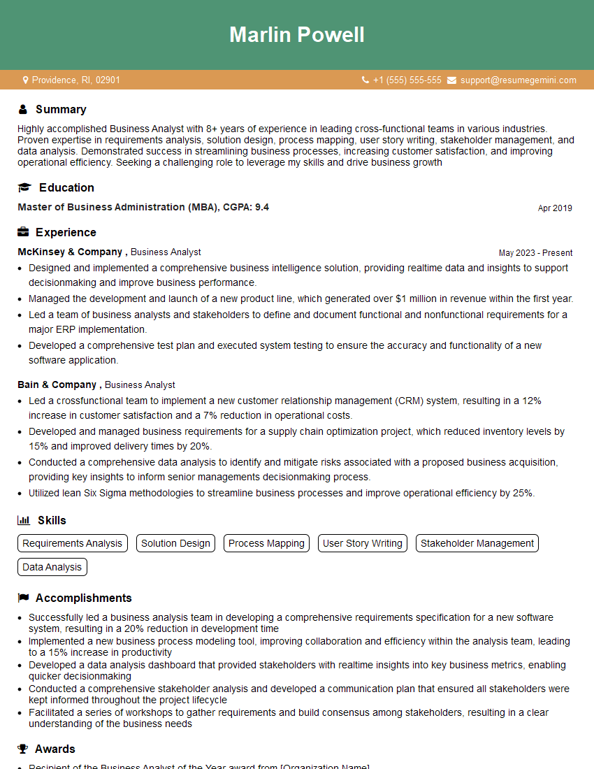
Business Analyst Resume Sample
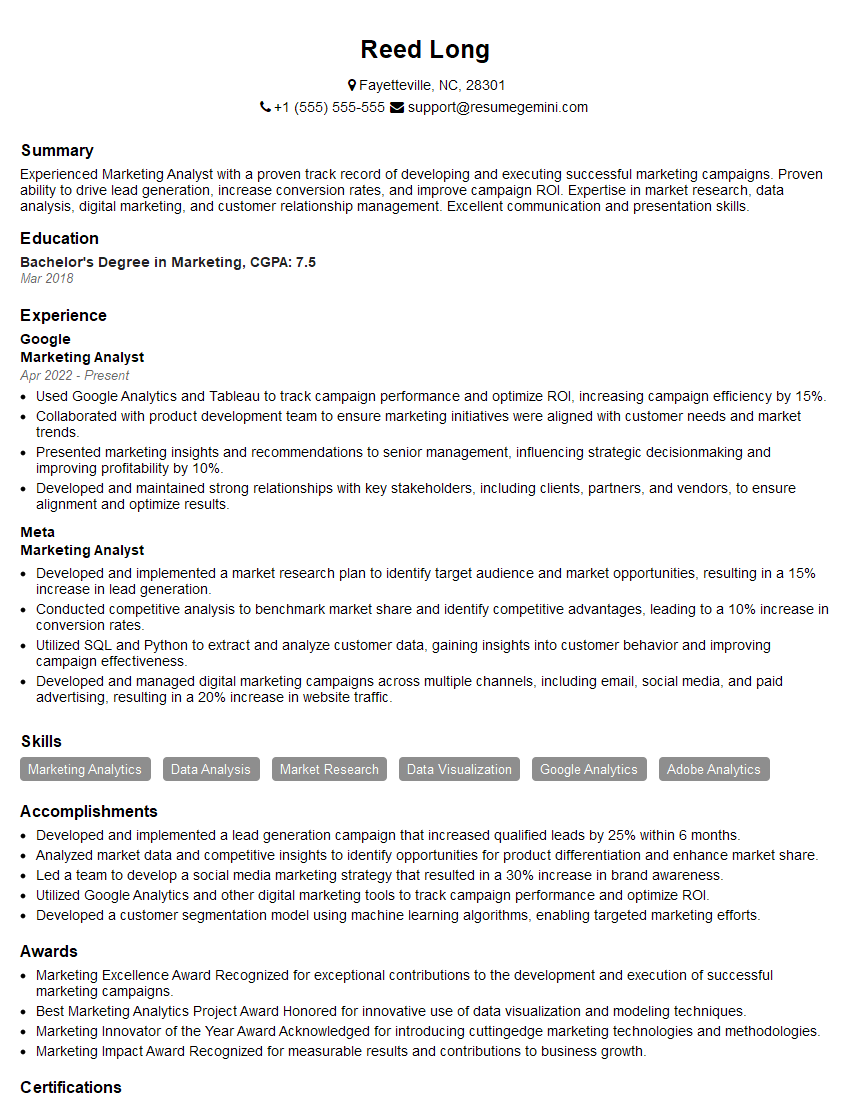
Marketing Analyst Resume Sample
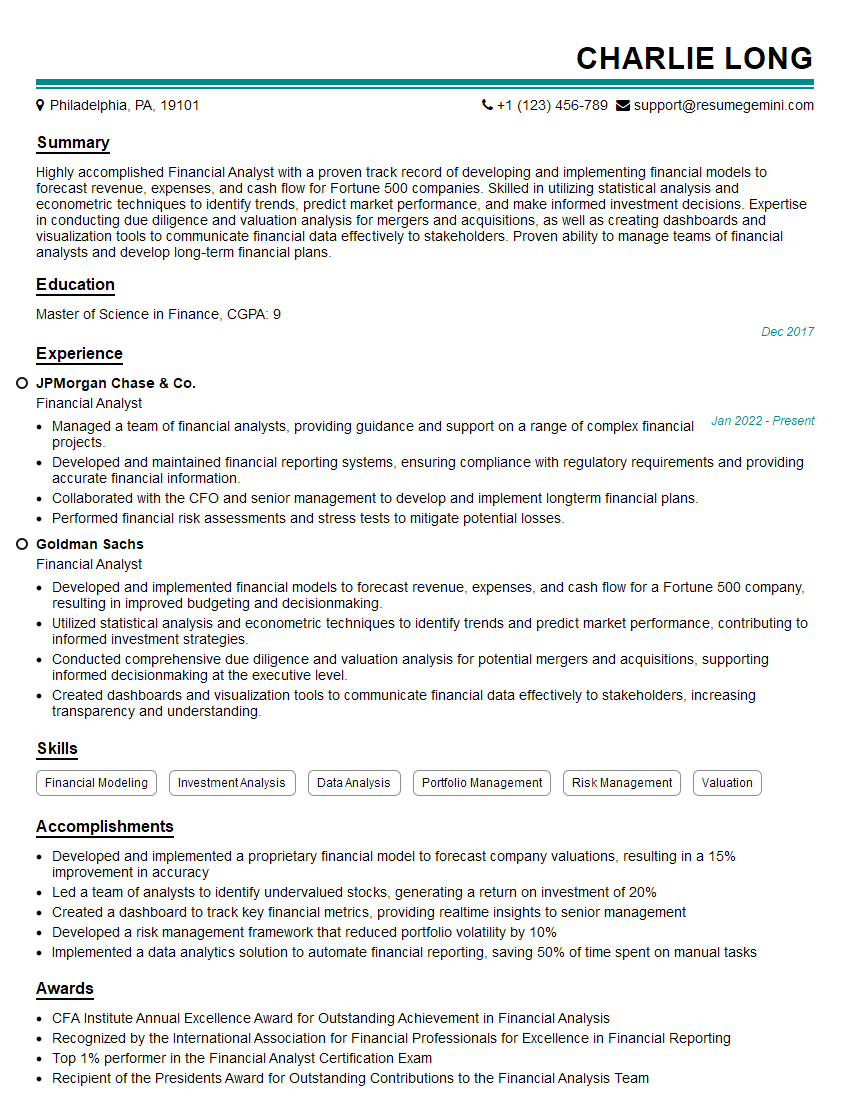
Financial Analyst Resume Sample
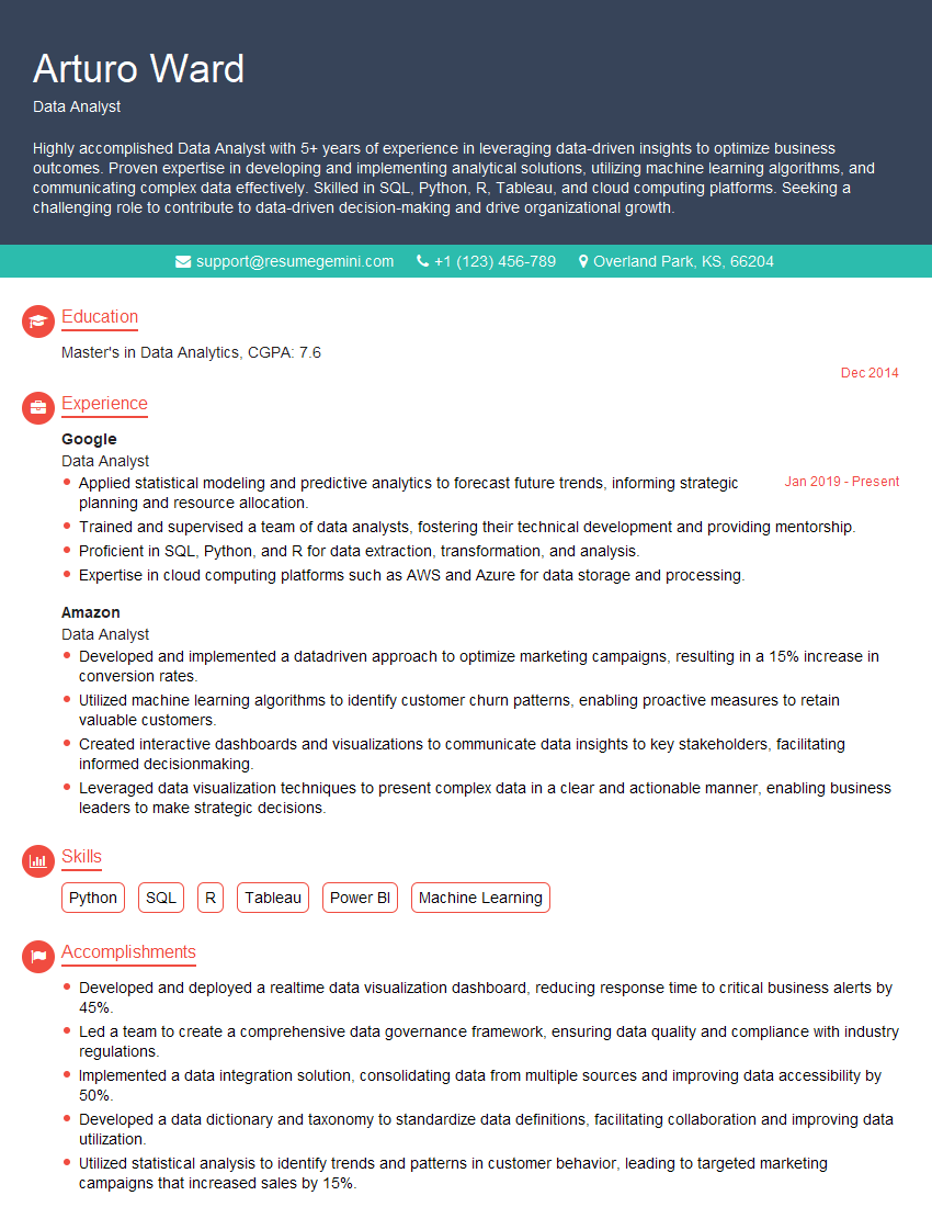
Data Analyst Resume Sample
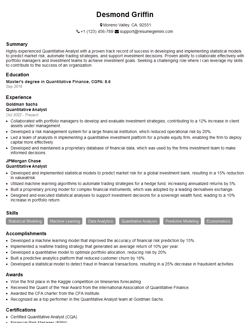
Quantitative Analyst Resume Sample
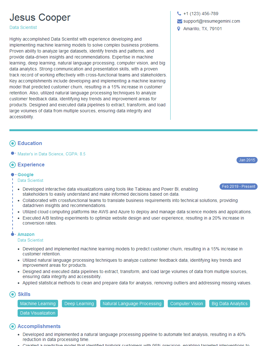
Data Scientist Resume Sample
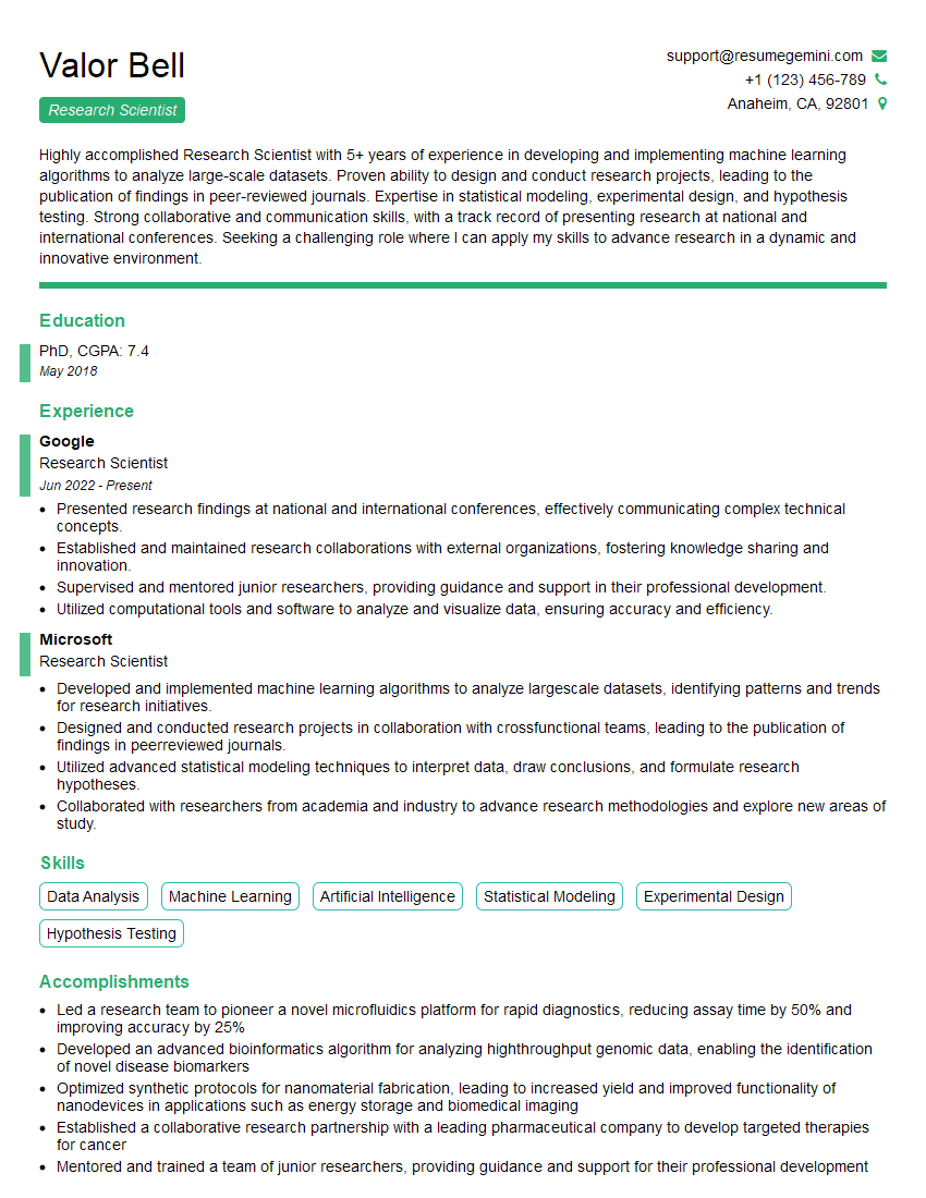
Research Scientist Resume Sample
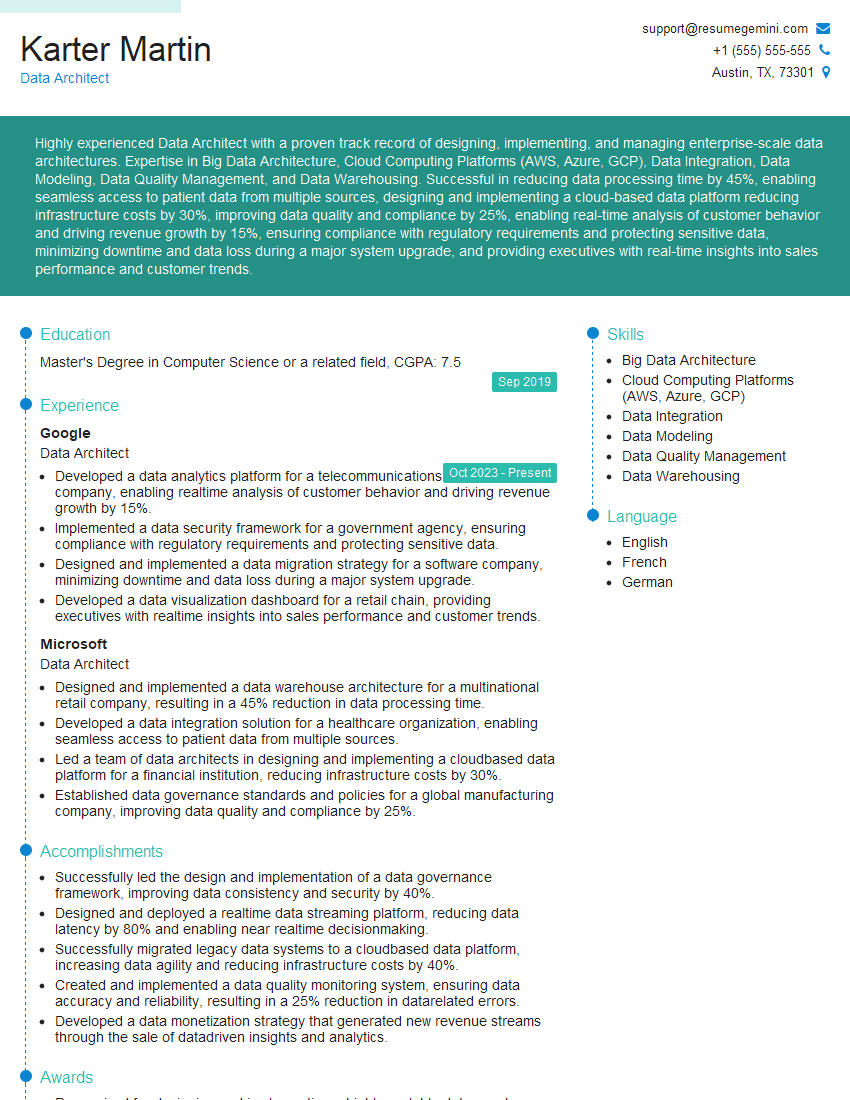
Data Architect Resume Sample
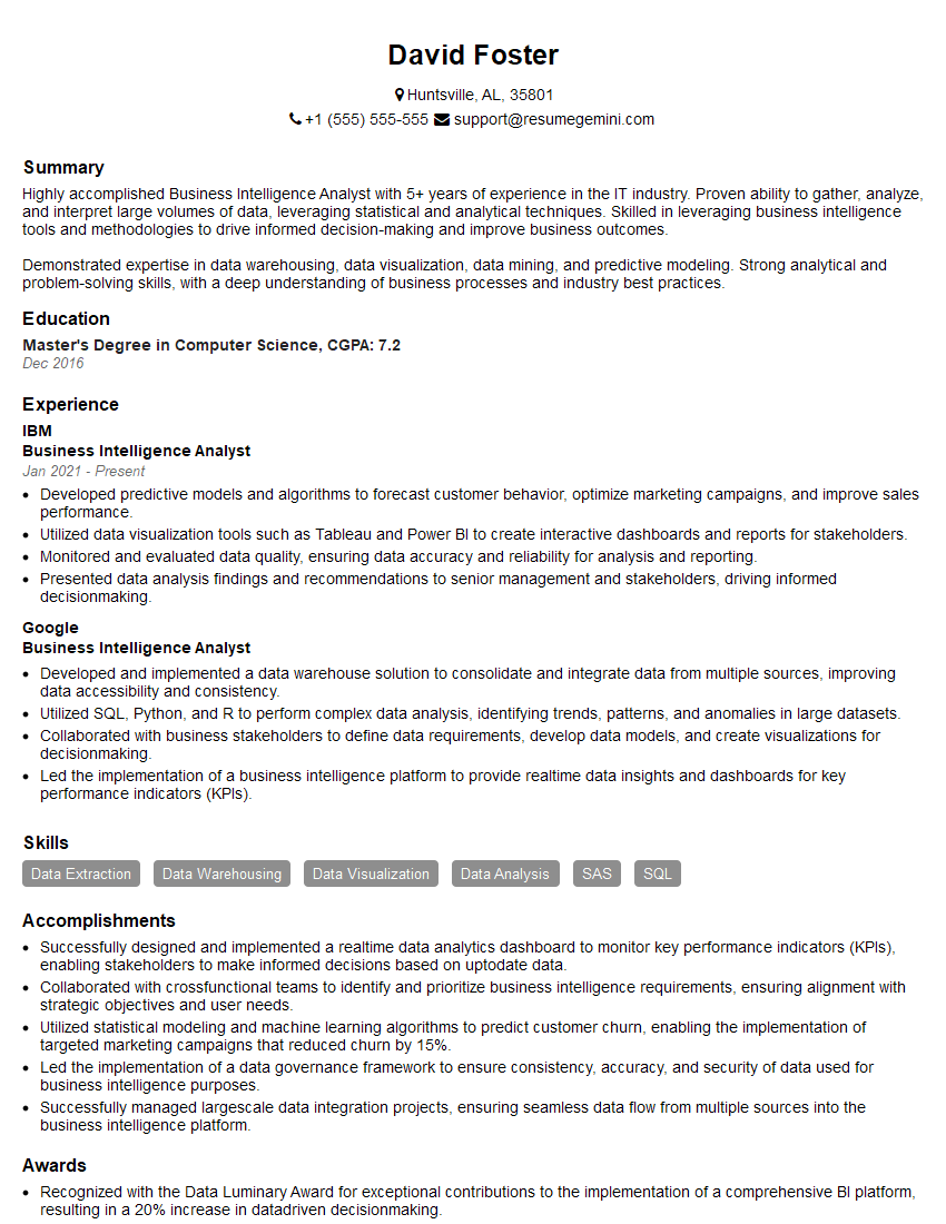
Business Intelligence Analyst Resume Sample
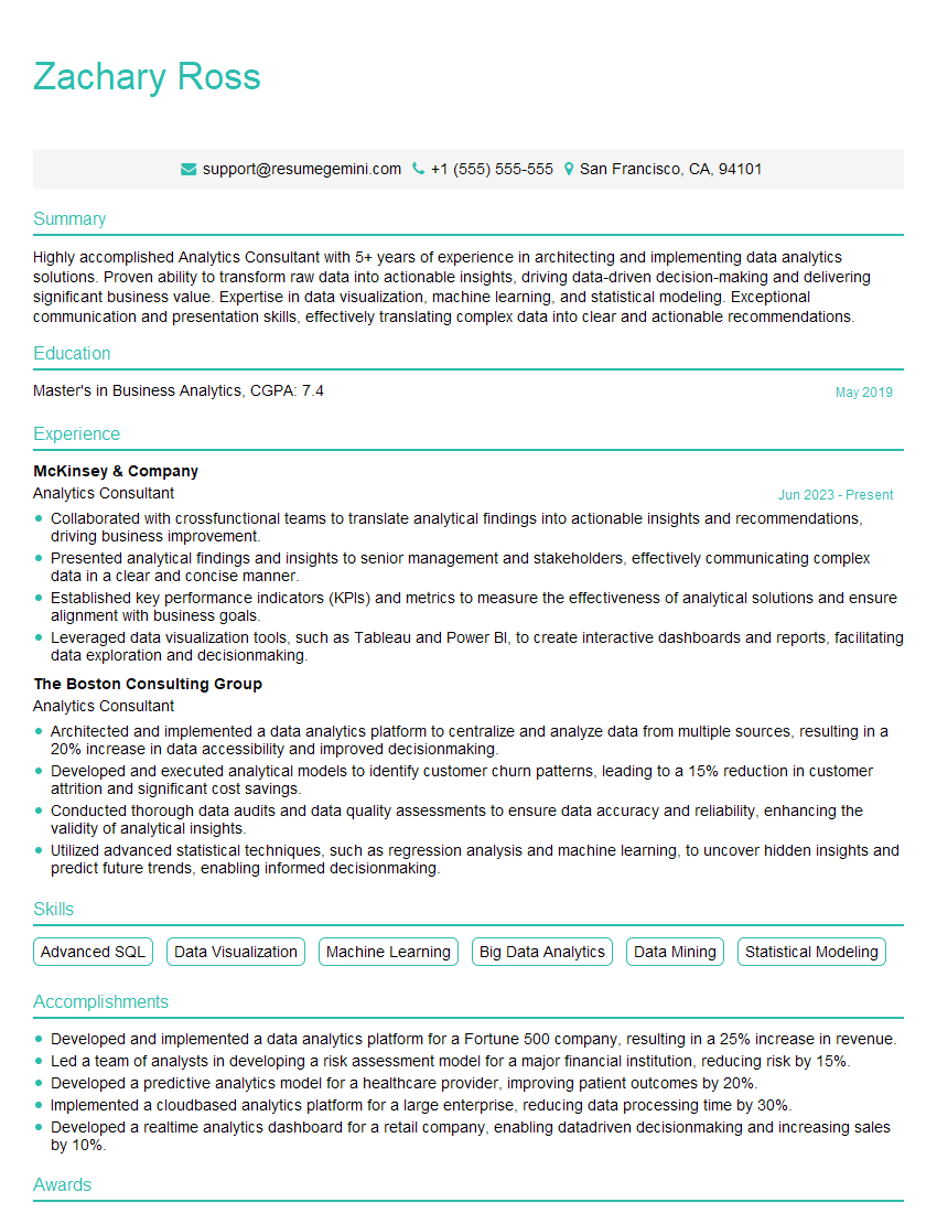
Analytics Consultant Resume Sample
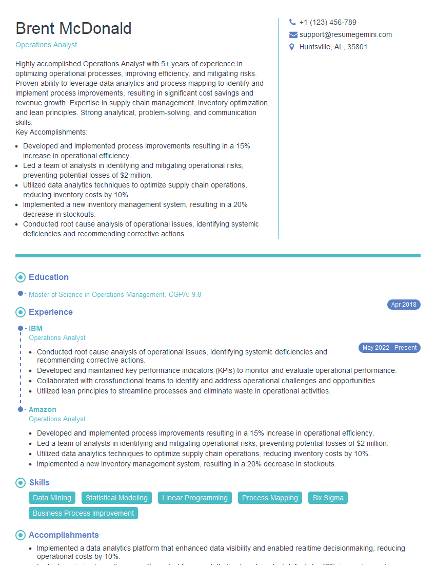
Operations Analyst Resume Sample
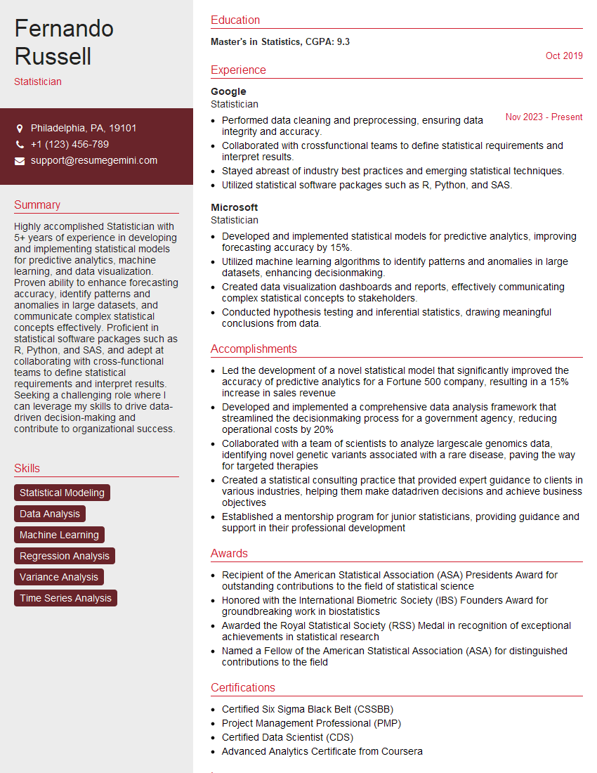
Statistician Resume Sample
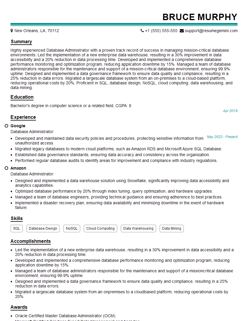
Database Administrator Resume Sample
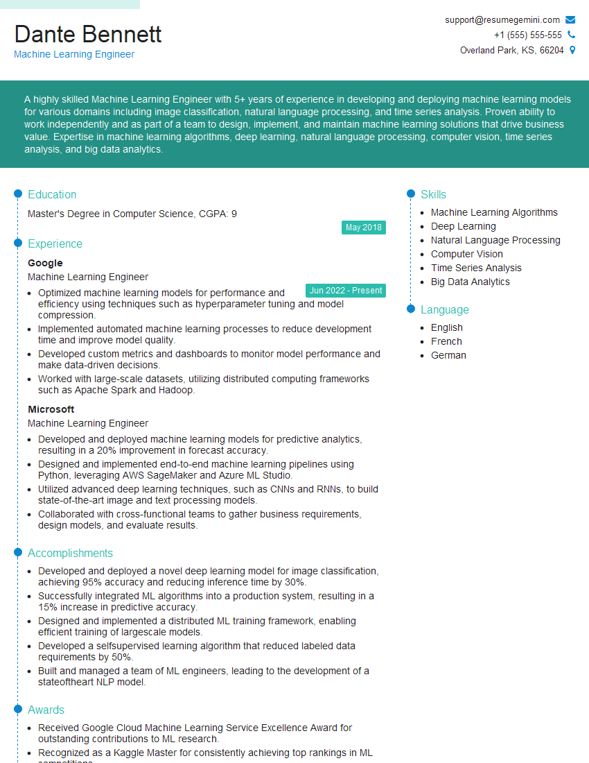
Machine Learning Engineer Resume Sample
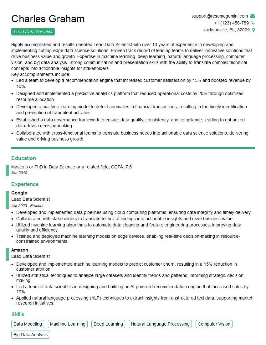
Lead Data Scientist Resume Sample
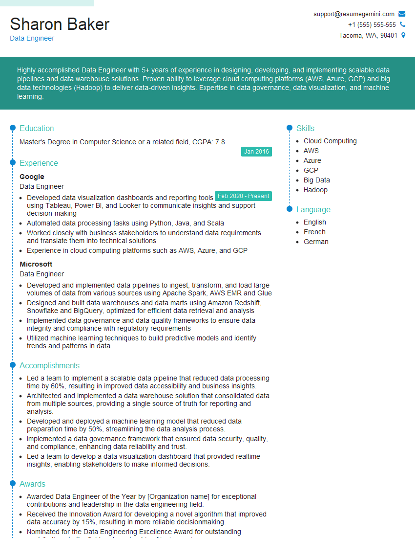
Data Engineer Resume Sample
Big Data Engineer Resume Sample
- Business Analyst
- Marketing Analyst
- Financial Analyst
- Data Analyst
- Quantitative Analyst
- Data Scientist
- Research Scientist
- Data Architect
- Business Intelligence Analyst
- Analytics Consultant
- Operations Analyst
- Statistician
- Database Administrator
- Machine Learning Engineer
- Lead Data Scientist
- Data Engineer
- Big Data Engineer
Explore more articles
Users Rating of Our Blogs
Share Your Experience
We value your feedback! Please rate our content and share your thoughts (optional).
What Readers Say About Our Blog
To the interviewgemini.com Webmaster.
Very helpful and content specific questions to help prepare me for my interview!
Thank you
To the interviewgemini.com Webmaster.
This was kind of a unique content I found around the specialized skills. Very helpful questions and good detailed answers.
Very Helpful blog, thank you Interviewgemini team.