Every successful interview starts with knowing what to expect. In this blog, we’ll take you through the top Microsoft Office Suite (e.g., Excel, Word, PowerPoint) interview questions, breaking them down with expert tips to help you deliver impactful answers. Step into your next interview fully prepared and ready to succeed.
Questions Asked in Microsoft Office Suite (e.g., Excel, Word, PowerPoint) Interview
Q 1. Explain the difference between a PivotTable and a PivotChart in Excel.
PivotTables and PivotCharts are powerful Excel tools for summarizing and analyzing large datasets. Think of them as interactive summaries that allow you to drill down into your data to understand trends and patterns. The key difference lies in their output: a PivotTable presents the summarized data in a tabular format, while a PivotChart visually represents that same data using various chart types.
A PivotTable organizes your data into rows and columns based on selected fields, allowing you to calculate sums, averages, counts, and other aggregations. You can easily filter, sort, and group data within the PivotTable to explore different aspects of your analysis. For example, if you have sales data by region and product, you could create a PivotTable to quickly see total sales for each region, or total sales for each product, or even the sales of a specific product in a particular region.
A PivotChart takes the summarized data from a PivotTable and displays it graphically. It’s essentially a visual representation of the PivotTable’s insights. The type of chart used (bar chart, pie chart, etc.) depends on the nature of the data and the insights you’re trying to convey. Changes made to the underlying PivotTable are automatically reflected in the PivotChart, keeping the visual representation up-to-date.
In short: a PivotTable provides the structured data analysis, and a PivotChart offers a visual interpretation of that analysis.
Q 2. How do you use VLOOKUP or INDEX/MATCH functions in Excel?
VLOOKUP and INDEX/MATCH are both used to look up values in a table, but they differ in their approach and capabilities. VLOOKUP is simpler but has limitations, while INDEX/MATCH offers greater flexibility and power.
VLOOKUP searches for a value in the first column of a table and returns a value in the same row from a specified column. Its syntax is: VLOOKUP(lookup_value, table_array, col_index_num, [range_lookup]). The limitation is that it only searches in the first column of the table.
For example: =VLOOKUP(A2,Sheet2!A:B,2,FALSE) searches for the value in cell A2 on Sheet1 within column A of Sheet2 and returns the corresponding value from column B of Sheet2. FALSE ensures an exact match.
INDEX/MATCH is more versatile. INDEX returns a value from a range based on its row and column number. MATCH finds the position of a value within a range. Combining them allows you to look up values in any column of a table. The syntax is: =INDEX(return_array, MATCH(lookup_value, lookup_array, [match_type]))
For example: =INDEX(Sheet2!B:B,MATCH(A2,Sheet2!A:A,0)) searches for the value in A2 on Sheet1 within column A of Sheet2 and returns the corresponding value from column B of Sheet2. 0 ensures an exact match. This approach allows you to look up based on any column (not just the first one), making it superior for complex lookups.
In a real-world scenario, imagine a large inventory database. INDEX/MATCH would be far more efficient if you needed to look up product information based on a product ID which might be in a column other than the first one.
Q 3. Describe your experience with Excel macros and VBA.
I have extensive experience with Excel macros and VBA (Visual Basic for Applications). VBA allows you to automate repetitive tasks, create custom functions, and significantly enhance Excel’s capabilities. I’ve used VBA to develop solutions for various scenarios, ranging from simple data cleaning and formatting to complex data manipulation and report generation.
For instance, I once automated a monthly sales report generation process. The previous manual process was time-consuming and error-prone. I wrote a VBA macro that automatically imported data from multiple sources, cleaned the data, performed calculations, created charts, and generated a formatted report, saving hours of work each month. This increased efficiency and reduced the risk of human error.
My VBA skills encompass:
- Creating user-defined functions (UDFs) to extend Excel’s functionality.
- Developing event-driven macros that respond to user actions (e.g., button clicks).
- Working with objects within the Excel application model (e.g., worksheets, ranges, charts).
- Using loops, conditional statements, and other programming constructs to create robust and efficient macros.
- Error handling and debugging techniques to ensure macro reliability.
I am also comfortable working with external data sources through VBA, such as databases and text files.
Q 4. How would you handle large datasets in Excel for efficient analysis?
Handling large datasets efficiently in Excel requires a strategic approach. Simply opening a massive file can lead to slow performance and crashes. My strategy involves several key techniques:
- Data Filtering and Subsetting: Instead of analyzing the entire dataset, I focus on relevant subsets. Excel’s filtering capabilities allow me to quickly isolate specific data points for analysis. This reduces the amount of data the program needs to handle at once.
- Power Query (Get & Transform Data): Power Query is a powerful tool for cleaning, transforming, and importing data from various sources. It allows for efficient data manipulation before loading it into Excel, reducing the load on the worksheet itself. For instance, I can use Power Query to consolidate multiple data sources into a single, manageable table.
- PivotTables and PivotCharts: As mentioned earlier, PivotTables provide an efficient way to summarize and analyze large datasets. They allow for interactive exploration without the need to perform complex calculations on the entire dataset.
- Data Consolidation: If dealing with multiple worksheets or workbooks, consolidating the data into a single table is crucial for efficiency. This allows for streamlined analysis and avoids repetition of calculations.
- External Data Sources: For extremely large datasets, considering an external database (like Access or SQL Server) and connecting to it via Excel is usually more efficient. This moves the data processing burden to the database engine and allows Excel to work with smaller, summarized data subsets.
- Data Validation: Before any analysis, data validation is crucial to ensure the data is consistent, accurate, and clean. This step, often done in Power Query or with VBA, eliminates errors and increases efficiency of further processing.
By combining these techniques, I can ensure Excel performs efficiently even with very large datasets.
Q 5. How do you use conditional formatting in Excel?
Conditional formatting in Excel allows you to visually highlight cells that meet specific criteria. This is incredibly useful for quickly identifying trends, outliers, and important data points within a large dataset. Imagine you have a spreadsheet of sales figures; conditional formatting can instantly highlight the highest and lowest performing products, or those exceeding a target sales threshold.
Here’s how it works: you select a range of cells, go to the ‘Home’ tab, click ‘Conditional Formatting’, and choose a rule. The rules can be based on various criteria, such as:
- Highlighting Cells Rules: These highlight cells based on their value (greater than, less than, between, equal to, etc.), text (containing specific text), or date (before/after a specific date).
- Top/Bottom Rules: Highlight the top 10% or bottom 10% of values.
- Data Bars: Visual representation of values as bars within the cells themselves.
- Color Scales: Gradually change cell colors based on value ranking (e.g., a color gradient from green to red).
- Icon Sets: Use icons (like arrows or traffic lights) to indicate performance based on cell values.
For example, to highlight sales figures above $10,000, I would select the sales range, choose ‘Highlight Cells Rules’ -> ‘Greater Than’, enter 10000, and select a formatting style (e.g., red fill). The cells exceeding $10,000 would then be highlighted red, making it easy to spot top performers. Conditional formatting is invaluable for quickly identifying key data points without manually scanning entire datasets.
Q 6. What are some advanced charting techniques you’re familiar with in Excel?
Beyond basic chart types, I’m proficient in several advanced charting techniques in Excel to create more insightful and compelling visualizations. This includes:
- Creating Combination Charts: Combining different chart types (e.g., a bar chart overlaid on a line chart) to show multiple data series with different scales or units. This is perfect for showing relationships between disparate data sets. For example, combine sales volume with profit margin on a single chart.
- Using Chart Layouts and Formatting: Fine-tuning chart elements like titles, axes, labels, legends, and data labels to ensure clarity and readability. This increases the effectiveness of your visual storytelling.
- Adding Trendlines and Error Bars: Enhance charts with trendlines to visualize trends and patterns, and error bars to represent the uncertainty or variability in the data.
- Using Sparklines: Small charts embedded within cells to quickly summarize data within a row or column. These are particularly effective in conveying trends across a dataset without needing separate charts.
- Customizing Chart Styles and Colors: Creating visually consistent and appealing charts by applying consistent formatting and color palettes.
- 3D Charts (with caution): While sometimes visually appealing, 3D charts can sometimes reduce readability. I use these judiciously, ensuring they enhance understanding rather than obscuring the data.
By employing these techniques, I can create charts that are not only visually attractive but also communicate complex data clearly and effectively to a wide audience.
Q 7. Explain the difference between various Excel chart types (e.g., bar chart, pie chart, scatter plot).
Excel offers a variety of chart types, each best suited for different types of data and analysis. The choice depends on what you want to highlight and how you want to present the information.
Bar Charts are ideal for comparing categories. They display data as rectangular bars, with the length of each bar representing the value. Horizontal bar charts are especially useful when category labels are long.
Pie Charts are best for showing proportions of a whole. Each slice represents a category, with the size of the slice relative to its proportion of the total. Pie charts are most effective with a relatively small number of categories.
Scatter Plots (or XY Charts) are used to show the relationship between two variables. Each point on the chart represents a data point, with its X and Y coordinates representing the values of the two variables. This helps identify correlations or trends between variables.
Line Charts are suitable for showing trends over time or other continuous variables. They connect data points with lines, making it easy to see changes and patterns over the duration of the variable.
Area Charts are similar to line charts, but the area under the line is filled in. This emphasizes the magnitude of change over time.
Choosing the right chart type is essential for effective data visualization. A poorly chosen chart can obscure insights, while a well-chosen one can clearly communicate key findings.
Q 8. How do you create and manage multiple worksheets within an Excel workbook?
Managing multiple worksheets in Excel is fundamental to organizing complex data. Think of a workbook as a binder, and each worksheet as a separate sheet of paper within that binder. You can easily create new worksheets by clicking the ‘+’ icon at the bottom of the existing sheets. To rename a sheet, double-click its tab and type a new name. Navigating between sheets is straightforward; simply click on the sheet tab at the bottom of the Excel window. This allows you to segregate different datasets (e.g., sales data for each quarter in separate sheets), perform calculations across sheets using formulas (like summing data from multiple sheets), and maintain a well-structured workbook for better analysis and reporting.
For instance, imagine you’re managing a project with different task categories. You might create separate worksheets for ‘Budget’, ‘Timeline’, ‘Resources’, and ‘Risks’. Each sheet focuses on a specific aspect, and you can then use Excel’s features to link them, creating a comprehensive project overview.
Q 9. How do you protect your Excel spreadsheets from unauthorized changes?
Protecting your Excel spreadsheets involves several layers of security. The simplest method is using password protection for the workbook itself. Go to ‘File’ > ‘Info’ > ‘Protect Workbook’. You can choose to protect the structure (preventing changes to sheets, etc.) or the contents (preventing cell edits). However, a determined user might still find ways around this.
For stronger protection, you can protect individual worksheets or ranges of cells. Select the sheet or range, go to ‘Review’ > ‘Protect Sheet’ (or ‘Protect Range’), and set permissions. You can specify who can edit what. This allows different users to access and modify only specific parts of the workbook. Consider also using data validation (discussed in the next question) to restrict the type of data entered into cells. This prevents incorrect inputs from being accidentally entered and helps maintain data integrity.
Finally, remember that the best protection often involves a combination of techniques. Relying on a single method is less secure than using several layers of protection simultaneously. The choice depends on the sensitivity of your data.
Q 10. Describe your experience with data validation in Excel.
Data validation in Excel is a powerful tool for ensuring data accuracy and consistency. It allows you to define rules for what kind of data can be entered into a cell, preventing errors and inconsistencies. Imagine a spreadsheet tracking customer orders; you can use data validation to ensure that only valid order numbers, or dates within a specific range, are entered.
To implement data validation, select the cells you want to restrict. Go to ‘Data’ > ‘Data Validation’. You’ll find options to set criteria, such as allowing only numbers within a specific range, dates, specific text, or even lists from another range. You can also add input messages to guide users and error alerts to inform them if they violate the validation rules. I’ve used this extensively to streamline data entry, preventing human error that could lead to inaccurate analysis. For example, I once used data validation to ensure that project status updates only contained values from a pre-defined list (‘In Progress’, ‘Completed’, ‘Delayed’). This prevented inconsistent entry and made reporting considerably simpler.
Q 11. What are your preferred methods for data cleaning and transformation in Excel?
Data cleaning and transformation are crucial for accurate analysis. My preferred methods in Excel involve a combination of techniques. First, I often use filtering and sorting to identify and isolate problematic data – for instance, finding inconsistencies or outliers. This helps visualize and understand the scope of data cleaning needed.
Then, I leverage Excel’s built-in functions. TRIM() removes extra spaces, UPPER() or LOWER() standardizes text, and SUBSTITUTE() replaces specific text strings. For more complex transformations, I utilize ‘Text to Columns’ to split combined data into separate columns and CONCATENATE() to join different data points. I also use ‘Find and Replace’ for simple text corrections across a large dataset.
Finally, conditional formatting helps highlight inconsistencies or errors, making it easier to visually identify and rectify them. Imagine a spreadsheet with inconsistent date formats; conditional formatting can highlight the cells with the incorrect format, simplifying the process of fixing them. The key is a systematic approach, tackling issues one at a time and testing each step to ensure data integrity.
Q 12. How do you use mail merge functionality in Microsoft Word?
Mail merge in Word automates the process of sending personalized letters, emails, or labels to multiple recipients. It works by combining a main document (e.g., a letter template) with a data source (e.g., an Excel spreadsheet containing recipient information). The data source typically includes fields like name, address, and any other personalized information you want to include.
To use mail merge, you begin by selecting ‘Mailings’ > ‘Start Mail Merge’ > choose your document type (letters, emails, etc.). Then you select your data source. Word will prompt you to match fields from the data source to placeholders in your document. Finally, you preview the merged documents to ensure everything looks correct before printing or sending.
For instance, I once used mail merge to create personalized thank-you notes for conference attendees. The data source was an Excel sheet with attendee names and contact information. This saved significant time and effort compared to manually creating each note individually.
Q 13. Explain how you would create a professional-looking document using Word’s formatting tools.
Creating a professional-looking document in Word relies heavily on understanding and utilizing its formatting tools. Start by selecting an appropriate template or creating a new document with a clean layout. Consistent use of styles is key: create styles for headings, paragraphs, lists, and other elements. This ensures a unified look and feel across the entire document and makes it easier to edit later. Use the styles pane to apply these styles to your text rather than directly formatting each element.
Pay attention to typography. Choose appropriate fonts and font sizes, ensuring readability and visual appeal. Use headings effectively to structure your content logically. Incorporate visuals like images and charts to break up the text and enhance comprehension. Ensure proper spacing between paragraphs, headings, and images. Use tables for presenting structured information clearly. Finally, use Word’s built-in spell and grammar checker to eliminate errors and proofread your document meticulously before finalizing it.
Imagine creating a formal business proposal. Consistent use of styles for headings, paragraphs, and lists ensures a polished look. Well-placed images and charts enhance the visual appeal, making the proposal easy to understand and increasing its credibility. Using tables for presenting financial data allows for a clearer and more organized representation.
Q 14. How do you manage styles and templates in Microsoft Word?
Managing styles and templates in Word streamlines the document creation process and ensures consistency. Styles are pre-defined formatting sets that apply to text, paragraphs, etc. Templates are pre-designed documents with predefined styles, layouts, and settings. Both significantly increase efficiency and consistency.
To create or modify a style, click the ‘Styles’ pane and either modify an existing style or create a new one by clicking ‘New Style’. Word allows you to customize many aspects: font, size, spacing, indentation, and more. To manage templates, navigate to ‘File’ > ‘New’. You can choose from built-in templates or browse online for more. You can also save your custom documents as templates to reuse later, incorporating your preferred styles and settings for future projects.
Using templates and styles allows for standardization. For example, a company might create a template for all business letters, including its logo, contact information, and predefined styles for headings and paragraphs. This ensures all outgoing communications maintain a consistent brand identity.
Q 15. Describe your experience using Word’s table features.
My experience with Word’s table features is extensive. I’m proficient in creating tables of various sizes and complexities, from simple data grids to intricate layouts with merged cells, row and column spanning, and different cell formatting. I understand how to use formulas within tables to perform calculations, such as summing columns or calculating averages. I also know how to convert tables to text and vice-versa, and how to effectively manage table styles for consistency and visual appeal. For example, I’ve used tables to create visually appealing reports, organize complex datasets for analysis, and design professional-looking documents like invoices and proposals. I’m comfortable working with advanced features like table properties to control borders, shading, and text wrapping.
In one project, I used tables to create a detailed comparison of different software solutions, allowing for easy visual analysis of features and pricing. Another instance involved using formulas within tables to automatically calculate totals and subtotals in a complex budget spreadsheet. These abilities have proven invaluable in streamlining data presentation and enhancing document professionalism.
Career Expert Tips:
- Ace those interviews! Prepare effectively by reviewing the Top 50 Most Common Interview Questions on ResumeGemini.
- Navigate your job search with confidence! Explore a wide range of Career Tips on ResumeGemini. Learn about common challenges and recommendations to overcome them.
- Craft the perfect resume! Master the Art of Resume Writing with ResumeGemini’s guide. Showcase your unique qualifications and achievements effectively.
- Don’t miss out on holiday savings! Build your dream resume with ResumeGemini’s ATS optimized templates.
Q 16. How do you effectively collaborate on Word documents using track changes?
Effective collaboration on Word documents using track changes is crucial for maintaining version control and ensuring everyone’s input is recorded. I initiate track changes by enabling the feature in the ‘Review’ tab. This allows me and my collaborators to add, edit, or delete text without overwriting each other’s work. We can view changes in different modes (balloons, highlighting), facilitating a clear understanding of revisions. The ‘Accept’ and ‘Reject’ functions help streamline the review process. Before finalizing the document, we carefully review all changes, discuss alterations, and ensure everyone agrees on the final version. Clear communication and organized comments are essential for efficient collaboration.
For example, in a recent project, a team of writers and editors collaborated on a lengthy report using track changes. This allowed us to see and discuss each suggested edit before finalizing the document. The ability to accept or reject changes prevented conflicts and made the editing process much more efficient.
Q 17. How do you create a table of contents or an index in Microsoft Word?
Creating a table of contents (TOC) and an index in Word is straightforward and greatly enhances document navigation. For a TOC, I first ensure that my headings are formatted using Word’s built-in heading styles (Heading 1, Heading 2, etc.). Then, I simply go to the ‘References’ tab and select ‘Table of Contents’. Word automatically generates a TOC based on the heading styles. For a custom TOC, further options are available for levels of detail and formatting. An index requires a bit more manual work. I mark index entries using the ‘Mark Index Entry’ feature in the ‘References’ tab. This allows me to specifically tag words or phrases that need to be included in the index. After all entries are marked, I can generate the index using the same ‘References’ tab.
Think of it like building a roadmap. The table of contents helps readers easily locate specific sections, while the index acts as a detailed search function. Both features are crucial for long documents and reports to improve readability and user experience.
Q 18. How familiar are you with creating and editing footnotes and endnotes in Word?
I’m very familiar with footnotes and endnotes. Footnotes appear at the bottom of the page, while endnotes are collected at the end of the document. Both are used for providing supplementary information or citations. In Word, I insert them using the ‘Insert’ tab, selecting either ‘Footnote’ or ‘Endnote’. Word automatically numbers them sequentially. I can easily edit the content of footnotes and endnotes, and modify their formatting to match the document’s style. The ‘Show Notes’ option lets me view and edit all notes in a single pane. Managing notes is critical for maintaining document integrity and providing clear references to sources or supporting evidence.
For instance, I recently used footnotes extensively in an academic paper to cite sources and provide elaborations on particular points. The automatic numbering and formatting features of Word greatly simplified the process.
Q 19. Describe your experience with creating and editing PDF files from Word documents.
Creating and editing PDFs from Word documents is a common task for me. Word offers several options for exporting to PDF. The simplest is using the ‘Save As’ function and choosing PDF as the file type. This produces a PDF directly from the Word file. For more control over the conversion process, I can use the ‘Print’ function and select a PDF printer. This allows me to fine-tune settings such as the page range and print quality. Sometimes, editing a PDF directly requires specialized PDF editing software, but often, I can make minor adjustments within Word before converting, if the need for editing is limited.
In a professional context, exporting to PDF ensures that the recipient views the document exactly as intended, regardless of their software or operating system. The PDF format is standard and provides a reliable, easily shared document.
Q 20. How do you create an effective PowerPoint presentation?
Creating an effective PowerPoint presentation involves more than just adding text and images. It’s about crafting a compelling narrative that engages the audience. I begin by defining a clear objective: What message do I want to convey? Then I structure the presentation logically, using a concise introduction, supporting body points, and a memorable conclusion. Visuals are crucial; I select high-quality images and charts to illustrate key ideas, avoiding cluttered slides. Animation and transitions can enhance engagement, but I use them sparingly to prevent distraction. I maintain a consistent design theme throughout the presentation for a professional look. Finally, I rehearse the presentation to ensure a smooth and confident delivery.
Recently, I developed a PowerPoint presentation for a company-wide product launch. By carefully structuring the content, incorporating relevant visuals, and practicing the delivery, I was able to create a compelling presentation that effectively communicated the product’s features and benefits to the audience.
Q 21. What are some best practices for designing visually appealing slides in PowerPoint?
Visually appealing slides in PowerPoint follow several best practices. First, maintain a consistent color scheme, using a limited palette for a professional and cohesive look. Avoid overwhelming the audience with excessive text; use bullet points and concise phrases. Incorporate high-quality images and graphics that are relevant to the content, ensuring they are properly sized and placed to avoid cluttering the slide. Use white space effectively to allow the eye to rest and improve readability. Think of it like composing a painting; you need balance and visual harmony. Consider using charts and graphs for data presentation as these are easily digestible visual representations of information. Finally, choose appropriate fonts that are easy to read at a distance, and use consistent font sizes and styles for uniformity.
For example, I often use a combination of high-quality images and minimalist text layouts to create a modern and engaging look. This creates visual interest and avoids overwhelming the audience with too much information on a single slide.
Q 22. Explain your experience using PowerPoint’s animation and transition features.
PowerPoint’s animation and transition features are powerful tools for creating engaging and dynamic presentations. Animations bring individual elements to life, while transitions smoothly connect slides. I’ve used both extensively to enhance presentations, making them more visually appealing and easier to follow.
For animations, I consider the message I want to convey. For instance, if presenting a process, I might use sequential animations to highlight each step. If showing data, I might use emphasis animations like appearing or highlighting to draw attention to key figures. I prefer using subtle, professional animations to avoid distracting the audience. I often use the ‘Appear’ or ‘Fade’ animations for simple elements and more complex animations such as ‘Fly In’ or ‘Spin’ only sparingly to create a specific effect. The key is to ensure animations support the narrative, not detract from it.
Transitions, on the other hand, control how one slide moves to the next. I generally favor subtle transitions like ‘Fade’ or ‘Push’ for a professional feel. More dramatic transitions are used judiciously – perhaps to separate distinct sections of the presentation. Consistency is key. I avoid using a variety of flashy transitions within a single presentation. I always preview my animations and transitions in slideshow mode to ensure a smooth, professional flow.
Q 23. How do you incorporate charts and graphs into a PowerPoint presentation effectively?
Charts and graphs are essential for communicating complex data concisely in PowerPoint. To incorporate them effectively, I prioritize clarity, simplicity, and relevance. First, I choose the appropriate chart type for the data. A bar chart is great for comparisons, a line chart for trends, and a pie chart for proportions. Then, I ensure the chart is visually clear: legible fonts, a consistent color scheme, and minimal clutter. I always label axes clearly and add a concise title explaining the data presented. Moreover, I avoid using 3D charts unless absolutely necessary, as they can often obscure data. I make sure the chart size is appropriate for the slide, neither too small to be unreadable nor so large it dominates the slide. I frequently use data labels directly on the chart elements themselves for quick understanding. In a recent presentation on marketing campaign performance, I used a column chart to effectively visualize the ROI of various strategies, making it immediately apparent which campaigns were most successful.
Q 24. How do you manage speaker notes in PowerPoint?
Speaker notes in PowerPoint are crucial for delivering a confident and engaging presentation. They serve as a personal reminder of key points, statistics, and transitions. I always create detailed speaker notes, using bullet points and short, memorable phrases rather than lengthy paragraphs. This helps me stay on track and avoid reading directly from the slides. PowerPoint offers a dedicated pane for speaker notes. To access it, I typically go to the ‘View’ tab and check ‘Notes’. I can then type my notes in the pane below the slide. During the presentation, if using Presenter View, my notes appear on my screen (second monitor or laptop screen), while the audience sees only the main presentation. This setup allows me to maintain eye contact with the audience while ensuring I deliver the presentation smoothly and confidently.
Q 25. How do you create and use hyperlinks in PowerPoint?
Hyperlinks are a great way to enhance interactivity and provide additional resources in PowerPoint. To create a hyperlink, I select the text or object I want to link. Then, I go to the ‘Insert’ tab and select ‘Hyperlink’. This opens a dialog box where I can enter the URL (web address), a file path (for a document on my computer), or even another slide in the same presentation. For instance, if I’m presenting a business proposal, I might hyperlink a section discussing financial projections to a detailed Excel spreadsheet containing the data. This makes the presentation much more efficient and easier to digest for the audience. I always test my hyperlinks before presenting to ensure they work correctly. I also make sure the linked text is descriptive and clearly indicates where the link leads.
Q 26. Describe your experience with PowerPoint’s presenter view.
PowerPoint’s Presenter View is a game-changer for delivering presentations. It allows me to see a much broader view of my presentation during delivery compared to what the audience sees. This is incredibly helpful for a smooth, confident presentation. On my monitor, I see the current slide, the next slide for previewing, my speaker notes, and a timer. This provides a fantastic overview and ensures that I stay on schedule and never lose my place. This view is particularly useful in large conferences where I need to manage timings carefully and refer to my speaker notes frequently without disrupting the audience’s view. The dual screen functionality is a major boost to confidence during high-pressure presentations. I consider this feature to be indispensable.
Q 27. How do you effectively use templates and themes in PowerPoint?
PowerPoint templates and themes are valuable tools for creating professional and consistent presentations. Templates provide a pre-designed structure with placeholders for text, images, and charts. This saves considerable time and ensures visual consistency throughout the presentation. I often use templates when creating presentations for clients or formal reports to project a polished, professional image. Themes, on the other hand, define the overall look and feel, including fonts, colors, and background styles. By selecting an appropriate theme, I can create a visually appealing presentation that aligns with my branding guidelines or the overall presentation style. The key to using templates and themes effectively is choosing ones that complement the presentation’s content and target audience. Overly flashy or distracting themes can be counterproductive, whereas a well-chosen theme enhances the presentation’s impact. For a recent project, I used a minimalist template and a consistent color scheme, ensuring the focus remained on the data and information being presented. This approach created a clean and sophisticated presentation.
Key Topics to Learn for Microsoft Office Suite (e.g., Excel, Word, PowerPoint) Interview
- Excel: Data manipulation, including sorting, filtering, and using advanced formulas (VLOOKUP, INDEX/MATCH, SUMIFS).
- Excel: Creating and interpreting charts and graphs to visualize data effectively; understanding pivot tables for data analysis.
- Excel: Practical application: Demonstrating proficiency in building dynamic spreadsheets for budgeting, forecasting, or data reporting.
- Word: Mastering document formatting, including styles, headers/footers, and tables; understanding advanced features like mail merge.
- Word: Practical application: Creating professional-looking reports, proposals, or letters showcasing strong formatting and organization skills.
- Word: Proofreading and editing techniques to ensure error-free documents; familiarity with track changes and collaboration features.
- PowerPoint: Designing engaging presentations with effective use of visuals, transitions, and animations; understanding best practices for storytelling through presentations.
- PowerPoint: Practical application: Creating a compelling presentation summarizing complex data or a project proposal.
- PowerPoint: Utilizing features like speaker notes and presenter view for effective delivery; understanding different presentation formats and layouts.
- General: Understanding file management, collaboration features (like co-authoring), and data security best practices across all three applications.
- Problem-Solving: Being able to articulate your problem-solving approach when faced with a data challenge or formatting issue.
Next Steps
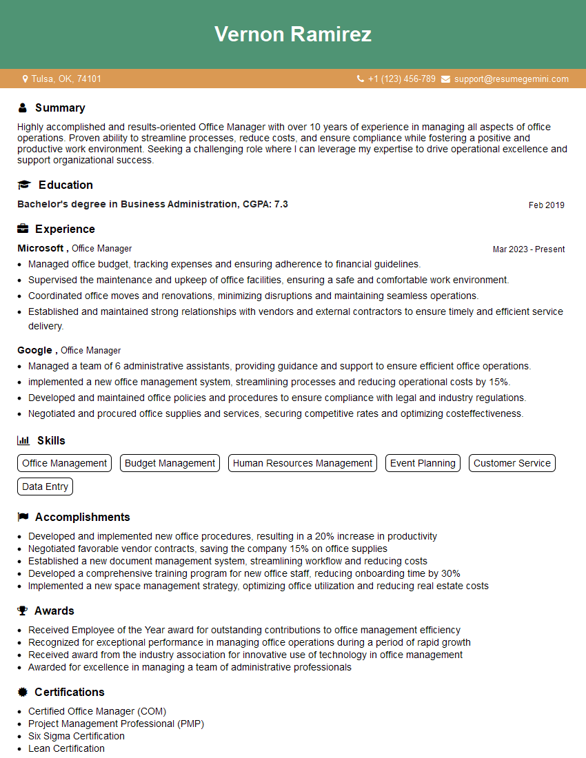
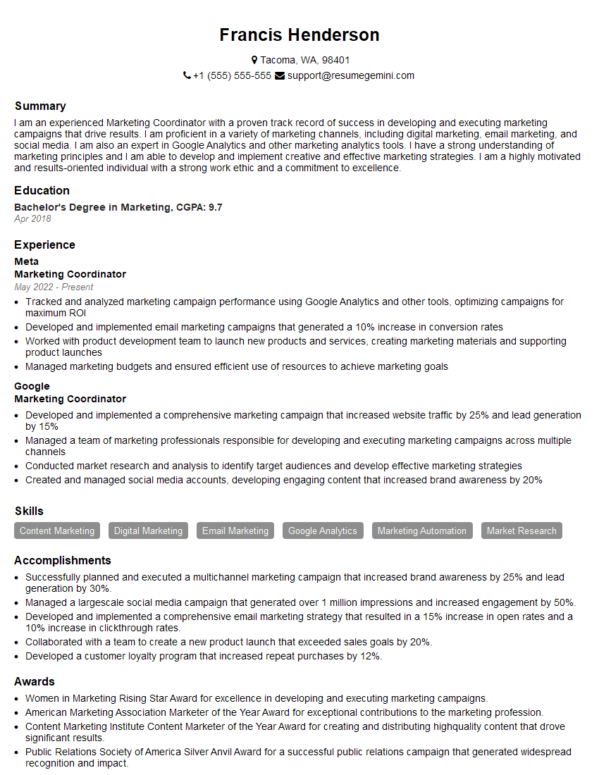
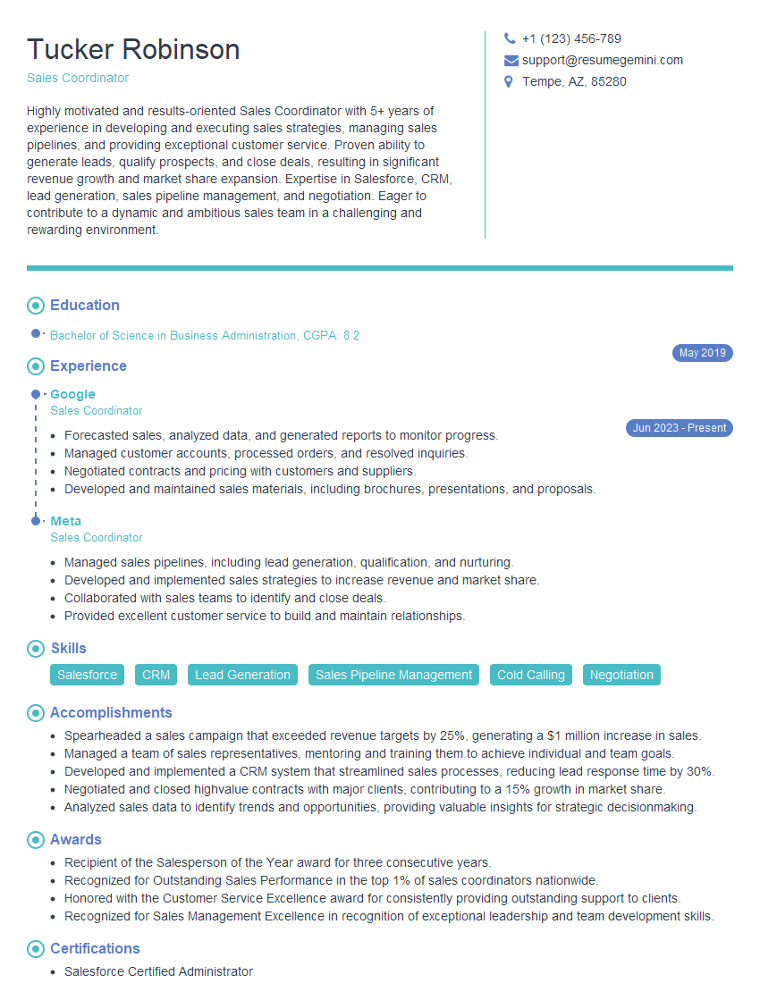
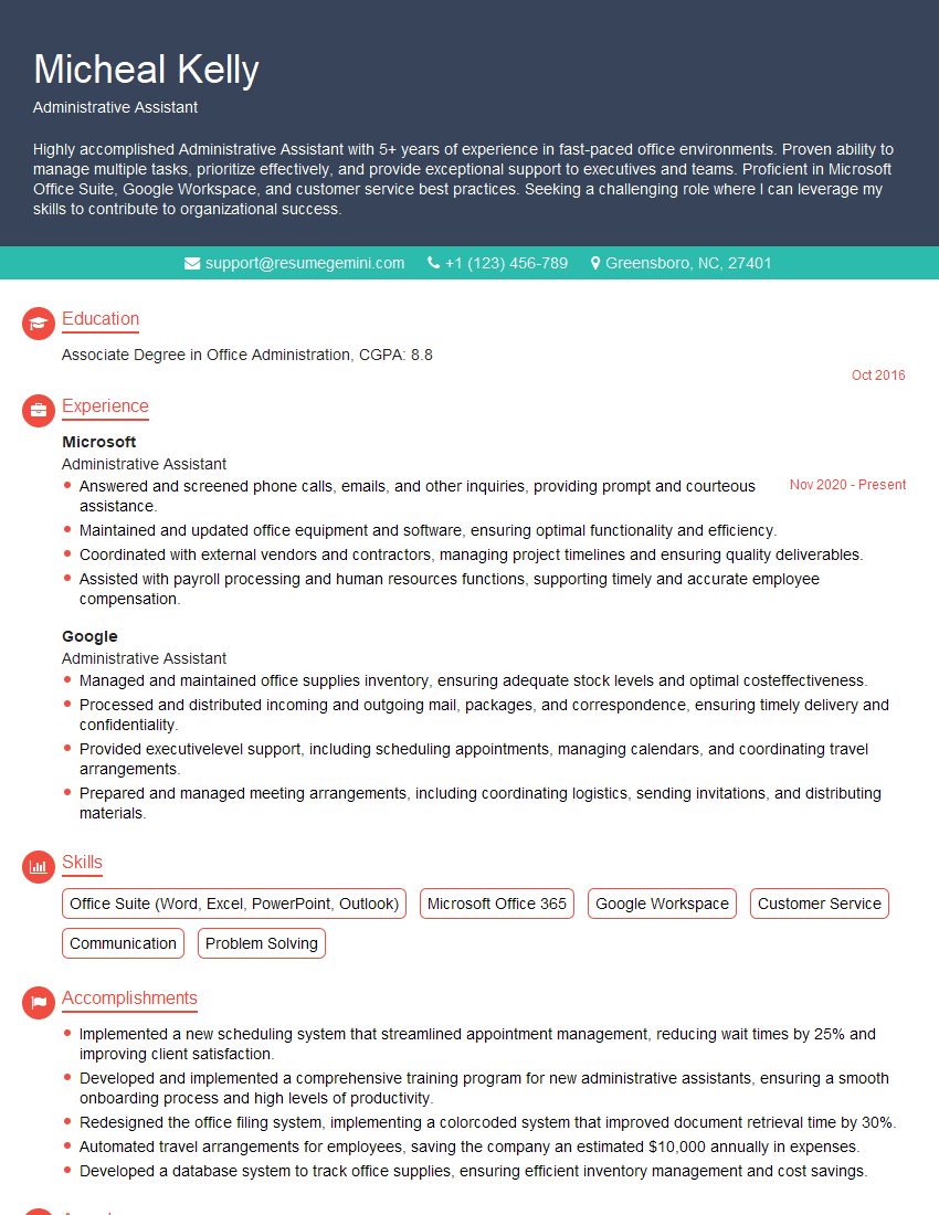
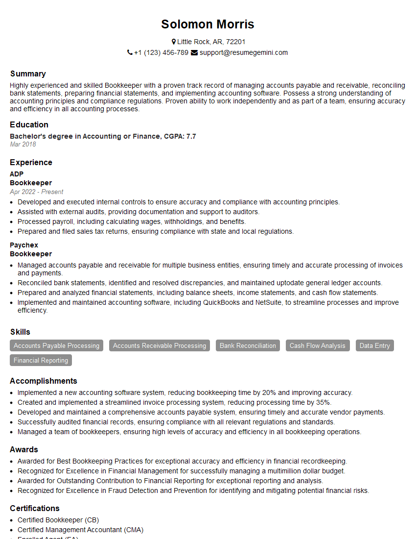
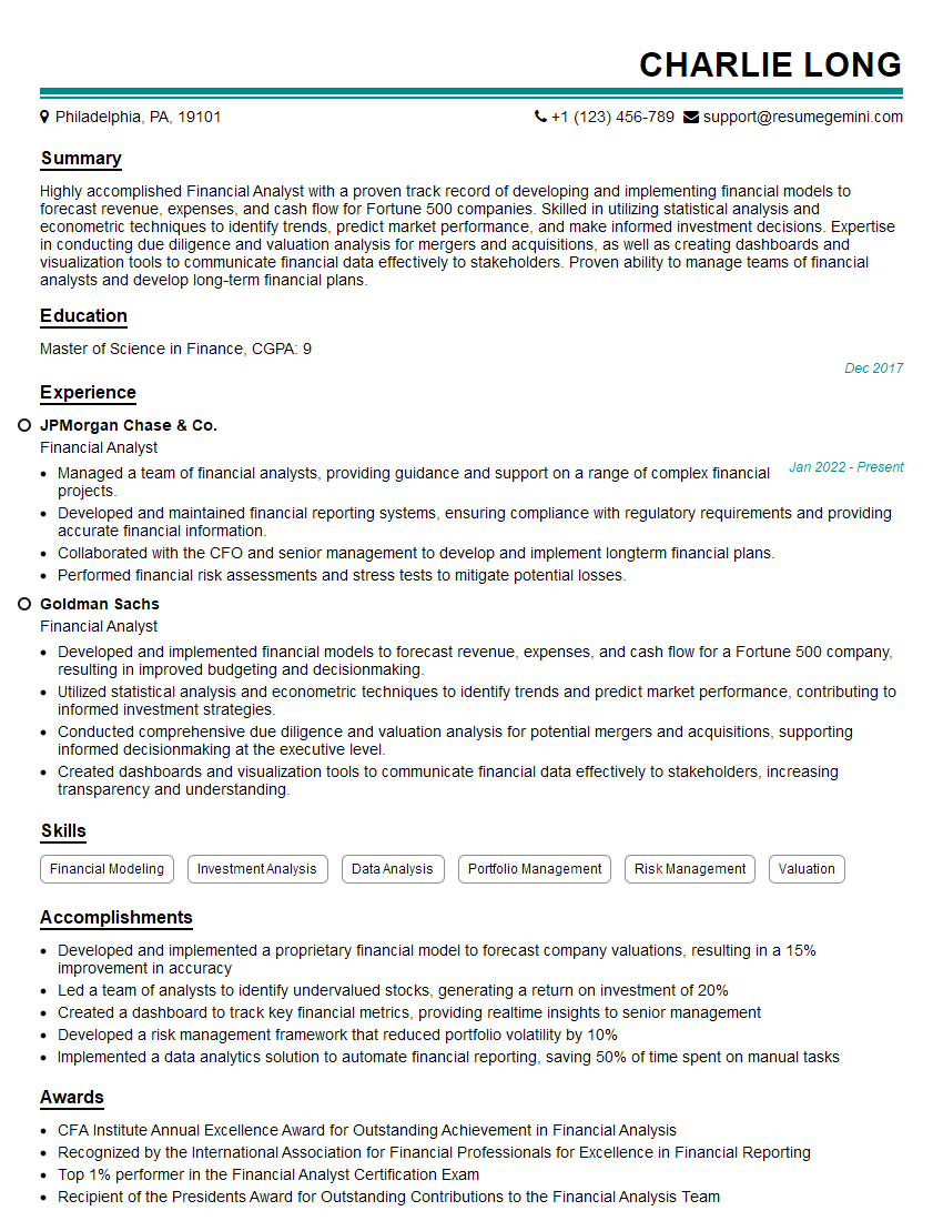
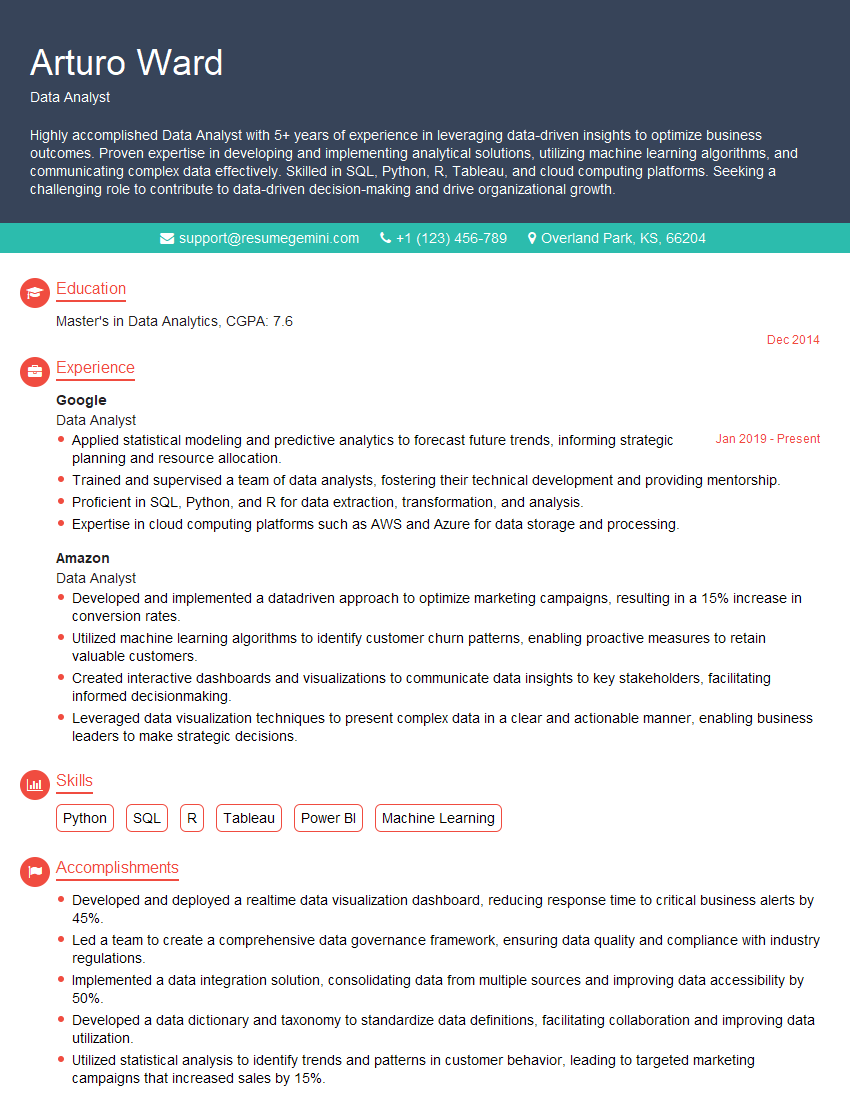
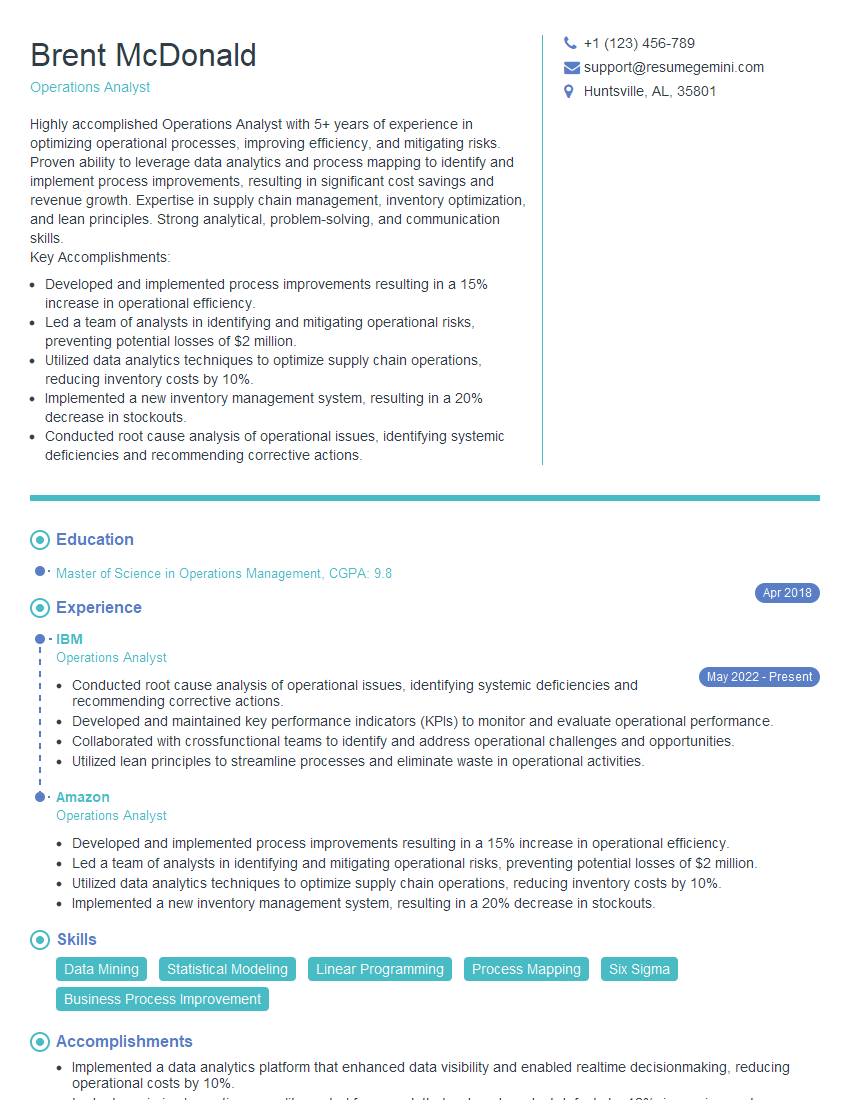
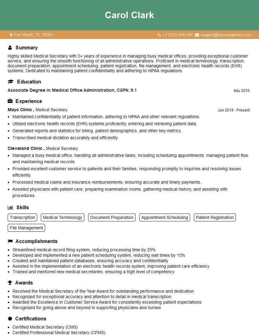
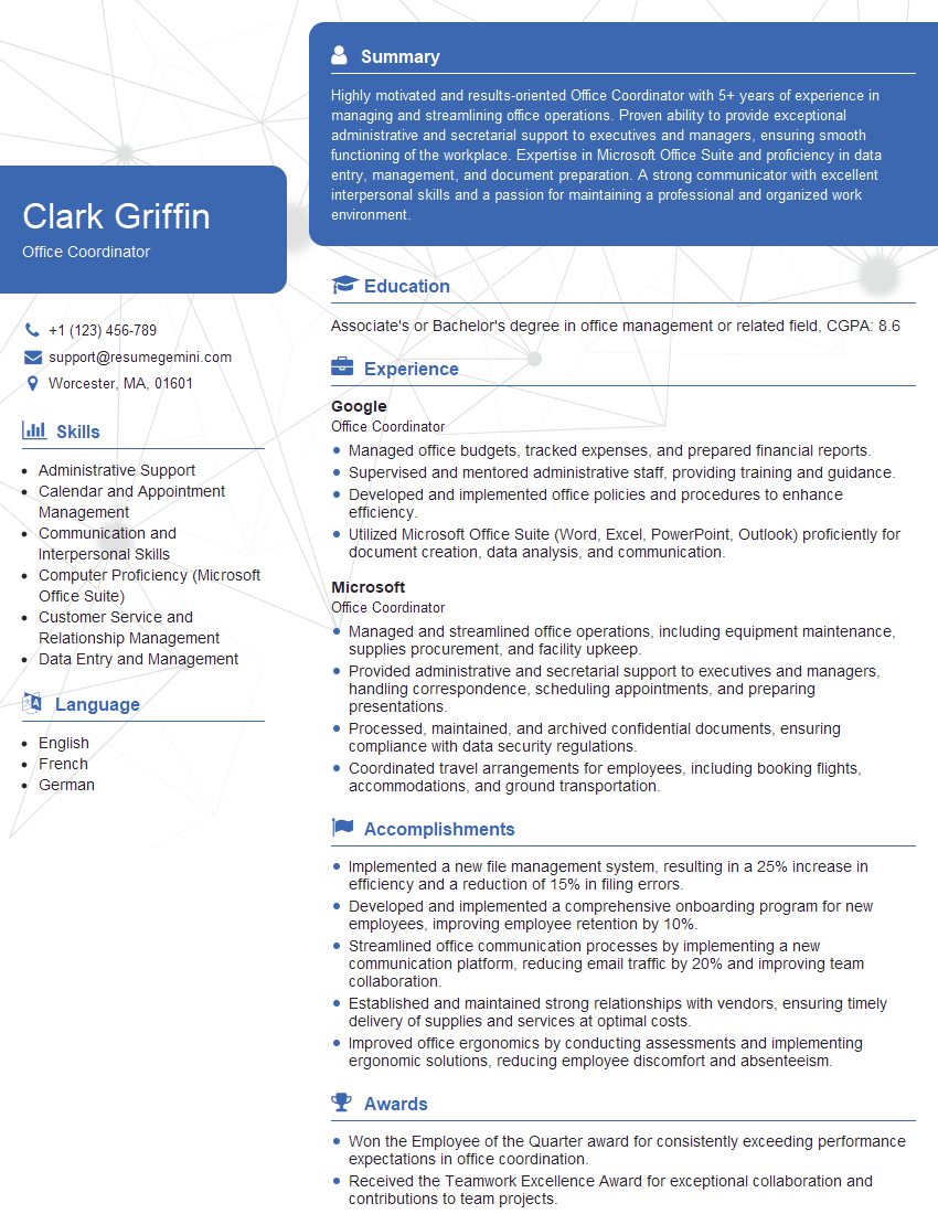
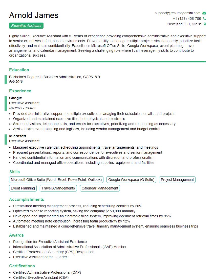
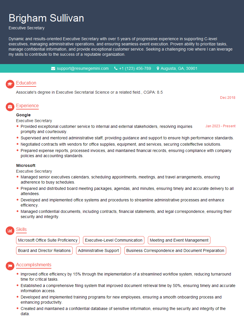
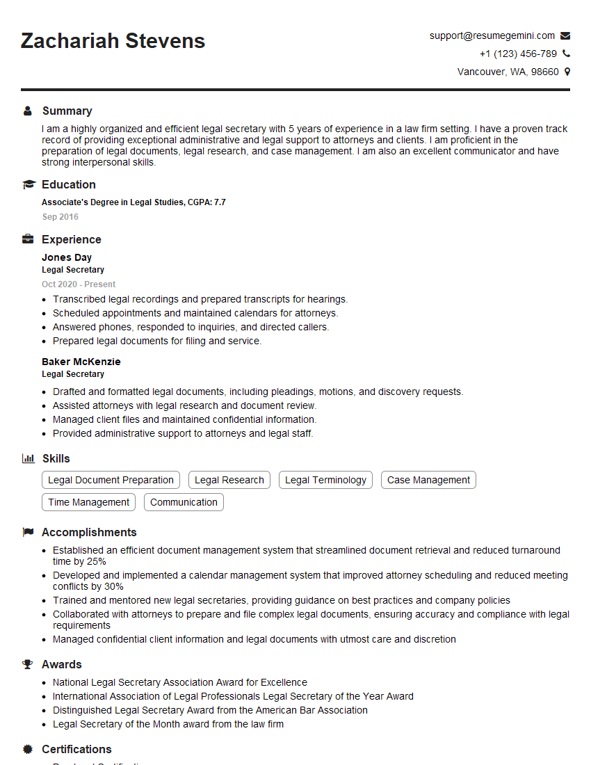
Mastering the Microsoft Office Suite is crucial for career advancement across many fields. Proficiency in these tools demonstrates essential skills for organization, analysis, and communication – highly valued by employers. To significantly boost your job prospects, focus on crafting an ATS-friendly resume that highlights your skills effectively. ResumeGemini is a trusted resource that can help you build a professional and impactful resume tailored to your experience. Examples of resumes specifically highlighting Microsoft Office Suite expertise are available to help guide you.
Explore more articles
Users Rating of Our Blogs
Share Your Experience
We value your feedback! Please rate our content and share your thoughts (optional).
What Readers Say About Our Blog
To the interviewgemini.com Webmaster.
Very helpful and content specific questions to help prepare me for my interview!
Thank you
To the interviewgemini.com Webmaster.
This was kind of a unique content I found around the specialized skills. Very helpful questions and good detailed answers.
Very Helpful blog, thank you Interviewgemini team.
