Are you ready to stand out in your next interview? Understanding and preparing for Statistical Software (e.g., R, Python, Stata) interview questions is a game-changer. In this blog, we’ve compiled key questions and expert advice to help you showcase your skills with confidence and precision. Let’s get started on your journey to acing the interview.
Questions Asked in Statistical Software (e.g., R, Python, Stata) Interview
Q 1. Explain the difference between a Type I and Type II error.
Type I and Type II errors are both errors in statistical hypothesis testing. Think of it like a courtroom trial: we’re trying to determine if the defendant is guilty (our null hypothesis).
A Type I error (false positive) occurs when we reject the null hypothesis when it’s actually true. In our courtroom analogy, this is like convicting an innocent person. The probability of committing a Type I error is denoted by alpha (α), often set at 0.05 (5%).
A Type II error (false negative) occurs when we fail to reject the null hypothesis when it’s actually false. In our courtroom analogy, this is like letting a guilty person go free. The probability of committing a Type II error is denoted by beta (β). The power of a test (1-β) is the probability of correctly rejecting a false null hypothesis.
The balance between these two types of errors is crucial. Reducing the probability of one often increases the probability of the other. The choice of alpha and the design of the study are key factors in managing this trade-off.
Q 2. What are the assumptions of linear regression?
Linear regression assumes several key conditions for accurate and reliable results. Violating these assumptions can lead to biased or inefficient estimates.
- Linearity: The relationship between the independent and dependent variables should be linear. Scatter plots can help visually assess this.
- Independence of errors: The errors (residuals) should be independent of each other. Autocorrelation, where errors are correlated over time, violates this assumption.
- Homoscedasticity: The variance of the errors should be constant across all levels of the independent variable(s). Heteroscedasticity (unequal variance) can lead to inefficient estimates.
- Normality of errors: The errors should be normally distributed. While minor deviations are often tolerable, severe departures can affect the validity of inferences.
- No or little multicollinearity: Independent variables should not be highly correlated with each other. High multicollinearity can make it difficult to isolate the effect of individual predictors.
- No significant outliers: Outliers can disproportionately influence the regression line. They should be investigated and addressed appropriately.
Diagnostic plots, such as residual plots and Q-Q plots, are helpful in assessing these assumptions. Transformations of variables or robust regression techniques might be necessary to address violations.
Q 3. How do you handle missing data in a dataset?
Handling missing data is a critical step in data preprocessing. Ignoring it can lead to biased or inaccurate results. The best approach depends on the nature and extent of the missing data and the type of analysis.
- Deletion: This involves removing observations or variables with missing values. Listwise deletion removes entire rows with any missing data, while pairwise deletion uses available data for each analysis. This is simple but can lead to a loss of information and bias if data is not missing completely at random (MCAR).
- Imputation: This involves replacing missing values with estimated values. Methods include:
- Mean/Median/Mode imputation: Simple, but can distort the variance and relationships between variables.
- Regression imputation: Predicts missing values based on other variables using a regression model.
- Multiple imputation: Creates multiple plausible imputed datasets, analyzes each separately, and combines results. This is more computationally intensive but handles uncertainty better.
- K-Nearest Neighbors (KNN) imputation: Imputes values based on the values of ‘k’ nearest neighbors in the feature space.
Before choosing a method, it’s essential to assess the mechanism of missingness (MCAR, MAR, MNAR). If data is not MCAR, more sophisticated methods like multiple imputation are generally preferred. Proper documentation of the handling of missing data is crucial for transparency and reproducibility.
Q 4. Describe different methods for feature scaling.
Feature scaling transforms the features of a dataset to a similar scale. This is crucial for many machine learning algorithms, particularly those based on distance calculations (e.g., k-NN, SVM) or gradient descent (e.g., linear regression, neural networks).
- Min-Max Scaling (Normalization): Scales features to a specific range, typically [0, 1]. The formula is:
x_scaled = (x - min(x)) / (max(x) - min(x)) - Z-score Standardization: Transforms features to have a mean of 0 and a standard deviation of 1. The formula is:
x_scaled = (x - mean(x)) / std(x) - Robust Scaling: Similar to Z-score standardization but uses the median and interquartile range (IQR) instead of the mean and standard deviation, making it less sensitive to outliers.
x_scaled = (x - median(x)) / IQR(x)
The choice of method depends on the dataset and the algorithm. Min-Max scaling is useful when the data is roughly uniformly distributed, while Z-score standardization is more suitable when there are outliers. Robust scaling is a good option when the data has outliers.
Q 5. What is the bias-variance tradeoff?
The bias-variance tradeoff is a fundamental concept in machine learning. It describes the relationship between the complexity of a model and its ability to generalize to unseen data.
Bias refers to the error introduced by approximating a real-world problem, which might be complex, by a simplified model. High bias leads to underfitting, where the model is too simple to capture the underlying patterns in the data. This results in poor performance on both training and test data.
Variance refers to the model’s sensitivity to fluctuations in the training data. High variance leads to overfitting, where the model learns the training data too well, including noise, and performs poorly on unseen data. This means it performs well on training data, but not on unseen test data.
The goal is to find a sweet spot that minimizes both bias and variance. A model with low bias and low variance generalizes well to new data.
Imagine trying to hit a bullseye with arrows. High bias means your arrows consistently miss the bullseye in the same direction (e.g., always to the left). High variance means your arrows are scattered all over the target, sometimes close, sometimes far.
Q 6. Explain regularization techniques (L1 and L2).
Regularization techniques are used to prevent overfitting in models by adding a penalty term to the loss function. This penalty discourages the model from learning overly complex relationships.
L1 regularization (LASSO): Adds a penalty proportional to the absolute value of the model’s coefficients. This tends to drive some coefficients to exactly zero, effectively performing feature selection. The loss function becomes: Loss = original_loss + λ * Σ|βi| where λ is the regularization parameter.
L2 regularization (Ridge): Adds a penalty proportional to the square of the model’s coefficients. This shrinks the coefficients towards zero but doesn’t force them to be exactly zero. The loss function becomes: Loss = original_loss + λ * Σβi2 where λ is the regularization parameter.
The choice between L1 and L2 depends on the specific problem. L1 is useful when feature selection is desired, while L2 is generally preferred when many features have small effects.
The regularization parameter λ controls the strength of the penalty. A larger λ leads to stronger regularization, reducing overfitting but potentially increasing bias.
Q 7. How do you evaluate the performance of a classification model?
Evaluating the performance of a classification model involves assessing its ability to correctly classify instances into different categories. Several metrics are commonly used, often in combination.
- Accuracy: The ratio of correctly classified instances to the total number of instances. Simple to understand but can be misleading if classes are imbalanced.
- Precision: The ratio of true positives to the sum of true positives and false positives. Measures the accuracy of positive predictions.
- Recall (Sensitivity): The ratio of true positives to the sum of true positives and false negatives. Measures the model’s ability to identify all positive instances.
- F1-score: The harmonic mean of precision and recall. Provides a balanced measure considering both false positives and false negatives.
- ROC curve (Receiver Operating Characteristic curve): Plots the true positive rate (recall) against the false positive rate at various classification thresholds. The area under the ROC curve (AUC) summarizes the overall performance.
- Confusion matrix: A table showing the counts of true positives, true negatives, false positives, and false negatives. Provides a detailed breakdown of the model’s performance.
The choice of metric depends on the specific problem and the relative costs of different types of errors. For example, in medical diagnosis, high recall is crucial to avoid missing positive cases, even if it means more false positives.
Cross-validation techniques are important for reliable performance estimation, preventing over-optimistic results from training data alone.
Q 8. How do you evaluate the performance of a regression model?
Evaluating a regression model’s performance goes beyond just looking at the R-squared value. We need a multifaceted approach, considering several key metrics. R-squared, while useful, only tells us how much variance in the dependent variable is explained by the model; it doesn’t indicate the model’s predictive power or if the model is overfitting.
Here’s a breakdown of crucial evaluation metrics:
- R-squared (R2): Represents the proportion of variance in the dependent variable explained by the independent variables. A higher R2 suggests a better fit, but it can be inflated by adding irrelevant variables. Adjusted R2 addresses this issue by penalizing the inclusion of unnecessary predictors.
- Adjusted R-squared: A modified version of R-squared that accounts for the number of predictors in the model. It’s preferred over R2 when comparing models with different numbers of predictors.
- Mean Squared Error (MSE): Measures the average squared difference between the predicted and actual values. A lower MSE indicates better accuracy. It’s sensitive to outliers.
- Root Mean Squared Error (RMSE): The square root of MSE. It’s easier to interpret than MSE because it’s in the same units as the dependent variable.
- Mean Absolute Error (MAE): Measures the average absolute difference between predicted and actual values. It’s less sensitive to outliers than MSE.
- Residual Plots: Visual inspection of residuals (the differences between observed and predicted values) can reveal patterns or heteroscedasticity (non-constant variance of errors), indicating potential model issues.
- F-statistic and p-value: These assess the overall significance of the model. A low p-value (typically below 0.05) indicates that the model is statistically significant, meaning the predictors collectively explain a significant portion of the variance in the dependent variable.
In practice, I’d use a combination of these metrics, along with residual plots, to get a holistic view of the model’s performance. For instance, I might use R-squared and adjusted R-squared to assess the model’s explanatory power, RMSE to gauge prediction accuracy, and residual plots to check for model assumptions. A strong model will display a high R-squared/adjusted R-squared, low RMSE/MAE, and residuals that show random scatter around zero.
Q 9. What is cross-validation and why is it important?
Cross-validation is a powerful resampling technique used to evaluate the performance of a machine learning model, particularly in preventing overfitting. It works by splitting the data into multiple subsets (folds). The model is trained on a portion of the data (training set) and validated on a held-out portion (testing set). This process is repeated multiple times, with different subsets used for training and testing in each iteration. The performance metrics obtained from these iterations are then averaged to get a robust estimate of the model’s generalization ability.
Why is it important?
Cross-validation helps us avoid overfitting, a situation where a model performs exceptionally well on the training data but poorly on unseen data. By evaluating the model on multiple different test sets, we obtain a more reliable estimate of its performance on new, unseen data. This is crucial because our ultimate goal is to build a model that generalizes well, not just one that memorizes the training data.
Types of Cross-Validation:
- k-fold cross-validation: The data is divided into k folds. The model is trained on k-1 folds and tested on the remaining fold. This is repeated k times, with each fold serving as the testing set once.
- Leave-one-out cross-validation (LOOCV): A special case of k-fold cross-validation where k equals the number of data points. Each data point is used as the testing set once.
- Stratified k-fold cross-validation: Ensures that the class distribution is maintained in each fold. This is particularly useful for imbalanced datasets.
For example, in predicting customer churn, k-fold cross-validation ensures the model’s performance isn’t skewed by a particular subset of customers in the dataset. A well-performing model across all folds indicates reliable predictive capability in real-world applications.
Q 10. Explain different types of sampling methods.
Sampling methods are crucial for selecting a representative subset of data from a larger population. The choice of method depends on the research question and the characteristics of the population. Here are some common types:
- Simple Random Sampling: Each member of the population has an equal chance of being selected. This is easy to implement but might not represent subgroups within the population well if the population is heterogeneous.
- Stratified Sampling: The population is divided into strata (subgroups) based on relevant characteristics (e.g., age, gender, income). A random sample is then taken from each stratum, ensuring representation from all groups. This is useful when we need to compare subgroups or when certain subgroups are small.
- Cluster Sampling: The population is divided into clusters (e.g., geographic areas, schools). A random sample of clusters is selected, and all members within the selected clusters are included in the sample. This is cost-effective when the population is geographically dispersed.
- Systematic Sampling: Every kth member of the population is selected after a random starting point. This is simple but can be biased if there’s a pattern in the data that aligns with the sampling interval.
- Convenience Sampling: Selecting readily available individuals. This is easy but highly prone to bias and not recommended for rigorous research.
For instance, if I’m studying the effectiveness of a new drug, stratified sampling based on age and health conditions would be appropriate to ensure that the results are generalizable across different patient groups. If I’m surveying customer satisfaction across different regions, cluster sampling by geographical area would be efficient.
Q 11. What is the central limit theorem?
The Central Limit Theorem (CLT) is a fundamental concept in statistics. It states that the distribution of the sample means of a large number of independent, identically distributed (i.i.d.) random variables, regardless of the shape of the original population distribution, will approximate a normal distribution.
In simpler terms: Imagine repeatedly taking samples from any population (even if it’s not normally distributed), calculating the mean of each sample, and plotting these means. As the number of samples increases, the distribution of these sample means will get closer and closer to a bell-shaped curve (normal distribution).
Why is it important?
The CLT is crucial because it allows us to make inferences about the population mean even if we don’t know the population distribution. We can use the sample mean and its standard error (which is calculated from the sample standard deviation and sample size) to construct confidence intervals and conduct hypothesis tests about the population mean. This is the foundation of many statistical procedures.
For example, if we want to estimate the average height of all adults in a country, we can take a large sample of adults, calculate the sample mean, and use the CLT to construct a confidence interval around this sample mean to estimate the true population average height.
Q 12. Explain the difference between correlation and causation.
Correlation and causation are often confused, but they are distinct concepts. Correlation refers to a statistical relationship between two variables – they tend to move together. Causation, on the other hand, implies that one variable directly influences or causes a change in another variable.
Correlation does not equal causation. Just because two variables are correlated doesn’t mean that one causes the other. There could be a third, confounding variable influencing both, or the relationship could be purely coincidental.
Examples:
- Correlation: Ice cream sales and crime rates are often positively correlated. This doesn’t mean that eating ice cream causes crime. Both are likely influenced by a third variable: warmer weather.
- Causation: Smoking causes lung cancer. There’s substantial evidence demonstrating a causal link between smoking and lung cancer.
Establishing causation requires rigorous research methods, often involving controlled experiments or longitudinal studies that can rule out alternative explanations. Observational studies can show correlation, but they can’t definitively prove causation.
Q 13. How do you deal with outliers in your data?
Outliers are data points that significantly deviate from the rest of the data. They can be caused by measurement errors, data entry mistakes, or genuinely unusual observations. Handling outliers requires careful consideration, as removing them can lead to biased results if done improperly.
Strategies for dealing with outliers:
- Identify Outliers: Use visual tools like box plots, scatter plots, or statistical methods like Z-scores or the interquartile range (IQR) to identify potential outliers. A common approach is to flag data points that fall outside 1.5 times the IQR above the third quartile or below the first quartile.
- Investigate the Cause: Before removing or transforming outliers, try to understand why they exist. Were there errors in data collection or entry? Is it a genuinely extreme observation? If it’s an error, correct it; if it’s not an error, proceed cautiously.
- Transformation: Transform the data using methods like logarithmic transformation or Box-Cox transformation to reduce the influence of outliers. This compresses the data range and makes the distribution closer to normal.
- Winsorizing: Replacing extreme values with less extreme ones (e.g., replacing the outlier with the highest non-outlier value). This method is less drastic than removal.
- Robust Statistical Methods: Use statistical methods that are less sensitive to outliers, such as median instead of mean, or robust regression techniques.
- Removal (Use with Caution): Removing outliers is a last resort. Only remove them if you are confident they are due to errors and if removing them doesn’t significantly bias the results. Always document your rationale for removal.
For example, if I’m analyzing income data, and I find a few individuals with exceptionally high incomes compared to the rest, I’d investigate first. If those incomes are due to data entry mistakes, I’ll correct them. If they are genuine, I might use a log transformation to reduce their impact on the analysis, instead of arbitrarily removing them. A log transformation also makes sense in this case because of the often skewed nature of income distributions.
Q 14. What is a p-value and how do you interpret it?
A p-value is the probability of obtaining results as extreme as, or more extreme than, the observed results, assuming the null hypothesis is true. The null hypothesis is a statement of no effect or no difference.
Interpreting p-values:
A small p-value (typically below a significance level, often set at 0.05) suggests that the observed results are unlikely to have occurred by chance alone, if the null hypothesis were true. In this case, we reject the null hypothesis in favor of the alternative hypothesis. A large p-value suggests that the observed results are consistent with the null hypothesis. We fail to reject the null hypothesis.
Important Considerations:
- P-values don’t measure the size of an effect: A statistically significant result (low p-value) doesn’t necessarily mean the effect is large or practically meaningful. Effect size measures provide additional information.
- P-values are influenced by sample size: With large sample sizes, even small effects can lead to statistically significant p-values. Conversely, with small sample sizes, large effects may not result in significant p-values.
- Multiple testing: Performing many statistical tests increases the chance of finding a significant p-value by chance (Type I error). Methods like adjusting the significance level using the Bonferroni correction are employed to account for this.
For example, in a clinical trial testing a new drug, a low p-value might indicate that the drug is effective. However, the p-value alone doesn’t tell us how much more effective the drug is compared to a placebo. We would also need to look at the effect size (e.g., the difference in average improvement between the drug and the placebo group) to assess the practical significance of the results.
Q 15. What are the different types of data (nominal, ordinal, interval, ratio)?
Data types are categorized based on the nature of the values they represent and the mathematical operations that can be meaningfully applied to them. Think of it like building blocks – you wouldn’t add colors (nominal) the same way you would add weights (ratio).
- Nominal: These are categorical data representing categories or groups with no inherent order. Think of eye color (blue, brown, green) – no color is inherently ‘better’ than another. You can count occurrences, but you can’t meaningfully compute averages.
- Ordinal: Similar to nominal, but with a meaningful order. Think of customer satisfaction ratings (very satisfied, satisfied, neutral, dissatisfied, very dissatisfied). We know ‘very satisfied’ is better than ‘satisfied’, but we don’t know the *magnitude* of the difference between them.
- Interval: Data with meaningful order and equal intervals between values, but lacking a true zero point. Temperature in Celsius is a classic example. The difference between 10°C and 20°C is the same as the difference between 20°C and 30°C, but 0°C doesn’t mean ‘no temperature’.
- Ratio: These have all the properties of interval data, plus a true zero point representing the absence of the quantity being measured. Height, weight, and income are all ratio data – a height of 0 means no height.
Understanding these distinctions is crucial because it dictates the appropriate statistical analysis. You wouldn’t calculate the mean of eye colors (nominal), but you would for height (ratio).
Career Expert Tips:
- Ace those interviews! Prepare effectively by reviewing the Top 50 Most Common Interview Questions on ResumeGemini.
- Navigate your job search with confidence! Explore a wide range of Career Tips on ResumeGemini. Learn about common challenges and recommendations to overcome them.
- Craft the perfect resume! Master the Art of Resume Writing with ResumeGemini’s guide. Showcase your unique qualifications and achievements effectively.
- Don’t miss out on holiday savings! Build your dream resume with ResumeGemini’s ATS optimized templates.
Q 16. Explain different statistical distributions (normal, binomial, Poisson).
Statistical distributions describe the probability of different outcomes for a random variable. They’re like blueprints of how data is expected to be spread.
- Normal Distribution: Also called the Gaussian distribution, it’s the bell curve. Many natural phenomena (like height or IQ) approximately follow a normal distribution. It’s defined by its mean (center) and standard deviation (spread). Knowing the mean and standard deviation lets us calculate probabilities of various outcomes.
- Binomial Distribution: This describes the probability of getting a certain number of successes in a fixed number of independent Bernoulli trials (each trial has only two outcomes, like heads/tails). For instance, the probability of getting exactly 3 heads in 5 coin flips follows a binomial distribution. It’s defined by the number of trials (n) and the probability of success in each trial (p).
- Poisson Distribution: This models the probability of a given number of events occurring in a fixed interval of time or space, if these events occur with a known average rate and independently of the time since the last event. For example, the number of customers arriving at a store in an hour might follow a Poisson distribution. It’s defined by the average rate (λ).
Understanding these distributions is essential for choosing the correct statistical tests and making inferences from data. For example, if your data follows a normal distribution, a t-test is often appropriate; otherwise, you might need a non-parametric test.
Q 17. What is A/B testing and how would you design one?
A/B testing is a randomized experiment where two versions (A and B) of something (a website, an ad, etc.) are shown to different groups of users to determine which performs better. It’s like a controlled experiment, helping to make data-driven decisions.
Designing an A/B test involves these steps:
- Define your objective: What are you trying to improve? (e.g., click-through rate, conversion rate, etc.)
- Define your metrics: How will you measure success? (e.g., number of clicks, number of purchases, etc.)
- Create variations (A and B): Design two versions of your item with a clear difference that might impact your chosen metric.
- Determine sample size: Use a power analysis to determine how many users you need in each group to detect a statistically significant difference.
- Randomly assign users: Ensure users are randomly assigned to either group A or group B to avoid bias.
- Run the test: Allow the test to run for a sufficient amount of time to collect enough data.
- Analyze the results: Use statistical tests (like a t-test or chi-squared test) to compare the performance of group A and group B and determine statistical significance.
- Draw conclusions: Based on the analysis, decide which version performs better and implement it.
Example: A company might A/B test two different website designs to see which leads to a higher conversion rate (percentage of visitors making a purchase).
Q 18. How would you perform hypothesis testing?
Hypothesis testing is a formal procedure for making decisions using data. It involves formulating a null hypothesis (a statement of no effect or no difference) and an alternative hypothesis (the opposite of the null hypothesis). We then use data to determine whether there is enough evidence to reject the null hypothesis.
- State the hypotheses: Formulate the null (H0) and alternative (H1) hypotheses. For example, H0: There is no difference in mean weight between two groups, H1: There is a difference in mean weight between two groups.
- Set the significance level (alpha): This is the probability of rejecting the null hypothesis when it is actually true (Type I error). A common value is 0.05.
- Choose a test statistic: This depends on the type of data and hypotheses. Examples include the t-statistic, z-statistic, chi-squared statistic, etc.
- Collect data and calculate the test statistic: Obtain a sample of data and use it to calculate the value of the test statistic.
- Determine the p-value: This is the probability of obtaining the observed results (or more extreme results) if the null hypothesis is true. A small p-value (less than alpha) provides evidence against the null hypothesis.
- Make a decision: If the p-value is less than alpha, reject the null hypothesis; otherwise, fail to reject the null hypothesis.
Think of it like a court trial: The null hypothesis is the presumption of innocence. The data is the evidence. The p-value represents the strength of the evidence against the null hypothesis. If the evidence is strong enough (p-value < alpha), we reject the null hypothesis and convict (reject H0).
Q 19. Write R code to perform a t-test.
Here’s R code to perform an independent samples t-test, comparing the means of two groups:
# Sample data
group1 <- c(10, 12, 15, 11, 13)
group2 <- c(14, 16, 18, 17, 19)

# Perform the t-test
t.test(group1, group2)
This code first creates two vectors, group1 and group2, representing the data from the two groups. The t.test() function then performs the t-test, providing the t-statistic, degrees of freedom, p-value, and confidence interval. If the p-value is less than your chosen significance level (e.g., 0.05), you would reject the null hypothesis of no difference between the means of the two groups.
Q 20. Write Python code to perform linear regression.
Here’s Python code using scikit-learn to perform linear regression:
import numpy as np
from sklearn.linear_model import LinearRegression

# Sample data
X = np.array([[1], [2], [3], [4], [5]])  # Independent variable
y = np.array([2, 4, 5, 4, 5])  # Dependent variable

# Create and train the model
model = LinearRegression()
model.fit(X, y)

# Make predictions
predictions = model.predict(X)

# Print the coefficients and intercept
print("Coefficients:", model.coef_)
print("Intercept:", model.intercept_)
This code first imports the necessary libraries. It then creates sample data for the independent (X) and dependent (y) variables. A LinearRegression model is created, trained using the fit() method, and used to make predictions on the same data. Finally, the code prints the coefficients (slope) and the intercept of the fitted regression line. You would use different data and potentially evaluate the model’s performance on a separate test dataset to assess its real-world predictive power.
Q 21. Write Stata code to create a frequency table.
Here’s Stata code to create a frequency table for a variable:
// Assuming your data is loaded and a variable named 'variable_name' exists
tabulate variable_name
This single line of code uses the tabulate command to generate a frequency table for the specified variable. This shows the count and percentage for each unique value of ‘variable_name’. You can also add options like , missing to include missing values in the table, or other options to customize the output further.
Q 22. Explain your experience with data visualization libraries (ggplot2, matplotlib, seaborn).
Data visualization is crucial for understanding data patterns and communicating insights effectively. I’m proficient in several libraries, including ggplot2 (R), matplotlib, and seaborn (Python). Each has its strengths.
ggplot2, in R, uses a grammar of graphics, allowing for highly customizable and aesthetically pleasing visualizations. Its layered approach makes building complex plots intuitive. For instance, creating a scatter plot with regression line, customized labels and themes is straightforward.
ggplot(data, aes(x = variable1, y = variable2)) + geom_point() + geom_smooth(method = 'lm') + labs(title = 'Scatter Plot', x = 'Variable 1', y = 'Variable 2') + theme_bw()Matplotlib, in Python, offers a vast array of plotting functionalities, providing fine-grained control over every aspect of the plot. It’s excellent for creating publication-quality figures, but it can be more verbose than ggplot2. I frequently use it for generating complex figures like multiple subplots or customized annotations.
import matplotlib.pyplot as plt
plt.scatter(data['variable1'], data['variable2'])
plt.xlabel('Variable 1')
plt.ylabel('Variable 2')
plt.title('Scatter Plot')
plt.show()Seaborn, built on top of matplotlib, simplifies creating statistically informative plots. Its functions automatically handle things like color palettes and plot annotations, making it ideal for exploratory data analysis and quick visualizations. I often use it to generate heatmaps, pair plots, or box plots that reveal relationships between multiple variables efficiently.
import seaborn as sns
import matplotlib.pyplot as plt
sns.heatmap(correlation_matrix, annot=True)
plt.show()
In my previous role, I used these libraries extensively to create dashboards visualizing key performance indicators (KPIs), reports highlighting trends in customer behavior, and presentations showcasing model performance to stakeholders. The choice of library always depends on the specific needs of the project and desired level of customization.
Q 23. Describe your experience with data manipulation using dplyr (R) or pandas (Python).
Data manipulation is the backbone of any data analysis project. I’m highly experienced with both dplyr (R) and pandas (Python), which are powerful tools for data wrangling. They allow for efficient data cleaning, transformation, and aggregation.
dplyr‘s syntax, based on the pipe operator (%>%), allows for elegant chaining of multiple operations. This makes code more readable and easier to maintain. For example, filtering data based on certain criteria, selecting specific columns, and grouping data for summarization becomes intuitive and efficient.
data %>% filter(variable1 > 10) %>% select(variable2, variable3) %>% group_by(variable2) %>% summarize(mean_variable3 = mean(variable3))pandas, in Python, offers similar functionalities with its DataFrame structure. It’s particularly strong when dealing with large datasets and its efficient indexing and slicing capabilities. I use pandas for tasks such as data cleaning (handling missing values, removing duplicates), feature engineering, and creating new variables from existing ones.
import pandas as pd
df = df[df['variable1'] > 10]
df = df[['variable2', 'variable3']]
df = df.groupby('variable2')['variable3'].mean().reset_index()
In a recent project, I used dplyr to preprocess a large customer database, cleaning inconsistent entries, creating dummy variables for categorical features, and then using pandas to efficiently merge it with other data sources. This combination of tools allowed for extremely efficient and robust data preparation for subsequent modeling.
Q 24. How do you handle imbalanced datasets?
Imbalanced datasets, where one class significantly outnumbers others, are a common challenge in machine learning. Ignoring this imbalance leads to biased models that perform poorly on the minority class, which is often the class of most interest. I employ several techniques to address this.
- Resampling techniques: This involves either oversampling the minority class (creating synthetic samples) or undersampling the majority class (removing samples). Tools like SMOTE (Synthetic Minority Over-sampling Technique) are commonly used for oversampling. Undersampling can lead to loss of information, so careful consideration is needed.
- Cost-sensitive learning: This involves assigning different misclassification costs to different classes. For example, misclassifying a fraudulent transaction (minority class) is far costlier than misclassifying a legitimate transaction (majority class). This can be implemented by adjusting class weights in the learning algorithm.
- Anomaly detection techniques: If the minority class represents anomalies or outliers, then algorithms specifically designed for anomaly detection (like Isolation Forest or One-Class SVM) might be more appropriate than standard classification algorithms.
- Ensemble methods: Combining multiple models trained on different subsets of the data or with different resampling strategies can improve overall performance and robustness.
The best approach depends on the specific dataset and problem. For instance, in a fraud detection system, I might use SMOTE to oversample fraudulent transactions and incorporate cost-sensitive learning to prioritize the correct identification of fraud. If the dataset is very large, I might use an ensemble method combining multiple models trained on different undersampled subsets to improve the efficiency of training and maintain model robustness.
Q 25. Explain the concept of dimensionality reduction.
Dimensionality reduction aims to reduce the number of variables (features) in a dataset while preserving as much important information as possible. High-dimensional data can lead to computational inefficiency, overfitting, and difficulty in interpretation. Dimensionality reduction techniques achieve this by either feature selection or feature extraction.
Feature selection involves choosing a subset of the original features based on their relevance to the target variable. Methods include filter methods (e.g., correlation analysis), wrapper methods (e.g., recursive feature elimination), and embedded methods (e.g., L1 regularization in linear models). I frequently use feature importance scores from tree-based models (like Random Forest) to guide feature selection.
Feature extraction creates new, lower-dimensional features that capture the essence of the original data. Principal Component Analysis (PCA) is a popular technique that transforms data into a new set of uncorrelated variables (principal components) that capture the maximum variance. t-SNE is another popular method widely used for visualizing high-dimensional data in a lower dimension that preserves local neighborhood structures.
In practice, I often use PCA to reduce the number of variables before training complex models like neural networks, which are computationally expensive. For exploratory data analysis, I might use t-SNE to visualize the data and identify clusters or patterns. The selection of the dimensionality reduction technique depends heavily on the context, goals, and the nature of the data itself.
Q 26. What are some common machine learning algorithms and their applications?
Many machine learning algorithms exist, each with specific applications. Here are a few common ones:
- Linear Regression: Predicts a continuous target variable based on a linear combination of features. Used for predicting house prices, stock prices, etc.
- Logistic Regression: Predicts a binary or categorical target variable. Used for classification tasks like spam detection, customer churn prediction, and medical diagnosis.
- Decision Trees: Creates a tree-like model to classify or regress data. Easy to interpret and visualize, but prone to overfitting. Used for credit scoring, customer segmentation, and fraud detection.
- Support Vector Machines (SVM): Finds an optimal hyperplane to separate data points into different classes. Effective in high-dimensional spaces and robust to outliers. Used for image classification, text classification, and bioinformatics.
- Random Forest: An ensemble method that combines multiple decision trees to improve accuracy and robustness. Used for similar tasks as decision trees, but generally with higher accuracy.
- Neural Networks: Complex models inspired by the human brain. Can learn complex patterns in data, but require significant computational resources. Used for image recognition, natural language processing, and time series forecasting.
The choice of algorithm depends on the nature of the data, the problem being solved (classification, regression, clustering), and the desired level of interpretability. For instance, in a project involving medical diagnosis, I might prefer a decision tree or logistic regression for its interpretability, allowing doctors to understand the reasoning behind the predictions. In a project involving image recognition, a neural network might be more appropriate due to its ability to handle complex patterns.
Q 27. Describe your experience with model deployment and monitoring.
Model deployment and monitoring are crucial for ensuring that a machine learning model continues to provide value in a real-world setting. My experience encompasses various aspects of this process.
Deployment: I’ve deployed models using various methods, including:
- REST APIs: Creating APIs using frameworks like Flask (Python) or Plumber (R) to expose model predictions to other systems or applications. This allows easy integration with other software and enables real-time predictions.
- Cloud platforms: Deploying models on cloud services like AWS SageMaker, Google Cloud AI Platform, or Azure Machine Learning, leveraging their scalability and managed infrastructure. This ensures reliability, accessibility, and easy scaling.
- Batch processing: Processing large datasets offline using tools like Apache Spark or Hadoop, generating predictions efficiently for large-scale applications.
Monitoring: Post-deployment monitoring is critical to ensure model performance doesn’t degrade over time. This involves tracking key metrics like accuracy, precision, recall, F1-score, and other relevant KPIs. I use tools and techniques for:
- Drift detection: Continuously monitoring for concept drift, where the relationship between input features and the target variable changes over time. This can be caused by changes in the underlying data distribution, requiring retraining or model updates.
- Performance dashboards: Creating dashboards to visualize model performance metrics and identify potential issues early on.
- Alerting systems: Setting up alerts to notify stakeholders when model performance drops below a predefined threshold.
In a recent project, I deployed a fraud detection model as a REST API using Flask, integrating it with a real-time transaction processing system. I set up monitoring using Prometheus and Grafana to track model performance and receive alerts in case of significant performance degradation. This proactive approach ensured the model remained accurate and effective in detecting fraudulent transactions.
Key Topics to Learn for Statistical Software (e.g., R, Python, Stata) Interview
- Data Wrangling and Manipulation: Mastering data import, cleaning, transformation, and manipulation techniques using the chosen software. This includes handling missing data, outliers, and data types effectively.
- Exploratory Data Analysis (EDA): Developing proficiency in visualizing data distributions, identifying patterns, and summarizing key insights using appropriate statistical graphics and summary statistics. Practical application: Generating insightful visualizations to communicate findings from a dataset.
- Statistical Modeling: Understanding and implementing various statistical models (linear regression, logistic regression, time series analysis, etc.) Practical application: Building predictive models and interpreting their results meaningfully.
- Hypothesis Testing and Inference: Grasping core concepts of hypothesis testing, p-values, confidence intervals, and their interpretations. Practical application: Conducting hypothesis tests to draw statistically sound conclusions from data.
- Data Visualization: Creating clear, concise, and effective visualizations to communicate statistical findings to both technical and non-technical audiences. Understanding the strengths and weaknesses of different visualization types.
- Programming Fundamentals: Demonstrating a solid understanding of programming concepts relevant to the chosen software (e.g., loops, conditional statements, functions, object-oriented programming principles where applicable).
- Version Control (Git): Understanding and utilizing version control systems for collaborative projects and reproducible research.
- Report Generation: Producing professional reports that clearly communicate your analysis, findings, and conclusions. This includes the effective use of tables, figures, and written descriptions.
- Advanced Techniques (depending on the role): Explore areas like machine learning algorithms, Bayesian statistics, or specific statistical methods relevant to the job description.
Next Steps
Mastering statistical software like R, Python, or Stata is crucial for career advancement in data science, analytics, and research. It opens doors to a wide range of exciting opportunities and allows you to contribute meaningfully to data-driven decision-making. To maximize your job prospects, focus on crafting an ATS-friendly resume that highlights your skills and experience effectively. ResumeGemini is a trusted resource that can help you build a professional and impactful resume, tailored to the specific requirements of the roles you’re targeting. Examples of resumes tailored to showcasing Statistical Software expertise (R, Python, Stata) are available to guide you.

Business Analyst Resume Sample

Market Research Analyst Resume Sample

Financial Analyst Resume Sample

Data Analyst Resume Sample

Quantitative Analyst Resume Sample

Data Scientist Resume Sample

Research Scientist Resume Sample

Actuary Resume Sample
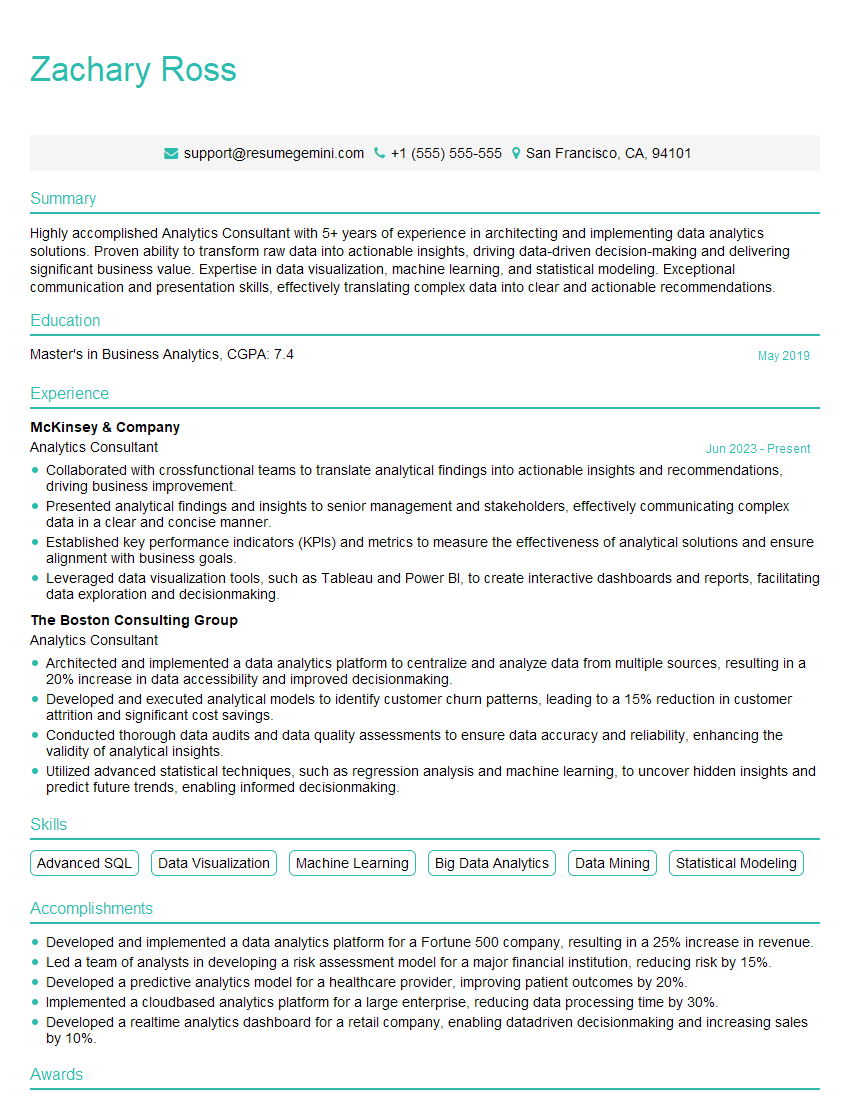
Analytics Consultant Resume Sample

Operations Research Analyst Resume Sample
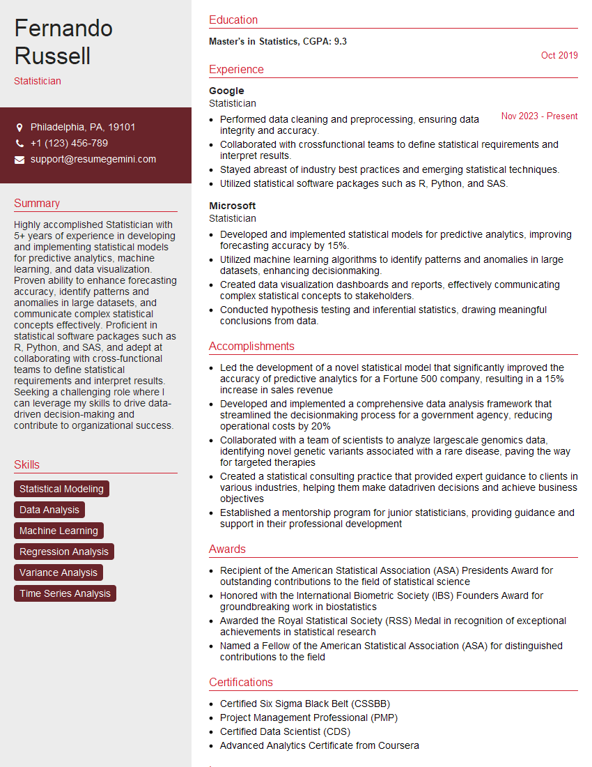
Statistician Resume Sample

Survey Statistician Resume Sample
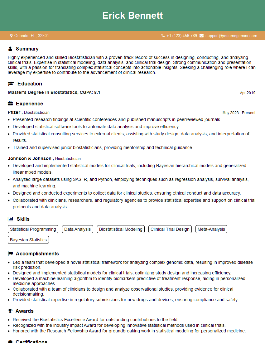
Biostatistician Resume Sample
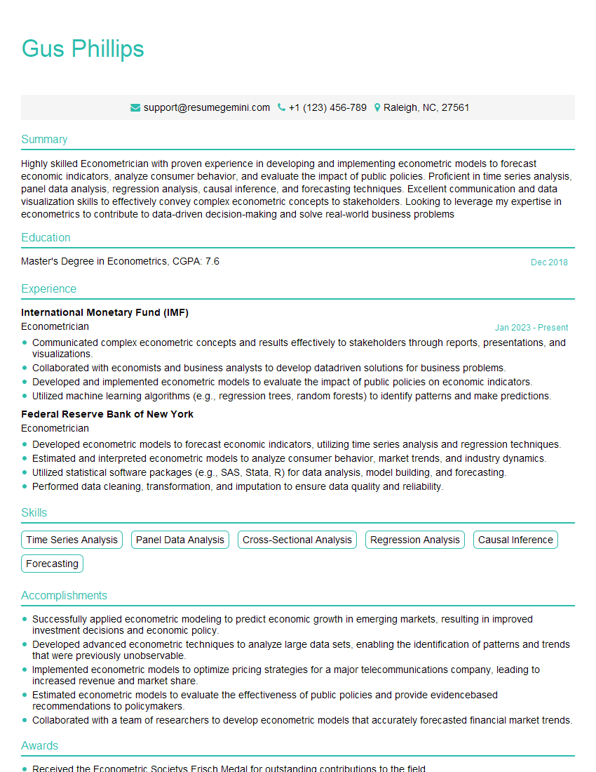
Econometrician Resume Sample
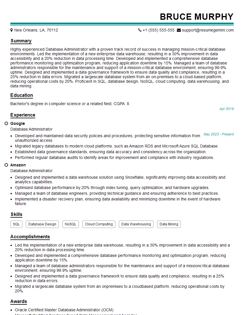
Database Administrator Resume Sample

Machine Learning Engineer Resume Sample
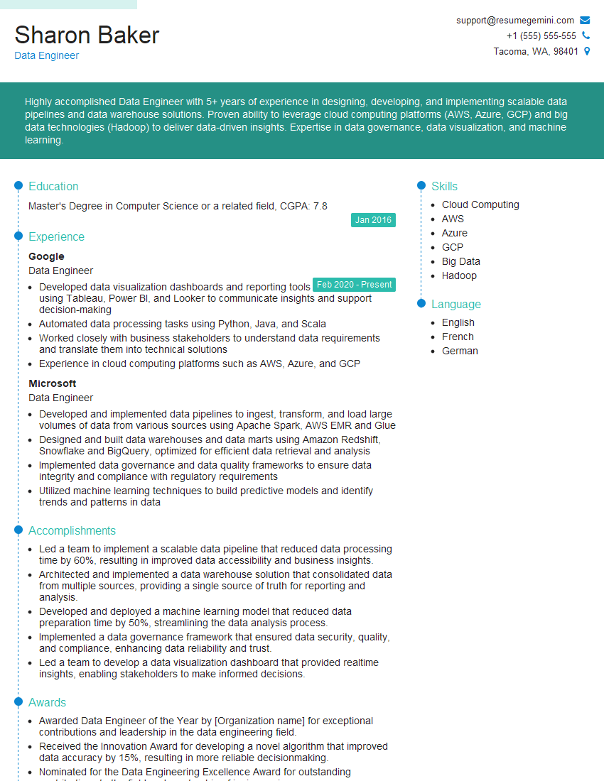
Data Engineer Resume Sample
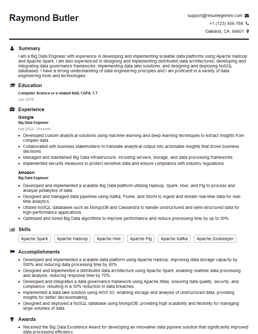
Big Data Engineer Resume Sample
- Business Analyst
- Market Research Analyst
- Financial Analyst
- Data Analyst
- Quantitative Analyst
- Data Scientist
- Research Scientist
- Actuary
- Analytics Consultant
- Operations Research Analyst
- Statistician
- Survey Statistician
- Biostatistician
- Econometrician
- Database Administrator
- Machine Learning Engineer
- Data Engineer
- Big Data Engineer
Explore more articles
Users Rating of Our Blogs
Share Your Experience
We value your feedback! Please rate our content and share your thoughts (optional).
What Readers Say About Our Blog
To the interviewgemini.com Webmaster.
Very helpful and content specific questions to help prepare me for my interview!
Thank you
To the interviewgemini.com Webmaster.
This was kind of a unique content I found around the specialized skills. Very helpful questions and good detailed answers.
Very Helpful blog, thank you Interviewgemini team.